
News
Dubai Starts App Development Program To Train 1,000 Emiratis
The scheme, called “Create Apps in Dubai” should triple the number of app creators by 2025.

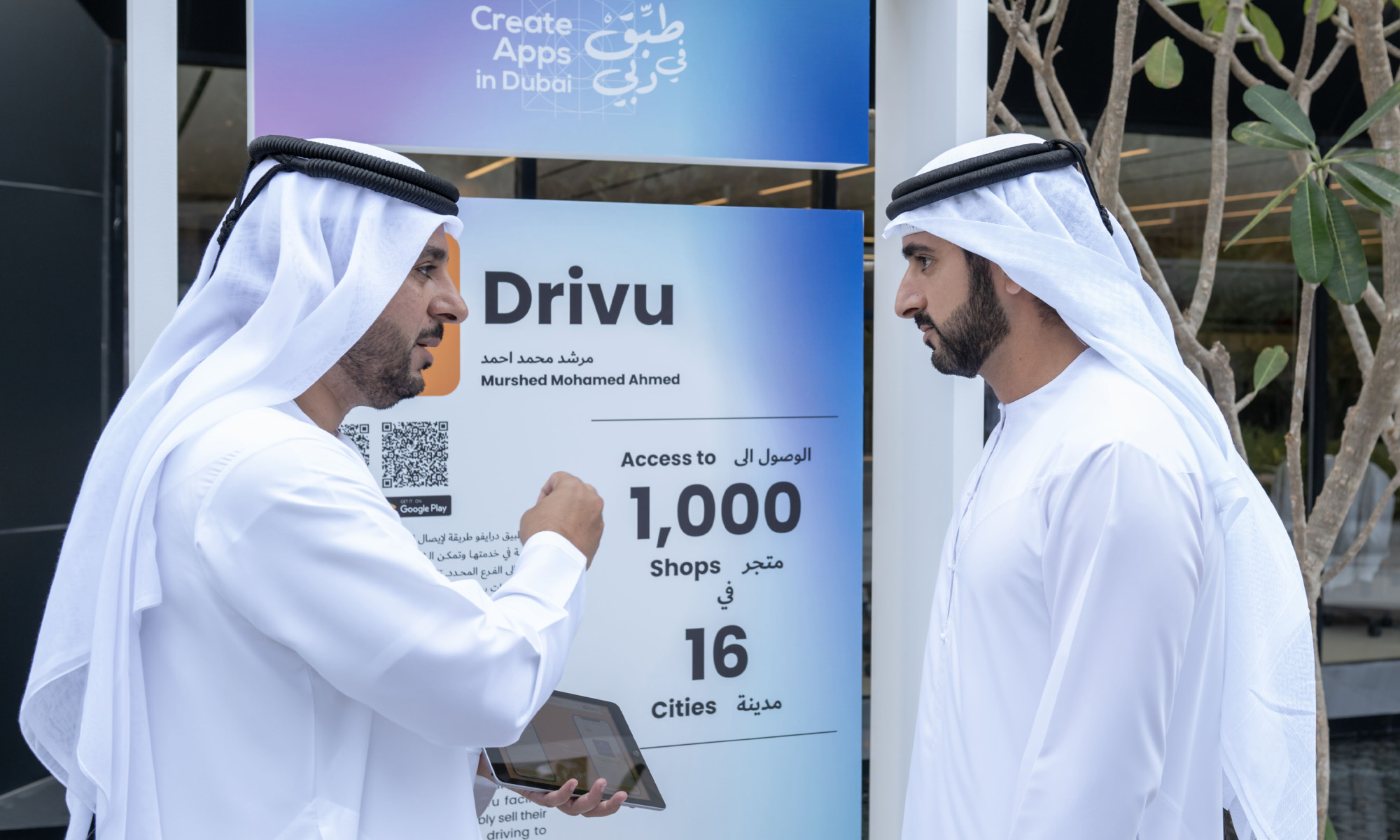
On Wednesday, Dubai’s Crown Prince, Sheikh Hamdan bin Mohammed, launched a new ecosystem for developing digital applications and growing the pool of local talent within the emirate.
The scheme, known as Create Apps in Dubai, aims to transform Dubai into one of the world’s “most attractive destinations” for business opportunities. By 2025, the program should also have trained over 1,000 Emiratis and tripled the number of app creators. Additionally, 100 new national app projects will become available in digital stores over the next two years.
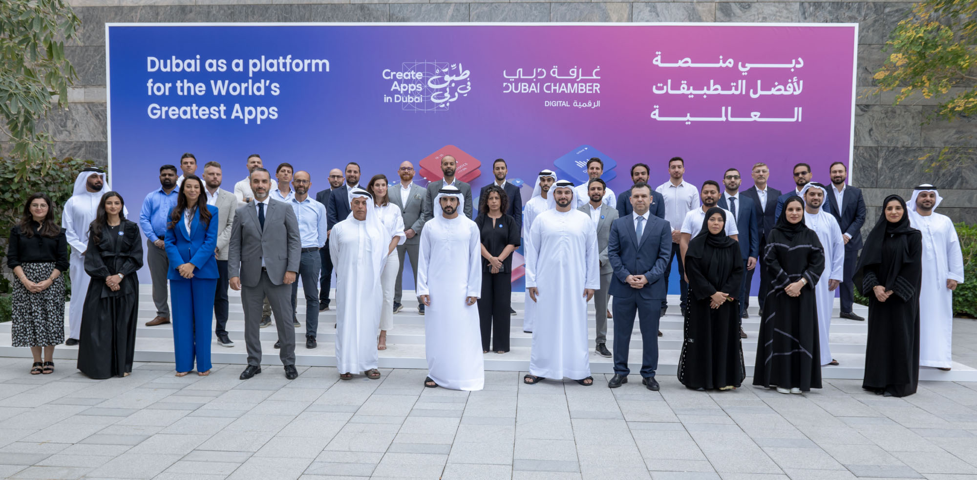
“The exponential growth of digital applications and platforms has created a new global competition for technological leadership. Dubai seeks to be at the forefront of this global race by providing a platform for fostering the development of 1,000 highly-skilled UAE nationals whose ideas and innovation will create a vibrant applications sector in Dubai,” says Sheikh Hamdan bin Mohammed, Crown Prince of Dubai.
Dubai is seeking to solidify its position as a global capital of the digital economy, with the Dubai Economic Agenda (D33) plan preparing to help 30 private companies achieve $1 billion in value.
Also Read: ChatGPT Is Accelerating The AI Revolution In The Middle East
With global smartphone sales exceeding $448 billion and 2 million new apps and games created in 2021 alone, the sector represents a massive opportunity for investors, entrepreneurs and tech startups to thrive.
Create Apps in Dubai will be overseen by the Dubai Chamber for Digital Economy, and support development plans to “empower UAE citizens to play key roles in realizing the country’s digital vision”, a recent statement said.
The UAE’s digital economy will be worth $140 billion by 2031, up from nearly $38 billion, according to recent figures from the Dubai Chamber of Digital Economy.






News
Instagram Redraws Its Wordmark And The Internet Reads “Instagzam”
Instagram’s first wordmark refresh in a decade arrives with new fonts, a restrained gradient — and a Reddit verdict of sidegrade.
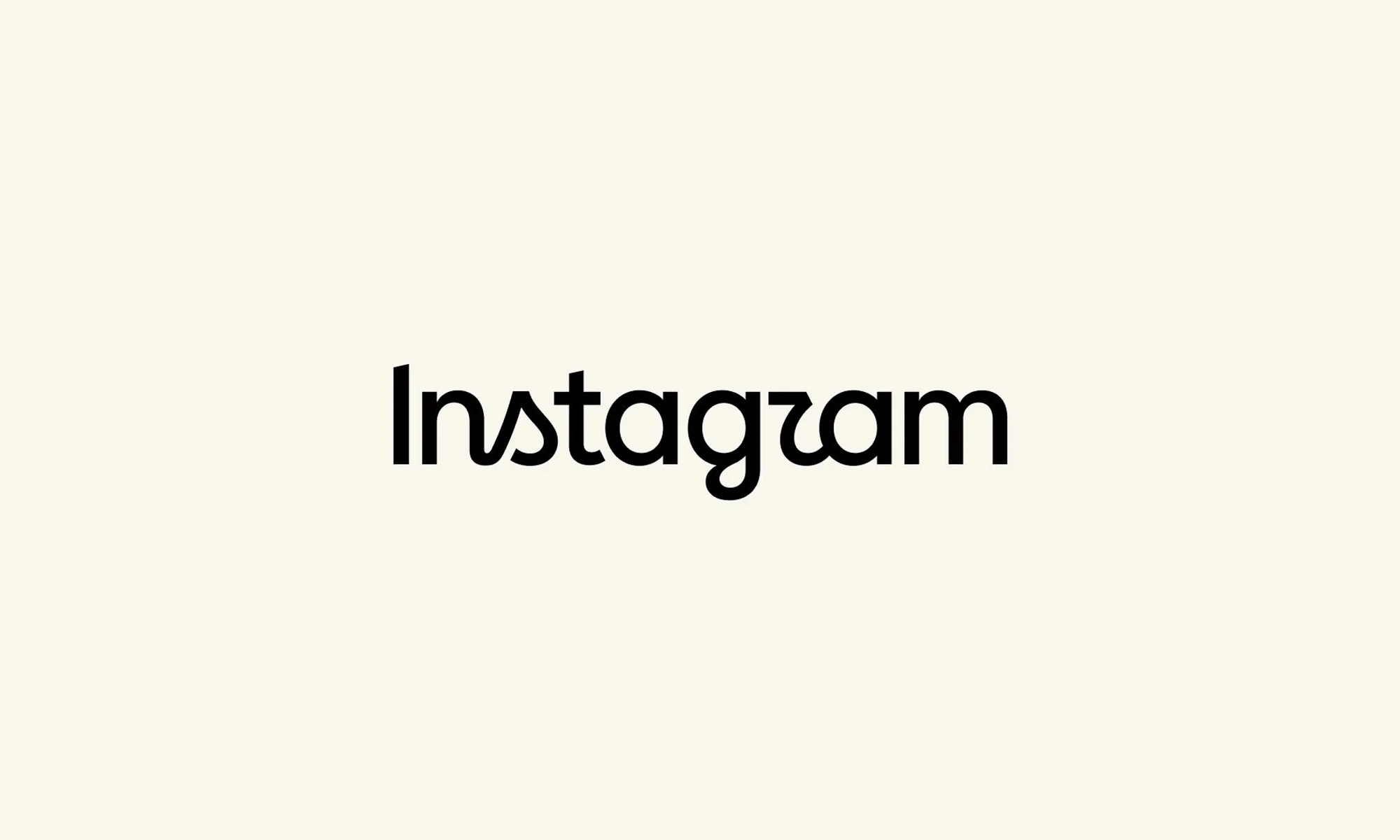
Although Instagram’s famous camera icon hasn’t changed, the company has refreshed the handwritten wordmark at the top of its app. This is the first redesign we’ve seen in ten years, and one the internet promptly set about renaming.
“The wordmark at the top of the app hasn’t changed in 10 years, so it was time for a refresh,” Instagram head Adam Mosseri wrote in a post on August 13, describing the new version as “cleaner and more modern” while keeping references to the original design.
Instagram says its team explored hundreds of options — all-caps lettering, camera-inspired concepts, even literal handwriting — before returning to script. “Script reflects individuality, so referencing that felt right,” Instagram director of product design Jasmine Probst said in Meta’s announcement. “The new wordmark is bolder and simpler, with touches of unexpectedness. It cues individual expression, a personal voice, both of which have always been core to Instagram”.
The wordmark is part of a broader brand overhaul: an updated Instagram Sans typeface, two new fonts — the hand-drawn Instagram Pen and Instagram Mono — plus refreshed motion and layouts, and more restrained use of the signature gradient. The wordmark is rolling out globally now, with the rest arriving throughout 2026 and beyond.
Also Read: Spotify Will Now Tell You If Your Favorite Artist Isn’t Real
The design mixes cursive and print lettering, some characters connected and others floating free. That hybrid approach, combined with unusually shaped “s” and “r” characters, led some users to conclude the logo actually reads “Instagzam”. On the r/logodesign subreddit, one user said the wordmark looked “fan-made,” like something built in Canva; another called it “an unsettling mix of manuscript and cursive”; a third summarized it as a “sidegrade” — or, inevitably, a “zidegrade”.
Not everyone was hostile to the new look. Some found the half-cursive design stylish and surprisingly readable, while others called it an improvement on its predecessor, and one commenter argued Instagram was simply adopting minimalist branding later than everyone else. Either way, the platform now has a refreshed identity, three updated fonts, and an unofficial new pronunciation.

Instagram Redraws Its Wordmark And The Internet Reads “Instagzam”

Spotify Will Now Tell You If Your Favorite Artist Isn’t Real

Samsung And Spotify Offer Free Premium Deal In MENA

Lebanon’s 5G Era Begins With 150 Stations And A $1M Budget

Syria Just Got Its First Super App Featuring Built-In Digital Payments

Dubai Police Finishes 65 Projects, Says AI Is The Next Priority

Beirut Wins US Flight Access, But Carriers Aren’t Sold Yet

Samsung’s Fold Goes Wide, And The Whole Galaxy Range Gets Pricier

Gulf AI Job Vacancies Nearly Triple, But Hiring Stays Lopsided

This UAE Platform Wants To Replace Fashion Photo Shoots With AI


-
 News3 weeks ago
This UAE Platform Wants To Replace Fashion Photo Shoots With AI
-

 News3 weeks ago
Nike And Hyperice’s New Slides Heat And Vibrate Your Feet
-
 Product Reviews3 weeks ago
Shokz OpenFit Pro Review: Open-Ear Audio Finally Grows Up
-
 News2 weeks ago
Syria Just Got Its First Super App Featuring Built-In Digital Payments