
News
Exploding Pagers Kill 12 & Injure Thousands In Lebanon & Syria
Several news agencies are now reporting that Israel’s Mossad was responsible for planting the devices used in the attack.

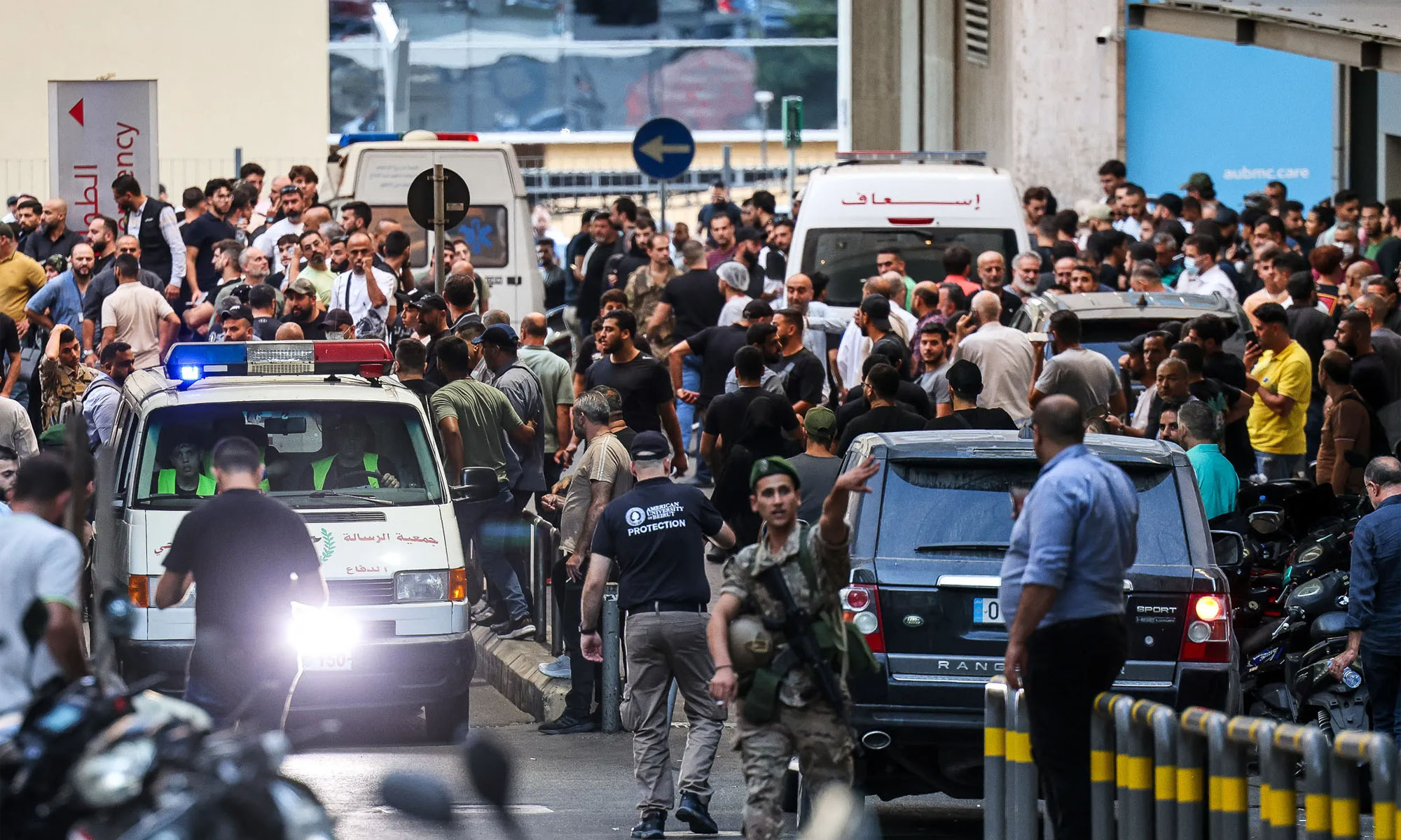
Thousands of Lebanese and Syrian citizens have been injured in an attack that used modified pagers loaded with explosives. Lebanon’s health minister, Firass Abiad, confirmed that twelve people, including a young child, had been killed. Meanwhile, the state media agency, NNA, announced that a further 2,800 people were injured.
By yesterday evening (Tuesday, September 17), the New York Times had reported that Israel was to blame for the attacks, stating: “Israel carried out its operation against Hezbollah on Tuesday by hiding explosive material within a new batch of Taiwanese-made pagers imported into Lebanon, according to American and other officials briefed on the operation”.
Israel's Mossad spy agency planted explosives inside 5,000 pagers imported by Lebanese group Hezbollah months before Tuesday's detonations, a senior Lebanese security source and another source told @Reuters https://t.co/8m4tTa4BSQ pic.twitter.com/O78WXLWUHp
— Reuters (@Reuters) September 18, 2024
Reuters also reported that it had gained information from a “senior Lebanese security source” and “another source” that Hezbollah had imported 5,000 pagers from Taiwanese manufacturer Gold Apollo. However, at some point in the supply chain, the units were intercepted and replaced with modified versions carrying explosives. The source also claimed that Israel’s Mossad spy agency was responsible, adding around three grams of high-explosive material inside the casing of each device.
The Importance Of Pagers To Hezbollah
As we have seen in both the Ukraine war and in places such as Afghanistan, smartphone communications can be deadly, as they’re relatively easy to intercept and give away the exact location of the person operating them.
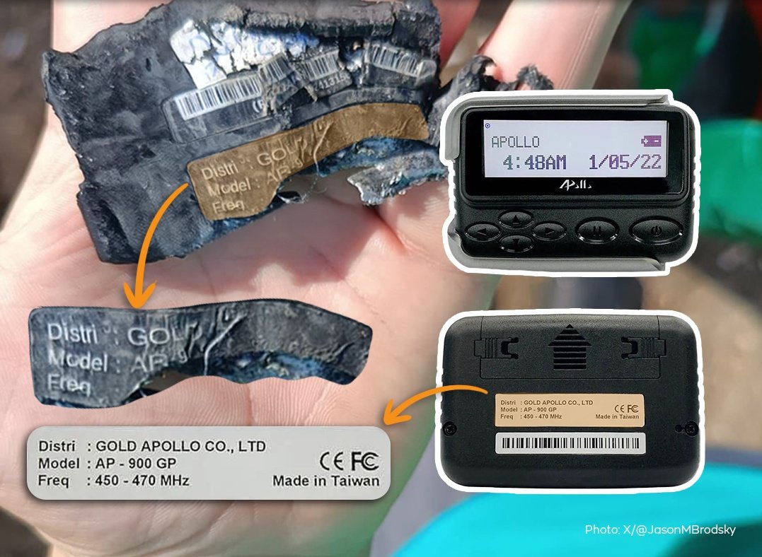
For that reason, groups waging asymmetric warfare prefer to use low-tech communication methods such as hand-delivered letters or, in this case, old-school devices like pagers.
Reuters sources said 3,000 pagers exploded after 15:00 local time after being triggered by receiving a coded message. According to the New York Times, the message “appeared as though it was coming from Hezbollah’s leadership”.
Also Read: The Top 10 Worst Cyberattacks In The Middle East Revealed
Videos of the exploding pagers have already spread like wildfire across news networks and social media platforms. One shows a man at a store checkout looking down to view his pager before it explodes, pushing him backwards. Another CCTV video from a market shows a man sustaining injuries after one of the modified devices explodes in his bag.




News
Microsoft Plans $10 Billion-Plus Gulf Expansion Despite Iran Conflict
Security is shaping Microsoft’s approach, from resilience work with governments to what it will say about how the money splits by country.
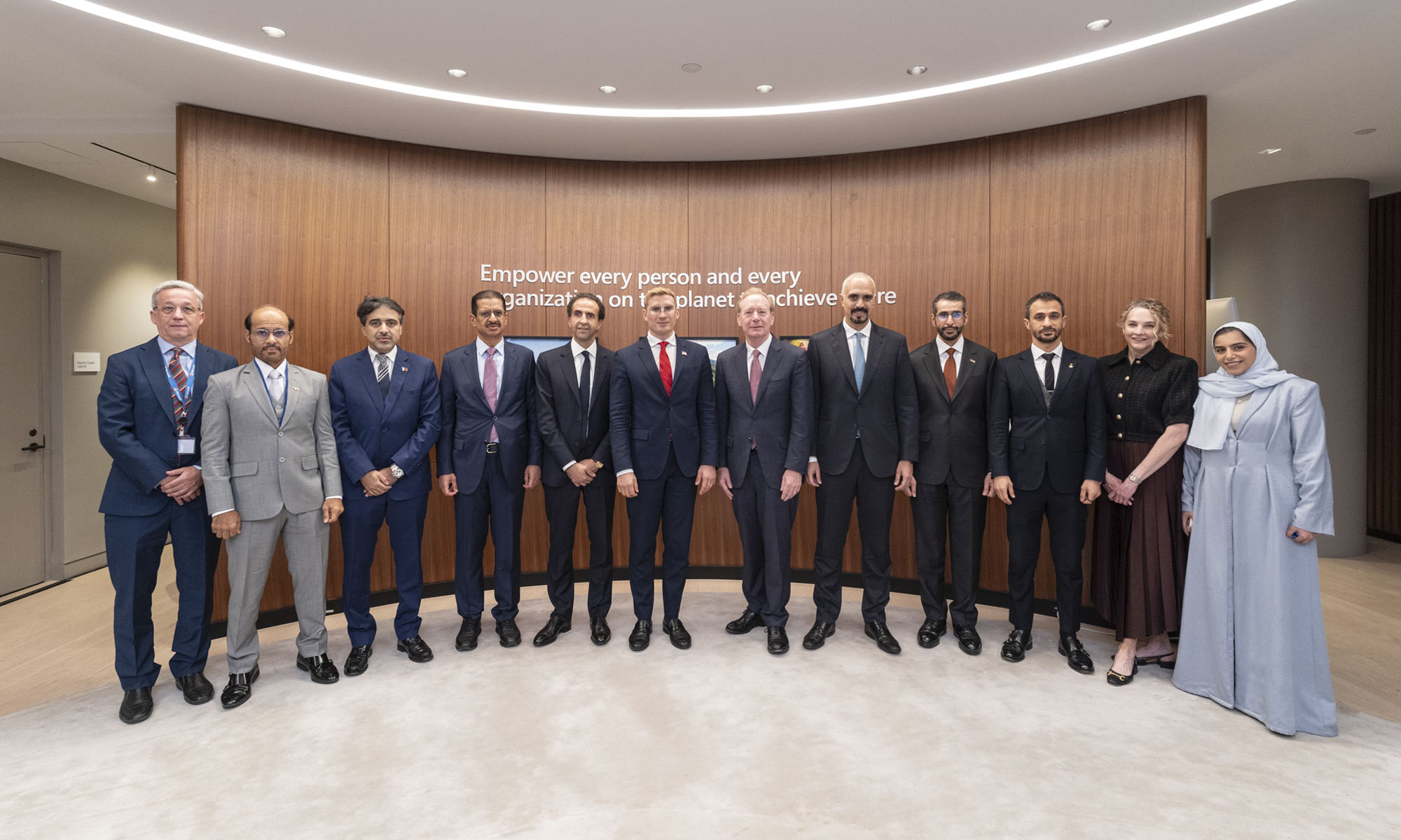
Microsoft is planning more than $10 billion of investment across the UAE, Saudi Arabia, Qatar and Kuwait through 2030, Vice Chair and President Brad Smith told Reuters, calling the spending schedule aggressive. The Iranian conflict that began on February 28 has not persuaded the company to scale back.
“We’re sustaining all the investments we planned to make before this conflict started, and we are in fact adding to them,” Smith said. The $10 billion-plus total does not, however, show how large those additions are.
The investment, which Smith described as part of Microsoft’s continued infrastructure expansion, is aimed at cloud and AI infrastructure and at the company’s growing regional operations. Microsoft also intends to put more than $400 million into subsea and terrestrial connectivity across the Middle East by 2030.
The spending fits the region’s own ambitions too. Gulf governments have been investing heavily in AI infrastructure as part of a push to diversify their economies beyond oil and gas and turn themselves into global technology hubs. Major cloud and AI providers have been drawn in part by the land and relatively low-cost energy on offer.
Microsoft is widening its partnerships with regional AI companies, though not on identical terms. In 2024, it invested $1.5 billion in Abu Dhabi-based G42 for a minority stake, and Smith currently sits on G42’s board. Saudi Arabia’s Humain and Qatar’s Qai are working with Microsoft on selected priority areas, but Smith said the company does not plan to make capital investments in either.
Also Read: Egypt’s Mobile Wallets Are Booming, But Cash Still Has Power
The conflict has added another strand to Microsoft’s work in the region. Since it began, Smith said, the company has supported regional partners with digital resilience assessments, and it is now working with Gulf countries through a digital resilience initiative focused on preparedness and the protection of critical data.
So far, the company has given no country-by-country breakdown of the investment, citing security among other factors. So while the headline figure is public, how Microsoft divides the spending among the four countries is not.

Microsoft Plans $10 Billion-Plus Gulf Expansion Despite Iran Conflict

In Kuwait, Your Surgeon Might Be Operating From Another Country

Qatar Folds 45 State Companies Into A Single Investment Platform

Trip.com Is Betting An AI Agent Will Book Your Next Vacation

Meta’s New $499 Plan Puts A Price On Reaching A Real Person

Apple’s First Folding iPhone Arrives Late To A Shrinking Market
Trip.com Is Betting An AI Agent Will Book Your Next Vacation

Egypt’s Mobile Wallets Are Booming, But Cash Still Has Power

OKX Bets Streaming Perks Can Take Crypto Mainstream Across MENA

Musk’s Boring Company Wants To Dig 150 KM Of Tunnel Under The UAE


-
 News3 weeks ago
Apple’s First Folding iPhone Arrives Late To A Shrinking Market
-
 News2 weeks ago
Trip.com Is Betting An AI Agent Will Book Your Next Vacation
-
 News2 weeks ago
Egypt’s Mobile Wallets Are Booming, But Cash Still Has Power
-
 News2 weeks ago
OKX Bets Streaming Perks Can Take Crypto Mainstream Across MENA