
News
Samsung One UI 8 Set To Usher In AI-Powered Galaxy Revolution
The Korean tech giant has revealed the models that will be compatible with the latest AI-driven features of the new user interface.


Samsung has confirmed that One UI 8 will begin rolling out as a stable release in September 2025, starting with the Galaxy S25 series before expanding to other eligible Galaxy devices. The update, built on Android 16, has already been previewed in a beta version on the Galaxy Z Fold7 and Flip7, showcasing AI-powered tools, a refreshed design, and stronger privacy features.
Beta testing began in May with the Galaxy S25 lineup, with additional models such as the Galaxy S24, Z Fold6, and A55 joining the rollout in July. According to Samsung, One UI 8 is not just an incremental update but a completely reimagined Galaxy experience that blends AI, usability, and design refinements.
A prominent highlight is Galaxy AI integration, designed to streamline productivity and creativity. Users can resize pop-up windows, generate instant content summaries, and multitask more efficiently. Foldable devices gain tailored enhancements, including drag-and-drop Drawing Assist and a more intuitive cover screen interface.
New AI tools also stand out. Portrait Studio transforms pet photos into studio-quality images, with AI-generated outputs watermarked for transparency. These services run on Google Cloud but require a Samsung Account and internet connection.
Design-wise, One UI 8 introduces softer blur effects and cohesive iconography, offering a more immersive visual environment. A redesigned Quick Panel adds one-tap access to Secure Folder, powered by Knox Vault encryption, while the “Now” bar on foldables provides instant access to music and notifications.
Also Read: KAUST Mathematical Model Tackles 5G Interference With Aircraft
Multitasking receives a boost through a 90:10 split-screen option, inspired by OnePlus’s Open Canvas, allowing one app to dominate while another remains in view. The Reminder app has also been rebuilt with categories displayed prominently at the top, integrating seamlessly with Samsung Calendar.
While early reviewers describe One UI 8 as more of a polished refinement than a radical overhaul, Samsung’s commitment to seven years of OS and security updates ensures longevity for its flagships. For many users, the focus on subtle design tweaks and powerful AI-driven functionality may set the stage for a more intelligent, user-friendly Galaxy ecosystem.


News
Microsoft Plans $10 Billion-Plus Gulf Expansion Despite Iran Conflict
Security is shaping Microsoft’s approach, from resilience work with governments to what it will say about how the money splits by country.
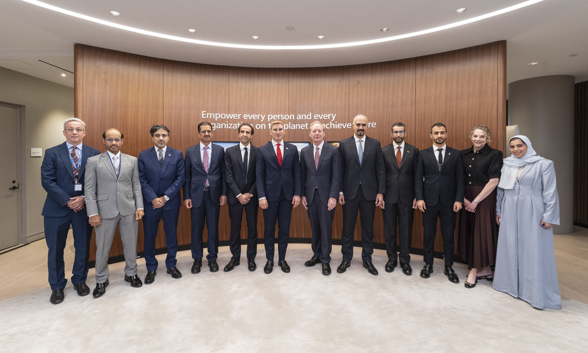
Microsoft is planning more than $10 billion of investment across the UAE, Saudi Arabia, Qatar and Kuwait through 2030, Vice Chair and President Brad Smith told Reuters, calling the spending schedule aggressive. The Iranian conflict that began on February 28 has not persuaded the company to scale back.
“We’re sustaining all the investments we planned to make before this conflict started, and we are in fact adding to them,” Smith said. The $10 billion-plus total does not, however, show how large those additions are.
The investment, which Smith described as part of Microsoft’s continued infrastructure expansion, is aimed at cloud and AI infrastructure and at the company’s growing regional operations. Microsoft also intends to put more than $400 million into subsea and terrestrial connectivity across the Middle East by 2030.
The spending fits the region’s own ambitions too. Gulf governments have been investing heavily in AI infrastructure as part of a push to diversify their economies beyond oil and gas and turn themselves into global technology hubs. Major cloud and AI providers have been drawn in part by the land and relatively low-cost energy on offer.
Microsoft is widening its partnerships with regional AI companies, though not on identical terms. In 2024, it invested $1.5 billion in Abu Dhabi-based G42 for a minority stake, and Smith currently sits on G42’s board. Saudi Arabia’s Humain and Qatar’s Qai are working with Microsoft on selected priority areas, but Smith said the company does not plan to make capital investments in either.
Also Read: Egypt’s Mobile Wallets Are Booming, But Cash Still Has Power
The conflict has added another strand to Microsoft’s work in the region. Since it began, Smith said, the company has supported regional partners with digital resilience assessments, and it is now working with Gulf countries through a digital resilience initiative focused on preparedness and the protection of critical data.
So far, the company has given no country-by-country breakdown of the investment, citing security among other factors. So while the headline figure is public, how Microsoft divides the spending among the four countries is not.

Microsoft Plans $10 Billion-Plus Gulf Expansion Despite Iran Conflict

In Kuwait, Your Surgeon Might Be Operating From Another Country

Qatar Folds 45 State Companies Into A Single Investment Platform

Trip.com Is Betting An AI Agent Will Book Your Next Vacation

Meta’s New $499 Plan Puts A Price On Reaching A Real Person

Apple’s First Folding iPhone Arrives Late To A Shrinking Market
Trip.com Is Betting An AI Agent Will Book Your Next Vacation

Egypt’s Mobile Wallets Are Booming, But Cash Still Has Power

OKX Bets Streaming Perks Can Take Crypto Mainstream Across MENA

Musk’s Boring Company Wants To Dig 150 KM Of Tunnel Under The UAE


-
 News3 weeks ago
Apple’s First Folding iPhone Arrives Late To A Shrinking Market
-
 News2 weeks ago
Trip.com Is Betting An AI Agent Will Book Your Next Vacation
-
 News2 weeks ago
Egypt’s Mobile Wallets Are Booming, But Cash Still Has Power
-
 News2 weeks ago
OKX Bets Streaming Perks Can Take Crypto Mainstream Across MENA