
News
KAUST Mathematical Model Tackles 5G Interference With Aircraft
The simulations showed that one tower inside the exclusion zone could reduce 5G efficiency by 20%, and up to 50% with three towers.


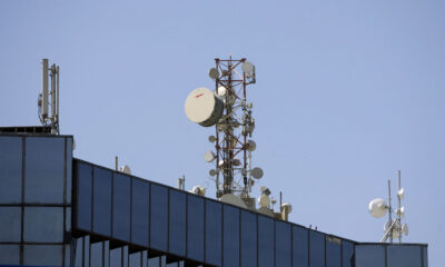
As 5G networks expand worldwide, concerns over aviation safety have sharpened. At the center is the risk that 5G signals may interfere with aircraft radio altimeters — instruments critical for determining altitude during landings and in low-visibility conditions. A research team at King Abdullah University of Science and Technology (KAUST) has now come up with a mathematical model to prevent such conflicts, aiming to protect aviation systems while preserving strong network performance.
The study, published in IEEE Transactions on Wireless Communications, introduces the idea of an ideal exclusion zone. These zones define areas near airports where higher-frequency 5G signals should be restricted to reduce interference. The approach offers regulators a framework for balancing passenger safety with mobile connectivity demands.
Led by Professor Mohamed-Slim Alouini, the KAUST team is the first to use stochastic geometry — a mathematical tool for modelling random network layouts — to forecast how 5G transmissions might overlap with radio altimeter signals. “5G operates near the same bandwidth as aircraft radio altimeters, which may cause signal interference,” explained Alouini. “This highlights the need to establish exclusion zones to reduce interference levels”.
The research suggests that triangular-shaped exclusion zones provide the best compromise, offering effective shielding for altimeters while limiting the impact on mobile networks. Within these areas, regulators could allow only lower-frequency signals, keeping higher-frequency bands that are more prone to interference outside the zone.
Also Read: Whish Money Partners With Mastercard For Cross Border Payments
Simulation results underscored the stakes. A single 5G tower placed inside the exclusion zone was shown to reduce overall efficiency by 20%, while three towers could slash performance by as much as 50%.
The project, supported by Saudi Arabia’s Communications, Space & Technology Commission (CST), positions the Kingdom at the forefront of a global debate. As countries refine their 5G rollout strategies, KAUST’s framework could help regulators worldwide protect aviation safety without stalling digital infrastructure progress.





News
Microsoft Plans $10 Billion-Plus Gulf Expansion Despite Iran Conflict
Security is shaping Microsoft’s approach, from resilience work with governments to what it will say about how the money splits by country.
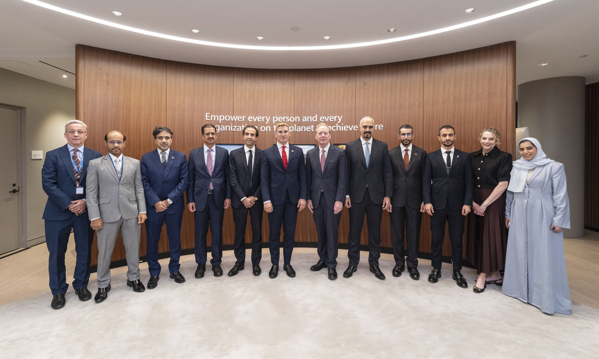
Microsoft is planning more than $10 billion of investment across the UAE, Saudi Arabia, Qatar and Kuwait through 2030, Vice Chair and President Brad Smith told Reuters, calling the spending schedule aggressive. The Iranian conflict that began on February 28 has not persuaded the company to scale back.
“We’re sustaining all the investments we planned to make before this conflict started, and we are in fact adding to them,” Smith said. The $10 billion-plus total does not, however, show how large those additions are.
The investment, which Smith described as part of Microsoft’s continued infrastructure expansion, is aimed at cloud and AI infrastructure and at the company’s growing regional operations. Microsoft also intends to put more than $400 million into subsea and terrestrial connectivity across the Middle East by 2030.
The spending fits the region’s own ambitions too. Gulf governments have been investing heavily in AI infrastructure as part of a push to diversify their economies beyond oil and gas and turn themselves into global technology hubs. Major cloud and AI providers have been drawn in part by the land and relatively low-cost energy on offer.
Microsoft is widening its partnerships with regional AI companies, though not on identical terms. In 2024, it invested $1.5 billion in Abu Dhabi-based G42 for a minority stake, and Smith currently sits on G42’s board. Saudi Arabia’s Humain and Qatar’s Qai are working with Microsoft on selected priority areas, but Smith said the company does not plan to make capital investments in either.
Also Read: Egypt’s Mobile Wallets Are Booming, But Cash Still Has Power
The conflict has added another strand to Microsoft’s work in the region. Since it began, Smith said, the company has supported regional partners with digital resilience assessments, and it is now working with Gulf countries through a digital resilience initiative focused on preparedness and the protection of critical data.
So far, the company has given no country-by-country breakdown of the investment, citing security among other factors. So while the headline figure is public, how Microsoft divides the spending among the four countries is not.

Microsoft Plans $10 Billion-Plus Gulf Expansion Despite Iran Conflict

In Kuwait, Your Surgeon Might Be Operating From Another Country

Qatar Folds 45 State Companies Into A Single Investment Platform

Trip.com Is Betting An AI Agent Will Book Your Next Vacation

Meta’s New $499 Plan Puts A Price On Reaching A Real Person

Apple’s First Folding iPhone Arrives Late To A Shrinking Market
Trip.com Is Betting An AI Agent Will Book Your Next Vacation

Egypt’s Mobile Wallets Are Booming, But Cash Still Has Power

OKX Bets Streaming Perks Can Take Crypto Mainstream Across MENA

Musk’s Boring Company Wants To Dig 150 KM Of Tunnel Under The UAE


-
 News3 weeks ago
Apple’s First Folding iPhone Arrives Late To A Shrinking Market
-
 News2 weeks ago
Trip.com Is Betting An AI Agent Will Book Your Next Vacation
-
 News2 weeks ago
Egypt’s Mobile Wallets Are Booming, But Cash Still Has Power
-
 News2 weeks ago
OKX Bets Streaming Perks Can Take Crypto Mainstream Across MENA