
News
EDT&Partners Buys eFlow To Bolster AI Learning Push
The Middle East-founded platform is adding engagement tech as the consultancy firm widens into regulated workforce training.


EDT&Partners has bought eFlow, an AI conversational learning platform founded in the Middle East, for an undisclosed sum. The deal marks a push by the consultancy business to tighten control over last-mile learning across education and workplace training.
EDT&Partners, long rooted in universities and public-sector work, is targeting a broader “knowledge economy” in which learning is continuous and embeds into daily workflows. Clients in regulated industries are pressing for digital learning that is both responsible and actually completed — not just designed.
“Education remains at the core of who we are,” said Pablo Langa, founder and managing partner at EDT&Partners. “At the same time, we are intentionally expanding into the broader learning ecosystem, particularly in highly regulated industries”.
eFlow delivers courses through chat-style interactions, using AI prompts to keep students and employees on task. The premise is blunt: engagement is the bottleneck in digital learning, and completion rates lag unless the platform actively supports the learner.
The acquisition folds eFlow’s engagement layer into EDT&Partners’ strategic and technology work, including Lecture, the firm’s open-source GenAI framework. The pitch is that institutions and employers can launch programs that people actually finish.
Co-founder Bassel Jalaleddine said the deal gives eFlow “the strategic and operational backbone needed to scale responsibly,” and stressed the platform’s intent to support educators rather than replace them.
Also Read: OpenAI’s ChatGPT Health Is A Private Space For Health Data
The move also strengthens EDT&Partners’ footing in the Middle East. The region is pushing workforce reform and talent development, and low-bandwidth, messaging-based learning travels well across emerging markets and community training programs.
eFlow’s co-founders, Jalaleddine and Samer Bawab, will join EDT&Partners as senior leaders. Both brands will run in parallel for now while teams and platforms are aligned ahead of industry events next year, including Bett 2026 in London.
The deal underlines demand for tools that move beyond content libraries toward engagement and completion — a direction echoed in corporate training budgets and government skills agendas.


News
Microsoft Plans $10 Billion-Plus Gulf Expansion Despite Iran Conflict
Security is shaping Microsoft’s approach, from resilience work with governments to what it will say about how the money splits by country.

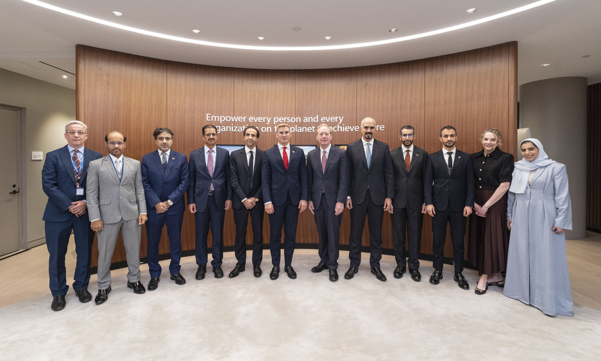
Microsoft is planning more than $10 billion of investment across the UAE, Saudi Arabia, Qatar and Kuwait through 2030, Vice Chair and President Brad Smith told Reuters, calling the spending schedule aggressive. The Iranian conflict that began on February 28 has not persuaded the company to scale back.
“We’re sustaining all the investments we planned to make before this conflict started, and we are in fact adding to them,” Smith said. The $10 billion-plus total does not, however, show how large those additions are.
The investment, which Smith described as part of Microsoft’s continued infrastructure expansion, is aimed at cloud and AI infrastructure and at the company’s growing regional operations. Microsoft also intends to put more than $400 million into subsea and terrestrial connectivity across the Middle East by 2030.
The spending fits the region’s own ambitions too. Gulf governments have been investing heavily in AI infrastructure as part of a push to diversify their economies beyond oil and gas and turn themselves into global technology hubs. Major cloud and AI providers have been drawn in part by the land and relatively low-cost energy on offer.
Microsoft is widening its partnerships with regional AI companies, though not on identical terms. In 2024, it invested $1.5 billion in Abu Dhabi-based G42 for a minority stake, and Smith currently sits on G42’s board. Saudi Arabia’s Humain and Qatar’s Qai are working with Microsoft on selected priority areas, but Smith said the company does not plan to make capital investments in either.
Also Read: Egypt’s Mobile Wallets Are Booming, But Cash Still Has Power
The conflict has added another strand to Microsoft’s work in the region. Since it began, Smith said, the company has supported regional partners with digital resilience assessments, and it is now working with Gulf countries through a digital resilience initiative focused on preparedness and the protection of critical data.
So far, the company has given no country-by-country breakdown of the investment, citing security among other factors. So while the headline figure is public, how Microsoft divides the spending among the four countries is not.

Microsoft Plans $10 Billion-Plus Gulf Expansion Despite Iran Conflict

In Kuwait, Your Surgeon Might Be Operating From Another Country

Qatar Folds 45 State Companies Into A Single Investment Platform

Trip.com Is Betting An AI Agent Will Book Your Next Vacation

Meta’s New $499 Plan Puts A Price On Reaching A Real Person

Apple’s First Folding iPhone Arrives Late To A Shrinking Market
Trip.com Is Betting An AI Agent Will Book Your Next Vacation

Egypt’s Mobile Wallets Are Booming, But Cash Still Has Power

OKX Bets Streaming Perks Can Take Crypto Mainstream Across MENA

Apple’s Latest Product Releases Make The Headlines


-
 News3 weeks ago
Apple’s First Folding iPhone Arrives Late To A Shrinking Market
-
 News2 weeks ago
Trip.com Is Betting An AI Agent Will Book Your Next Vacation
-
 News2 weeks ago
Egypt’s Mobile Wallets Are Booming, But Cash Still Has Power
-
 News2 weeks ago
OKX Bets Streaming Perks Can Take Crypto Mainstream Across MENA