Website Reviews
RelayThat Review: Easily Create Engaging Marketing Images
RelayThat is a next-generation design automation app that makes it possible to create stunning marketing images with just a few clicks.
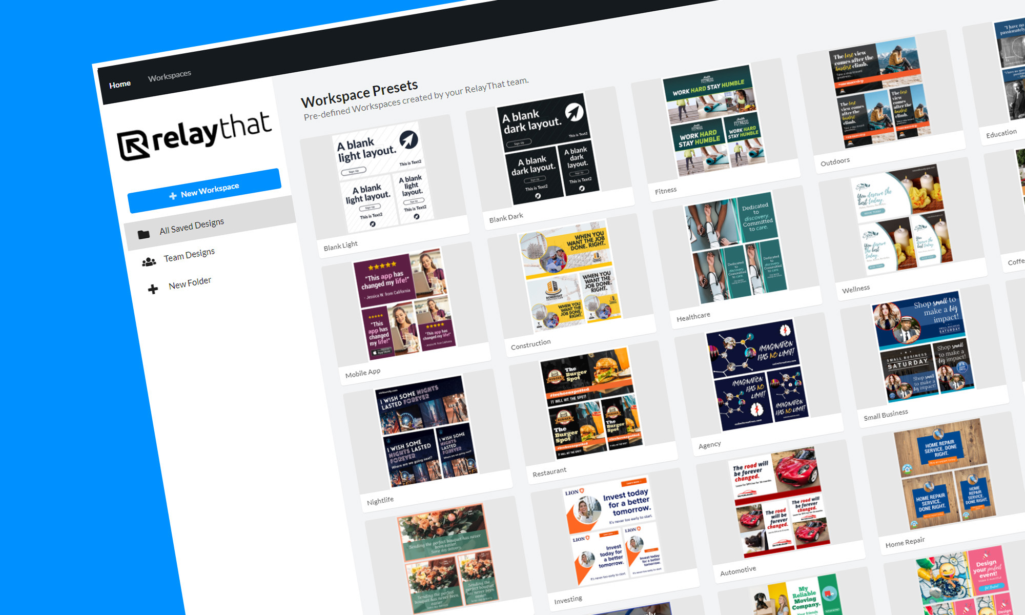
For brands to stand out and capture the attention of audiences across multiple online and offline channels, they must unify their brand assets to achieve a consistent look that represents their message and values.
Traditionally, brand assets were created using heavy-weight graphics editors like Adobe Photoshop and Illustrator, which are far from easy to use and are too expensive for solo entrepreneurs and small businesses.
RelayThat is a next-generation design automation app that makes it possible to create incredible marketing images for websites, social media posts, print and online ads, and other channels with just a few clicks — no graphic design skills required. Let’s take a closer look at what it has to offer.
What Is RelayThat & Who Is It For?
RelayThat describes itself as a design automation platform that takes the guesswork out of design, allowing its users to create professional marketing designs in a fraction of the time.
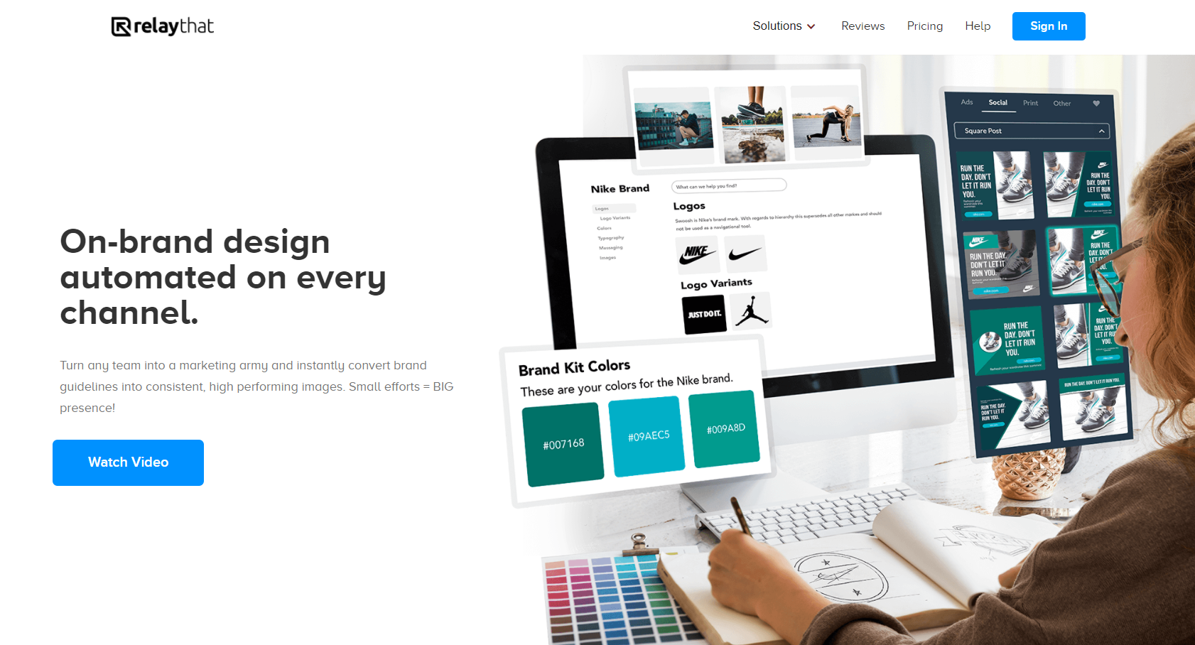
You can think of it as a modern alternative to traditional graphics editors. While it doesn’t offer nearly the same flexibility, options, and creative freedom as applications like Adobe Photoshop and Illustrator, it does make it possible to create attractive brand assets without wasting hours and days watching online tutorials and doing everything from scratch.
As such, it’s perfect for solo entrepreneurs, small businesses, startups, non-profit organizations, and everyone else who wants to see big results with minimal effort.
Features
Now that you know what RelayThat is, you’re probably interested to learn more about its features. We won’t cover everything this design automation platform has to offer because this RelayThat review would end up too long for its own good, so let’s focus on the main features.
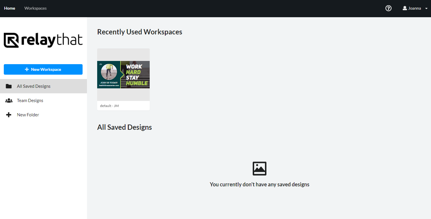
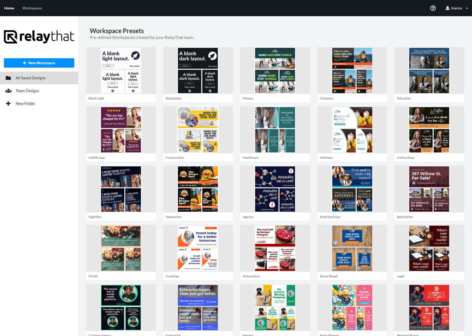
When you create a RelayThat account and sign in, you’re greeted with a dashboard showing you all recently used workspaces and saved designs. A workspace is essentially an instance of the RelayThat editor, where you can work on a specific set of brand assets. There are pre-defined workspaces for all kinds of projects, so getting started is very easy.
Since you can create multiple workspaces and switch between them with a single click, managing multiple brands and marketing campaigns is effortless. But workspace management is probably the least exciting aspect of RelayThat. The real fun begins when you enter a workspace and start generating jaw-dropping designs.
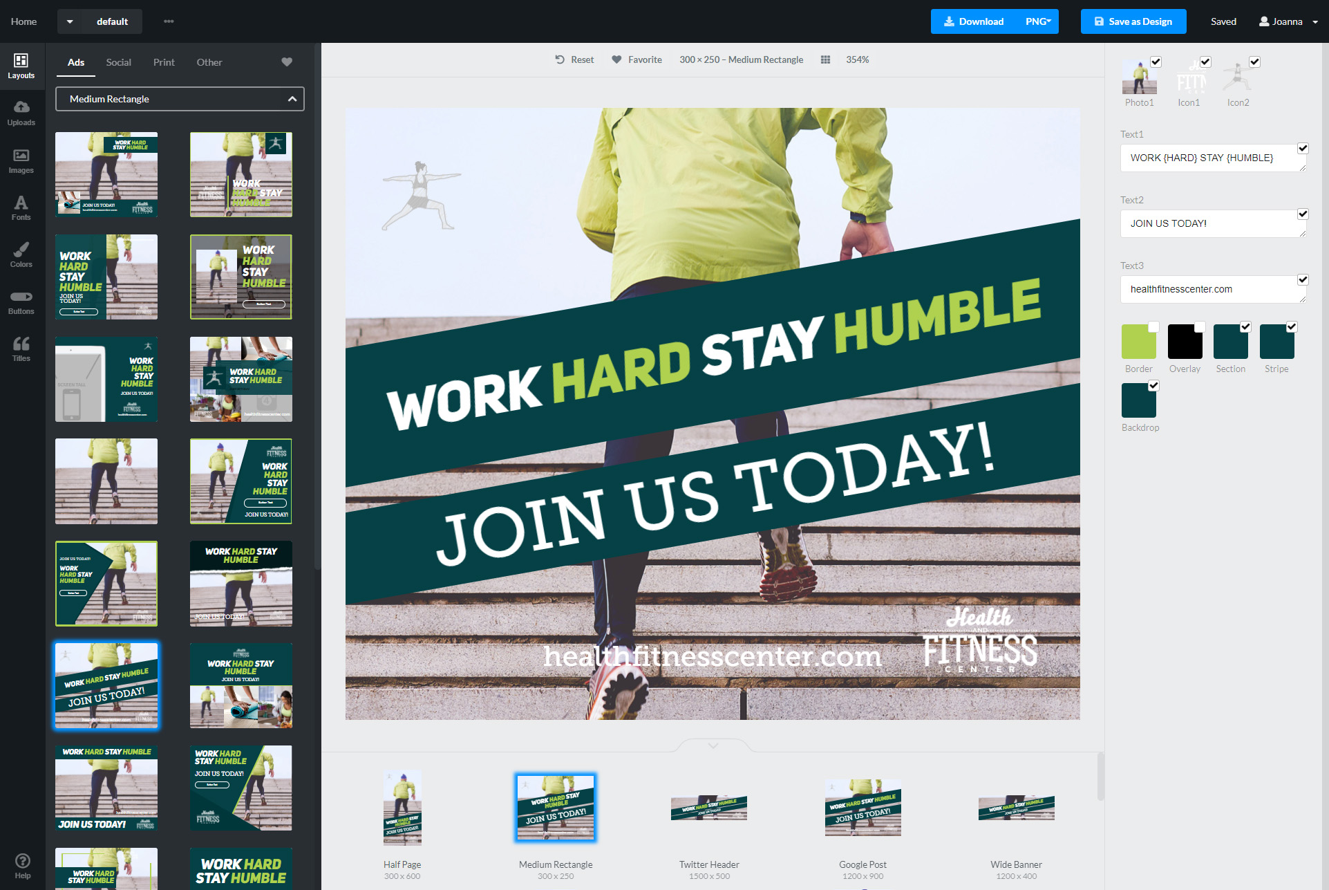
The image above shows an example workspace in all its beauty. In the middle, you can see your design in all of its glory. The right pane lets you change all images and text that was used to generate the design. Finally, the left pane is where you can switch between different layouts and access stock photographs, fonts, color pallets, and more.
According to RelayThat, users can choose from over 3 million royalty-free images with no usage fees or additional costs, and the selection of fonts and color pallets is just as impressive. All these design elements can be used to instantly generate everything from online ads to YouTube thumbnails to business cards. You simply need to select the layout that best fits your needs, customize it, and either save it or download it to your computer as a JPG or PNG file.
RelayThat also makes it possible to create interactive designs with buttons thanks to its “Smart Layouts” feature. Again, all you need to do is pick a layout with buttons, customize it, and use it for your project. To make customization even easier and quicker than it already is, you can click the “Magic Import” button and let RelayThat automatically collect assets, including colors, photos, icons, and text, from any website.
All these and many other features make RelayThat an excellent graphic design tool that makes it possible for anyone to impress potential customers, users, or visitors with stunning brand assets.
Pricing
Great graphic design tools don’t come cheap, but RelayThat is certainly an exception. For just $25 per month, you can purchase the Pro plan, which lets up to 2 users create 20 workspaces, download an unlimited number of high-quality images, collaborate with other designers, change any responsive layout to perfectly fit any channel, upload custom fonts, add keywords to drive traffic with every image posted online, and much more.
RelayThat also offers an enterprise plan, which unlocks an unlimited number of workspaces and adds branded sign-in pages, data integration, white-label options, and large team collaboration capabilities. This plan doesn’t have a price tag attached to it because its cost depends on the size of the enterprise purchasing it.
RelayThat vs. Canva vs. Stencil
RelayThat isn’t the only solution that automates the creation of social media posts and marketing images. Canva and Stencil are both popular alternatives, each offering its own approach to brand asset creation.
Being a more mature product, Canva has more features than RelayThat, and it also enjoys a significantly larger userbase. With Canva, you get more freedom to customize pre-defined layouts since the tool lets you quickly add and modify all kinds of design elements, including images, text, and shapes. Canva also gives its users access to stock video footage and music, making it easy to create promotional videos.
Stencil aims to be a lighter version of Canva, designed from the ground up to be fast and easy to use. It provides full access to 4,900,000+ photos and 3,100,000+ icons and integrates with great social tools like Buffer.
The biggest advantage of both Canva and Stencil over RelayThat is that they offer free plans, which provide access to everything you need to start designing. Canva’s Pro plan costs $12.95 a month for up to 5 people, while Stencil Pro costs $9 a month per user. In other words, both Canva and Stencil are cheaper than RelayThat.
Read Now: Softonic Review: Is This Download Service Safe To Use?
Conclusion
Overall, RelayThat is a fantastic graphics editor for people who want to spend less time designing and more time enjoying the results of their work. It automates the design process to such an extent that generating a stunning design takes just a single click. If all this sounds interesting to you, we encourage you to try it yourself so that you can see first-hand what it has to offer.
Did you find our RelayThat review helpful in making a platform selection for your next marketing project? Let us know in the comments below!
Website Reviews
PicSo Review: A Popular AI-Based Text-To-Image App
Text-to-image apps are exploding in popularity lately, so when we saw this offering from PicSo achieve 1K+ upvotes and 270 comments on Producthunt, we had to check it out.
Artificial intelligence has developed rapidly over the last few years, with the technology cropping up in all kinds of applications. However, one medium that’s really gaining popularity right now is the text-to-art generator.
If you haven’t tried one of these apps for yourself yet, the premise is pretty simple. The user types a descriptive sentence into the AI generator, and the algorithm tries its best to generate an image that best fits the description.
So how are the results? Generally, they’re pretty amazing! Typing “squirrel soldier wearing battle armor” will yield some pretty artistic (and humorous) results. Once you’ve exhausted the weird and wonderful, these generators can produce some genuinely decent artwork.
One of the latest offerings in the world of text-to-art AI apps is PicSo, whose developers named “after Picasso to convey the idea that everyone can be a great artist”. Let’s take a look at the app to see if those claims stack up.
PicSo AI Art Generator
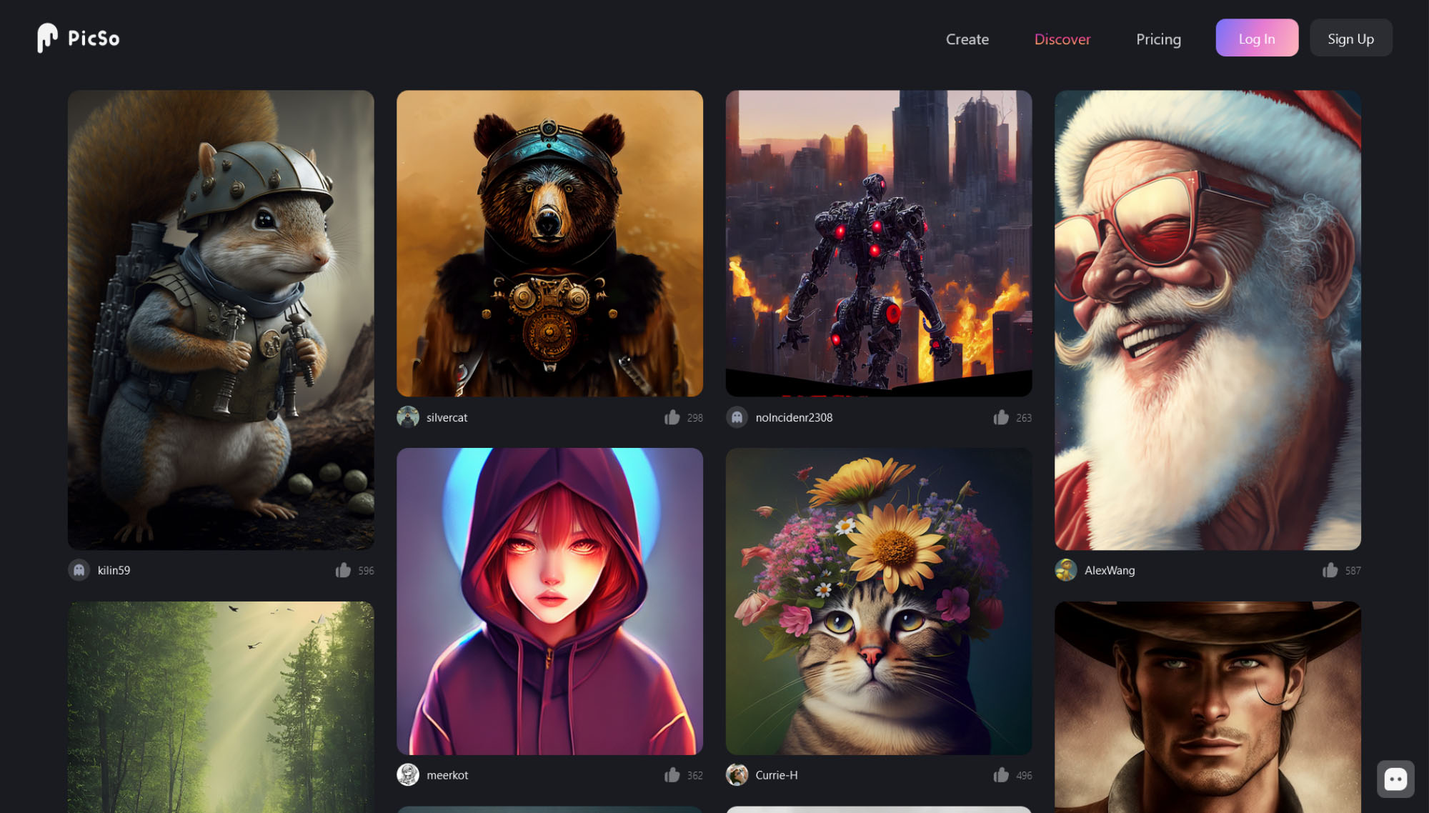
PicSo uses machine learning to search for themes based on the words you’ve entered and skillfully blends them into unique images. The concept might not be new, but the software does offer plenty of unique styles for your masterpieces, including settings for Van Gogh, Epic, Sketch, Octane Render, Cyberpunk, CG Render, Anime, Traditional Art, Digital, Ghibli, and many more.
How Easy Is PicSo To Use?
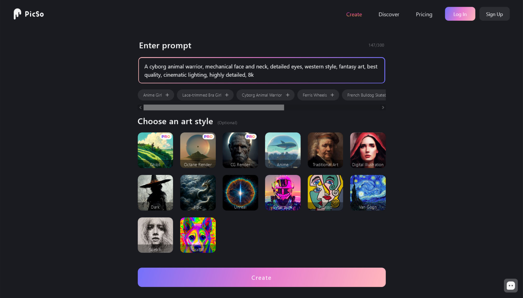
PicSo’s AI text-to-image converter is straightforward to use. Here are the basic steps involved:
Step 1: Click The Create Button
To start creating amazing artwork, click on the create button.
Step 2: Type In A Phrase
Enter a phrase to generate an image based on your input, select an art style and then click the create button.
Step 3: Press Save Or Publish
Once your art is generated, you can either save a copy or publish it online.
PicSo Pricing
PicSo is a free-to-use app, but there are some caveats. You can generate 3 free images per day on the app and 3 more on the website. You can unlock 2 further freebies by watching ads.
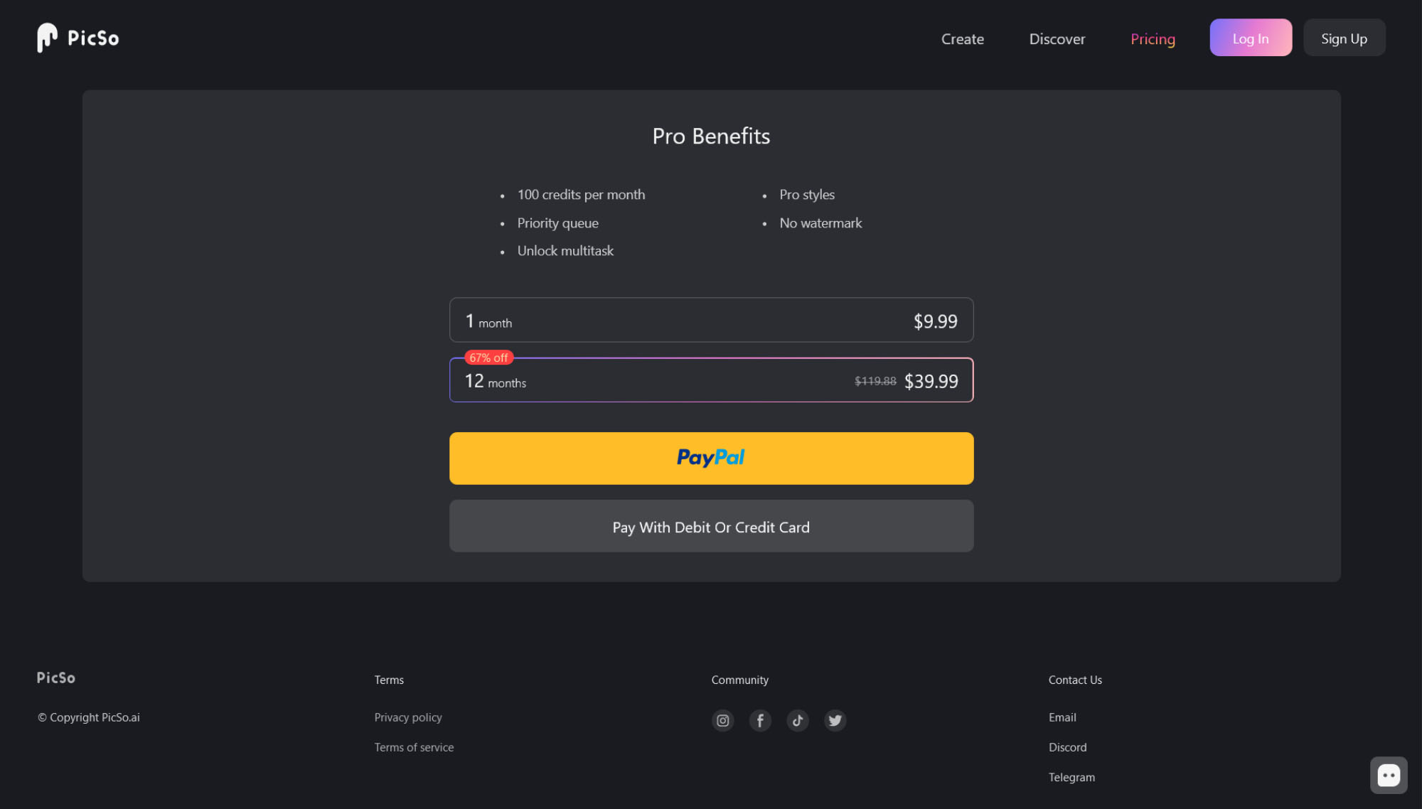
If you want to create more artwork than that, you’ll need to purchase a Pro subscription, which unlocks 100 credits per month, Pro styles, and multitasking. In addition, you’ll enjoy priority rendering for your images and the watermark will be removed.
Pro subscriptions cost $9.99 per month or $39.99 if you sign up for a whole year.
Summing Up
Overall, we really enjoyed using PicSo. The app is versatile, user-friendly, and constantly gets decent results. The artwork produced by PicSo is of excellent quality, and the site offers alternative formats for output and upscaling too. If we had to think of a downside, it would be that the free version is a little restrictive — however, the subscription pricing is very competitive if you purchase a whole year at once.
If you want to take PicSo for a test drive, head over to the official website.


