
News
Saudi Arabia To Send First Female Astronaut Into Space By 2023
Saudi Arabia will begin a training program that will include female astronauts as part of a wider space strategy.


As part of a broader plan to promote science and technology, Saudi Arabia’s space commission is partnering with Houston-based company Axiom Space, which includes a program to send the first female Saudi astronaut out of the earth’s atmosphere by 2023.
The news of this gender-breaking program comes after 2018’s landmark decision to lift the ban on women driving in the Kingdom, forming part of the ambitious Vision 2030 plan.
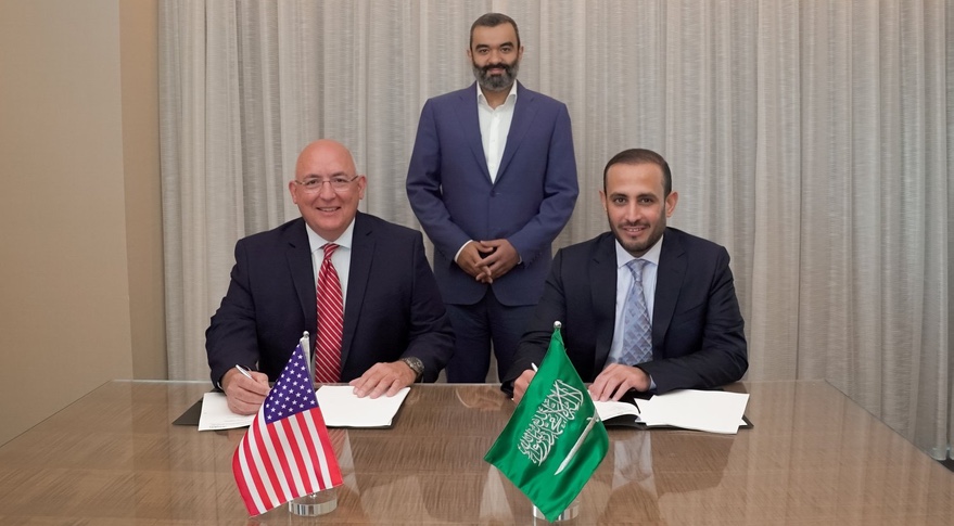
“The Saudi Astronaut Program, an integral part of the Kingdom’s ambitious Vision 2030, will send Saudi astronauts into space to help better serve humanity. One of the astronauts will be a Saudi woman, whose mission to space will represent a historical first for the Kingdom,” says the Saudi Space Commission.
The program follows the same direction taken by the UAE in recent years, from the launch of the Mars Hope Probe in 2021 and the Mars Science City plan, as well as the ambitious goal of sending a lunar rover to the moon in November this year.
Also Read: Saudi Arabia Reveals Plans To Build The City Of The Future
“Space belongs to all of humanity, which is one of the reasons Axiom Space is pleased to welcome our new partnership with the Saudi Space Commission to train and fly Saudi astronauts, including the first female Saudi astronaut,” says Michael Suffredini, President and CEO of Axiom Space.
Saudi Arabia will reveal the full extent of its interplanetary program in the coming months in the National Space Strategy. The Kingdom is no stranger to space exploration, as Saudi prince Sultan Ibn Salman Al Saud was the first Muslim and Arab to leave the earth’s atmosphere way back in 1985 with NASA’s Discovery mission.




News
Microsoft Plans $10 Billion-Plus Gulf Expansion Despite Iran Conflict
Security is shaping Microsoft’s approach, from resilience work with governments to what it will say about how the money splits by country.
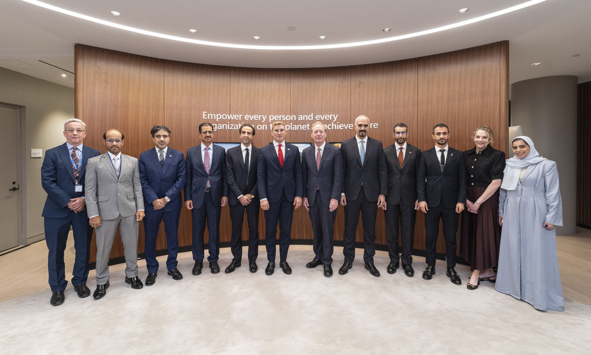
Microsoft is planning more than $10 billion of investment across the UAE, Saudi Arabia, Qatar and Kuwait through 2030, Vice Chair and President Brad Smith told Reuters, calling the spending schedule aggressive. The Iranian conflict that began on February 28 has not persuaded the company to scale back.
“We’re sustaining all the investments we planned to make before this conflict started, and we are in fact adding to them,” Smith said. The $10 billion-plus total does not, however, show how large those additions are.
The investment, which Smith described as part of Microsoft’s continued infrastructure expansion, is aimed at cloud and AI infrastructure and at the company’s growing regional operations. Microsoft also intends to put more than $400 million into subsea and terrestrial connectivity across the Middle East by 2030.
The spending fits the region’s own ambitions too. Gulf governments have been investing heavily in AI infrastructure as part of a push to diversify their economies beyond oil and gas and turn themselves into global technology hubs. Major cloud and AI providers have been drawn in part by the land and relatively low-cost energy on offer.
Microsoft is widening its partnerships with regional AI companies, though not on identical terms. In 2024, it invested $1.5 billion in Abu Dhabi-based G42 for a minority stake, and Smith currently sits on G42’s board. Saudi Arabia’s Humain and Qatar’s Qai are working with Microsoft on selected priority areas, but Smith said the company does not plan to make capital investments in either.
Also Read: Egypt’s Mobile Wallets Are Booming, But Cash Still Has Power
The conflict has added another strand to Microsoft’s work in the region. Since it began, Smith said, the company has supported regional partners with digital resilience assessments, and it is now working with Gulf countries through a digital resilience initiative focused on preparedness and the protection of critical data.
So far, the company has given no country-by-country breakdown of the investment, citing security among other factors. So while the headline figure is public, how Microsoft divides the spending among the four countries is not.

Microsoft Plans $10 Billion-Plus Gulf Expansion Despite Iran Conflict

In Kuwait, Your Surgeon Might Be Operating From Another Country

Qatar Folds 45 State Companies Into A Single Investment Platform

Trip.com Is Betting An AI Agent Will Book Your Next Vacation

Meta’s New $499 Plan Puts A Price On Reaching A Real Person
Trip.com Is Betting An AI Agent Will Book Your Next Vacation

Apple’s First Folding iPhone Arrives Late To A Shrinking Market

Egypt’s Mobile Wallets Are Booming, But Cash Still Has Power

OKX Bets Streaming Perks Can Take Crypto Mainstream Across MENA

Musk’s Boring Company Wants To Dig 150 KM Of Tunnel Under The UAE


-
 News3 weeks ago
Trip.com Is Betting An AI Agent Will Book Your Next Vacation
-
 News3 weeks ago
Apple’s First Folding iPhone Arrives Late To A Shrinking Market
-
 News3 weeks ago
Egypt’s Mobile Wallets Are Booming, But Cash Still Has Power
-
 News3 weeks ago
OKX Bets Streaming Perks Can Take Crypto Mainstream Across MENA