
News
Dubai Gives Go Ahead For $35 Billion Al Maktoum Airport Expansion
The project will include a new passenger terminal, helping the emirate achieve its goal of operating the world’s largest airport by 2050.

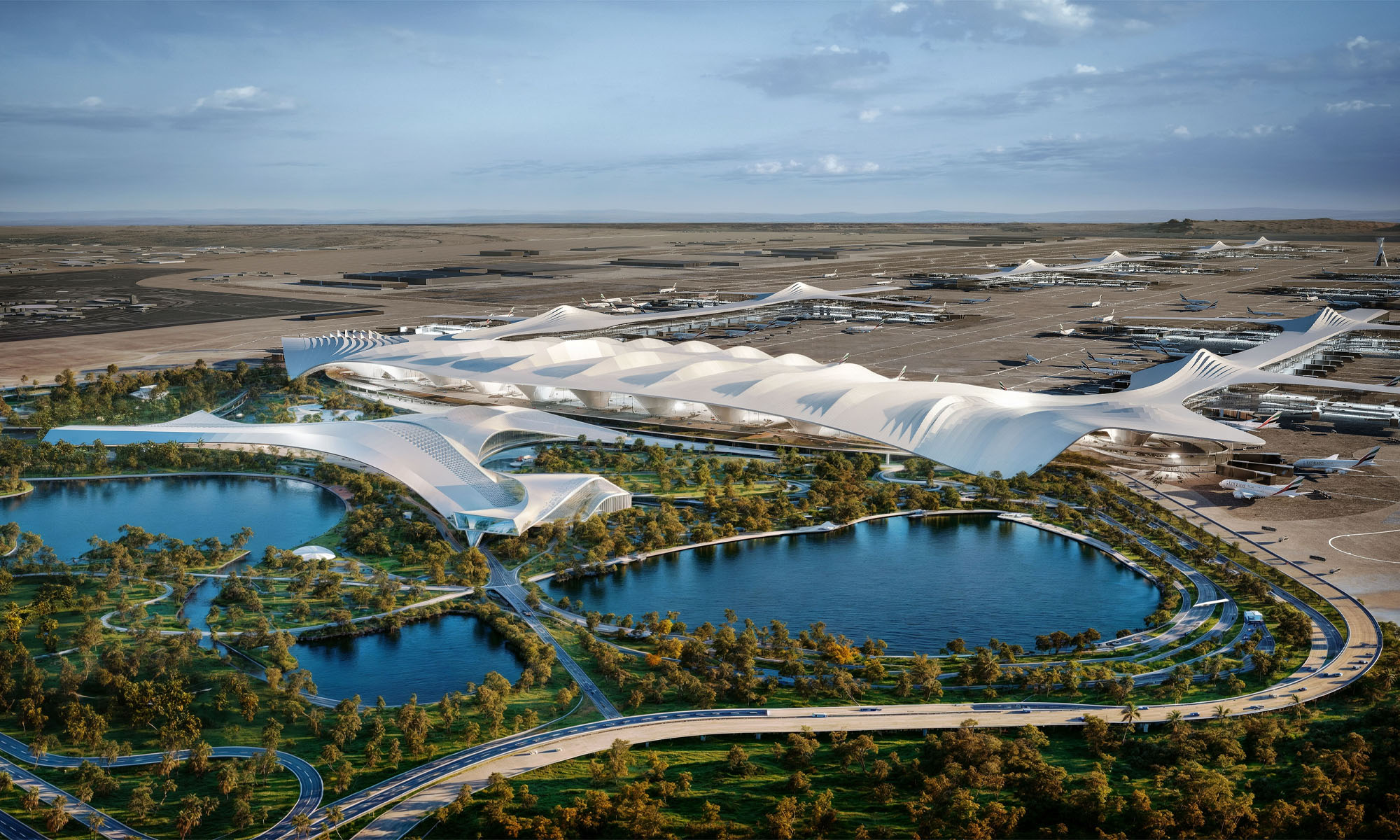
On Sunday, April 28th, Dubai’s HH Sheikh Mohammed bin Rashid Al Maktoum gave the go-ahead to a major expansion project for Al Maktoum Airport (DWC).
The development will add a new passenger terminal to DWC, marking a major step in the emirate’s goal to transform the global transport hub into the world’s largest airport by 2050.
The construction project is valued at a massive $34.8 billion (AED128 billion), and is necessary to accommodate the projected surge in air travel over the coming years.
The DWC expansion plans were reportedly shelved in 2019. However, the project regained traction under the airport operating company Dubai Airports, who manage both Dubai International Airport (DXB) and DWC.
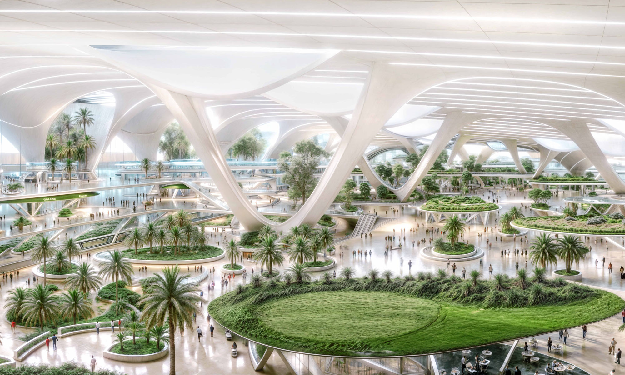
“HH Sheikh Mohammed bin Rashid Al Maktoum reviewed the strategic plan of the #Dubai Aviation Engineering Projects and approved designs for the new passenger terminal at Al Maktoum International Airport, which will be the largest in the world when fully operational,” announced the Dubai government on X, noting that the new terminal will increase annual capacity to over 260 million passengers.
Under the comprehensive development plans, Al Maktoum Airport will surpass the scale of Dubai International Airport by fivefold. Eventually, all of Dubai International’s operations will be moved to the new site.
Also Read: Abu Dhabi Developer To Build World’s First Healthy Living Island
Dubai Airport CEO Paul Griffiths has emphasized the need for a new facility as DXB airport approaches its maximum annual capacity of 120 million passengers, explaining that the new development will transform airport operations.
“We are not planning an airport that has terminals. We’re going to completely change the business model for airports, make them far more intimate, and get rid of all the legacy processes that we’ve had to subject our customers to for far too long,” Griffiths stated.






News
Microsoft Plans $10 Billion-Plus Gulf Expansion Despite Iran Conflict
Security is shaping Microsoft’s approach, from resilience work with governments to what it will say about how the money splits by country.
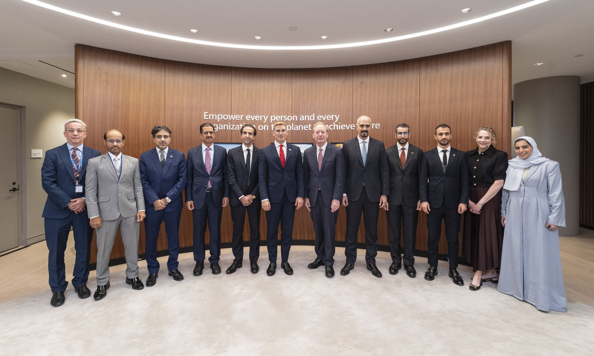
Microsoft is planning more than $10 billion of investment across the UAE, Saudi Arabia, Qatar and Kuwait through 2030, Vice Chair and President Brad Smith told Reuters, calling the spending schedule aggressive. The Iranian conflict that began on February 28 has not persuaded the company to scale back.
“We’re sustaining all the investments we planned to make before this conflict started, and we are in fact adding to them,” Smith said. The $10 billion-plus total does not, however, show how large those additions are.
The investment, which Smith described as part of Microsoft’s continued infrastructure expansion, is aimed at cloud and AI infrastructure and at the company’s growing regional operations. Microsoft also intends to put more than $400 million into subsea and terrestrial connectivity across the Middle East by 2030.
The spending fits the region’s own ambitions too. Gulf governments have been investing heavily in AI infrastructure as part of a push to diversify their economies beyond oil and gas and turn themselves into global technology hubs. Major cloud and AI providers have been drawn in part by the land and relatively low-cost energy on offer.
Microsoft is widening its partnerships with regional AI companies, though not on identical terms. In 2024, it invested $1.5 billion in Abu Dhabi-based G42 for a minority stake, and Smith currently sits on G42’s board. Saudi Arabia’s Humain and Qatar’s Qai are working with Microsoft on selected priority areas, but Smith said the company does not plan to make capital investments in either.
Also Read: Egypt’s Mobile Wallets Are Booming, But Cash Still Has Power
The conflict has added another strand to Microsoft’s work in the region. Since it began, Smith said, the company has supported regional partners with digital resilience assessments, and it is now working with Gulf countries through a digital resilience initiative focused on preparedness and the protection of critical data.
So far, the company has given no country-by-country breakdown of the investment, citing security among other factors. So while the headline figure is public, how Microsoft divides the spending among the four countries is not.

Microsoft Plans $10 Billion-Plus Gulf Expansion Despite Iran Conflict

In Kuwait, Your Surgeon Might Be Operating From Another Country

Qatar Folds 45 State Companies Into A Single Investment Platform

Trip.com Is Betting An AI Agent Will Book Your Next Vacation

Meta’s New $499 Plan Puts A Price On Reaching A Real Person

Apple’s First Folding iPhone Arrives Late To A Shrinking Market
Trip.com Is Betting An AI Agent Will Book Your Next Vacation

Egypt’s Mobile Wallets Are Booming, But Cash Still Has Power

OKX Bets Streaming Perks Can Take Crypto Mainstream Across MENA

Musk’s Boring Company Wants To Dig 150 KM Of Tunnel Under The UAE


-
 News3 weeks ago
Apple’s First Folding iPhone Arrives Late To A Shrinking Market
-
 News2 weeks ago
Trip.com Is Betting An AI Agent Will Book Your Next Vacation
-
 News2 weeks ago
Egypt’s Mobile Wallets Are Booming, But Cash Still Has Power
-
 News2 weeks ago
OKX Bets Streaming Perks Can Take Crypto Mainstream Across MENA