
News
WhatsApp Developing Offline File Sharing Similar To AirDrop
The new beta feature for iOS and Android will be called Nearby Share, and allows users to share files offline with nearby devices.

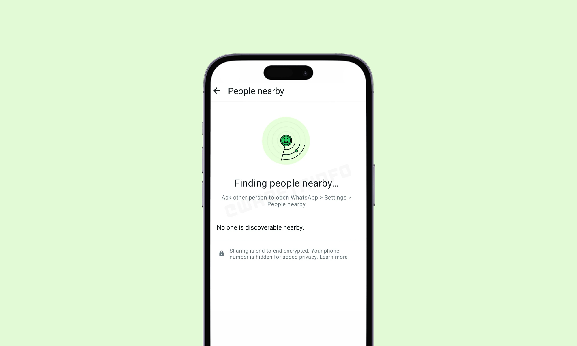
Popular messaging platform WhatsApp is working on a new feature that will significantly improve the way users share files. According to WABetaInfo, the upcoming file-sharing update will allow users to send documents, photos, videos, and other files to nearby devices without needing an internet connection. The feature will be available for both Android and iOS devices, though both versions are currently still in beta.
WABetaInfo’s report included an image showing a scanner interface that will facilitate the sharing of various file types. The new feature, named Nearby Share, will function similarly to Apple’s AirDrop, with the iOS version using a QR code for file sharing and Android devices also utilizing proximity detection technology.
The introduction of offline file sharing is a significant step forward for WhatsApp, and especially helpful for users in areas with patchy internet access. Nearby Share will be particularly useful for transferring large files, such as high-resolution images, videos, and important documents.
Also Read: Virtual Arab Influencer Takes Crown At Miss AI Beauty Pageant
Eventually, the new feature is expected to be compatible with most operating systems, regardless of device type. Additionally, the transfers will be end-to-end encrypted, ensuring that only the intended recipients can access the shared data, helping to maintain user privacy and security.
It’s important to note that Nearby Share is still in its early stages. As the development continues, the final product may see changes or improvements from the current beta version. It is also possible that the iOS version may eventually adopt functionality similar to the Android one, relying on proximity detection instead of QR code scanning.





News
Microsoft Plans $10 Billion-Plus Gulf Expansion Despite Iran Conflict
Security is shaping Microsoft’s approach, from resilience work with governments to what it will say about how the money splits by country.
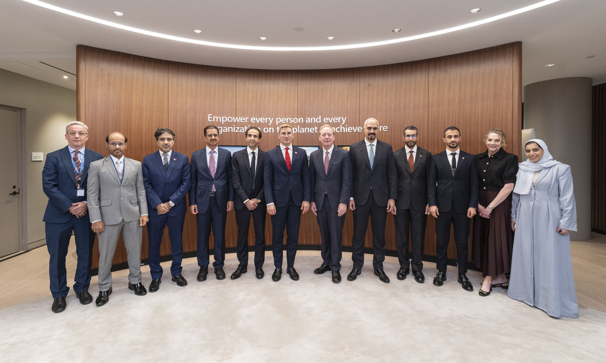
Microsoft is planning more than $10 billion of investment across the UAE, Saudi Arabia, Qatar and Kuwait through 2030, Vice Chair and President Brad Smith told Reuters, calling the spending schedule aggressive. The Iranian conflict that began on February 28 has not persuaded the company to scale back.
“We’re sustaining all the investments we planned to make before this conflict started, and we are in fact adding to them,” Smith said. The $10 billion-plus total does not, however, show how large those additions are.
The investment, which Smith described as part of Microsoft’s continued infrastructure expansion, is aimed at cloud and AI infrastructure and at the company’s growing regional operations. Microsoft also intends to put more than $400 million into subsea and terrestrial connectivity across the Middle East by 2030.
The spending fits the region’s own ambitions too. Gulf governments have been investing heavily in AI infrastructure as part of a push to diversify their economies beyond oil and gas and turn themselves into global technology hubs. Major cloud and AI providers have been drawn in part by the land and relatively low-cost energy on offer.
Microsoft is widening its partnerships with regional AI companies, though not on identical terms. In 2024, it invested $1.5 billion in Abu Dhabi-based G42 for a minority stake, and Smith currently sits on G42’s board. Saudi Arabia’s Humain and Qatar’s Qai are working with Microsoft on selected priority areas, but Smith said the company does not plan to make capital investments in either.
Also Read: Egypt’s Mobile Wallets Are Booming, But Cash Still Has Power
The conflict has added another strand to Microsoft’s work in the region. Since it began, Smith said, the company has supported regional partners with digital resilience assessments, and it is now working with Gulf countries through a digital resilience initiative focused on preparedness and the protection of critical data.
So far, the company has given no country-by-country breakdown of the investment, citing security among other factors. So while the headline figure is public, how Microsoft divides the spending among the four countries is not.

Microsoft Plans $10 Billion-Plus Gulf Expansion Despite Iran Conflict

In Kuwait, Your Surgeon Might Be Operating From Another Country

Qatar Folds 45 State Companies Into A Single Investment Platform

Trip.com Is Betting An AI Agent Will Book Your Next Vacation

Meta’s New $499 Plan Puts A Price On Reaching A Real Person

Apple’s First Folding iPhone Arrives Late To A Shrinking Market
Trip.com Is Betting An AI Agent Will Book Your Next Vacation

Egypt’s Mobile Wallets Are Booming, But Cash Still Has Power

OKX Bets Streaming Perks Can Take Crypto Mainstream Across MENA

Apple’s Latest Product Releases Make The Headlines


-
 News3 weeks ago
Apple’s First Folding iPhone Arrives Late To A Shrinking Market
-
 News2 weeks ago
Trip.com Is Betting An AI Agent Will Book Your Next Vacation
-
 News2 weeks ago
Egypt’s Mobile Wallets Are Booming, But Cash Still Has Power
-
 News2 weeks ago
OKX Bets Streaming Perks Can Take Crypto Mainstream Across MENA