
News
NanoKnife Destroys Prostate Cancer In Under An Hour
Surgeons praise the game-changing therapy as a breakthrough in tumor removal procedures.


A groundbreaking “NanoKnife” operation has been developed to help fight prostate cancer. Developed by AngioDynamics, the procedure uses electrical pulses guided by MRI scanning to eradicate hard-to-reach tumors, delicately opening cell membranes and reducing the risk of damage to surrounding tissues.
Traditional treatments for prostate cancer involve radiotherapy or removal surgery, often resulting in complications. The NanoKnife therapy offers greater efficiency and could soon be used as an alternative treatment option by the UK’s NHS.
The NanoKnife trials saw six successful operations performed by surgeons from University College London Hospital (UCLH), who praised the treatment’s simplicity and speed. It is now thought that in the future, overnight hospital stays could be eliminated, reducing strain on healthcare systems.
UCLH consultant urologist Mark Emberton said: “We are delighted to have been the first hospital in the NHS to use irreversible electroporation for patients with prostate cancer. And at times like this, when the NHS is under great pressure, day surgery avoids the need for overnight stays in hospital and means that we can use our operating theaters more efficiently”.
Meanwhile, Neil Gershon, one of the recipients of NanoKnife therapy, added, “It was completed in a day, which was fantastic. After the effects of the general anesthesia subsided, I felt perfectly fine, with no discomfort. It couldn’t have gone any smoother”.
Also Read: Google Is Developing An AI Cancer-Spotting Microscope
According to experts, early studies indicate that NanoKnife and similar focal therapies could revolutionize prostate cancer treatment by attacking tumors with unparalleled accuracy. However, the road to widespread adoption depends on the success of more extensive clinical trials.
For the 50,000+ men diagnosed with prostate cancer each year, this new procedure offers a beacon of hope, with swift, effective, and minimally invasive operations redefining the standard of cancer treatment and care.




News
Instagram Redraws Its Wordmark And The Internet Reads “Instagzam”
Instagram’s first wordmark refresh in a decade arrives with new fonts, a restrained gradient — and a Reddit verdict of sidegrade.
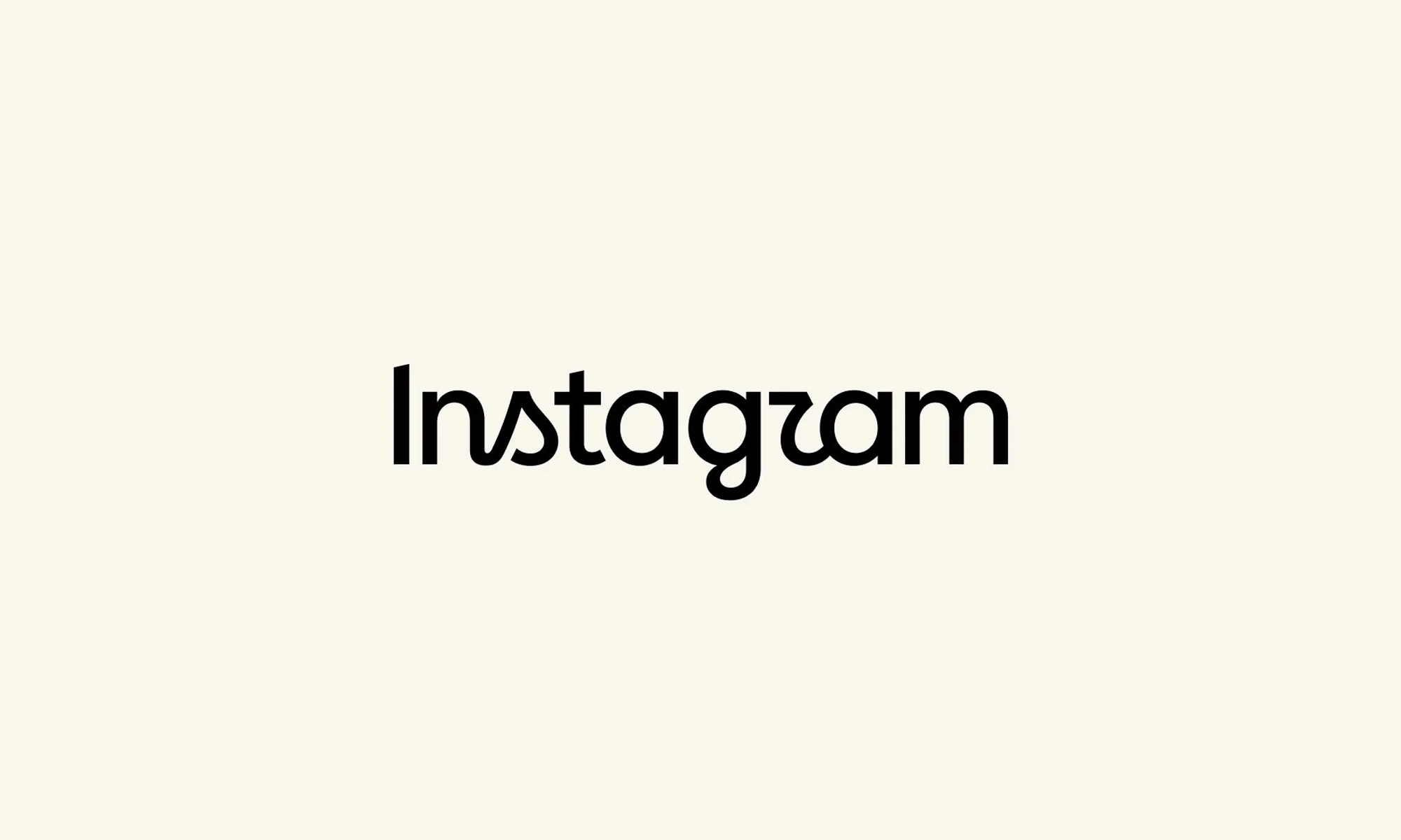
Although Instagram’s famous camera icon hasn’t changed, the company has refreshed the handwritten wordmark at the top of its app. This is the first redesign we’ve seen in ten years, and one the internet promptly set about renaming.
“The wordmark at the top of the app hasn’t changed in 10 years, so it was time for a refresh,” Instagram head Adam Mosseri wrote in a post on August 13, describing the new version as “cleaner and more modern” while keeping references to the original design.
Instagram says its team explored hundreds of options — all-caps lettering, camera-inspired concepts, even literal handwriting — before returning to script. “Script reflects individuality, so referencing that felt right,” Instagram director of product design Jasmine Probst said in Meta’s announcement. “The new wordmark is bolder and simpler, with touches of unexpectedness. It cues individual expression, a personal voice, both of which have always been core to Instagram”.
The wordmark is part of a broader brand overhaul: an updated Instagram Sans typeface, two new fonts — the hand-drawn Instagram Pen and Instagram Mono — plus refreshed motion and layouts, and more restrained use of the signature gradient. The wordmark is rolling out globally now, with the rest arriving throughout 2026 and beyond.
Also Read: Spotify Will Now Tell You If Your Favorite Artist Isn’t Real
The design mixes cursive and print lettering, some characters connected and others floating free. That hybrid approach, combined with unusually shaped “s” and “r” characters, led some users to conclude the logo actually reads “Instagzam”. On the r/logodesign subreddit, one user said the wordmark looked “fan-made,” like something built in Canva; another called it “an unsettling mix of manuscript and cursive”; a third summarized it as a “sidegrade” — or, inevitably, a “zidegrade”.
Not everyone was hostile to the new look. Some found the half-cursive design stylish and surprisingly readable, while others called it an improvement on its predecessor, and one commenter argued Instagram was simply adopting minimalist branding later than everyone else. Either way, the platform now has a refreshed identity, three updated fonts, and an unofficial new pronunciation.

Instagram Redraws Its Wordmark And The Internet Reads “Instagzam”

Spotify Will Now Tell You If Your Favorite Artist Isn’t Real

Samsung And Spotify Offer Free Premium Deal In MENA

Lebanon’s 5G Era Begins With 150 Stations And A $1M Budget

Syria Just Got Its First Super App Featuring Built-In Digital Payments

Dubai Police Finishes 65 Projects, Says AI Is The Next Priority

Beirut Wins US Flight Access, But Carriers Aren’t Sold Yet

Samsung’s Fold Goes Wide, And The Whole Galaxy Range Gets Pricier

Gulf AI Job Vacancies Nearly Triple, But Hiring Stays Lopsided

This UAE Platform Wants To Replace Fashion Photo Shoots With AI


-
 News3 weeks ago
This UAE Platform Wants To Replace Fashion Photo Shoots With AI
-
 News3 weeks ago
Nike And Hyperice’s New Slides Heat And Vibrate Your Feet
-
 Product Reviews3 weeks ago
Shokz OpenFit Pro Review: Open-Ear Audio Finally Grows Up
-
 News2 weeks ago
Syria Just Got Its First Super App Featuring Built-In Digital Payments