
News
Saudi Arabia’s Gaming Sector Is Quickly Gathering Momentum
Around 3,000 locals already attend Gamers8, an 8-week eSports festival in Riyadh, with a tournament prize pool of $45 million.

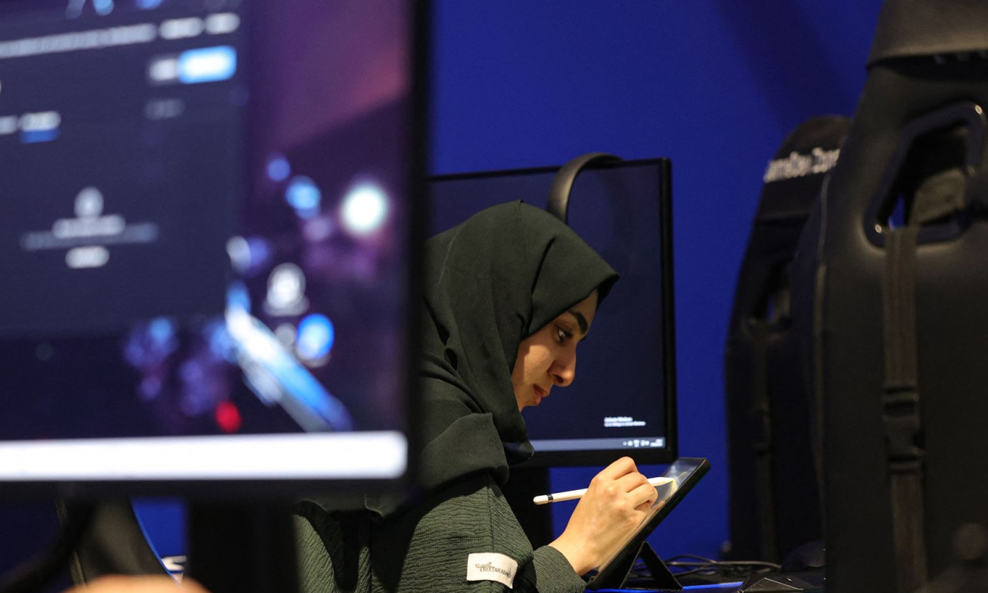
Saudi Arabian locals make no secret of their passion for video games and eSports, with even Crown Prince Mohammed bin Salman rumored to be an avid Call of Duty player.
Last year, the Saudi royal announced a $38-billion investment strategy for the Kingdom’s Savvy Games Group, which is owned by the country’s Public Investment Fund.
Meanwhile, as Gamers8 — an eight-week eSports festival in Riyadh with 3,000 attendees — gathers momentum, the government is increasingly emphasizing local game production, hoping to turn Saudi Arabia into “an Eden for game developers” with homegrown titles promoting Arabic culture.
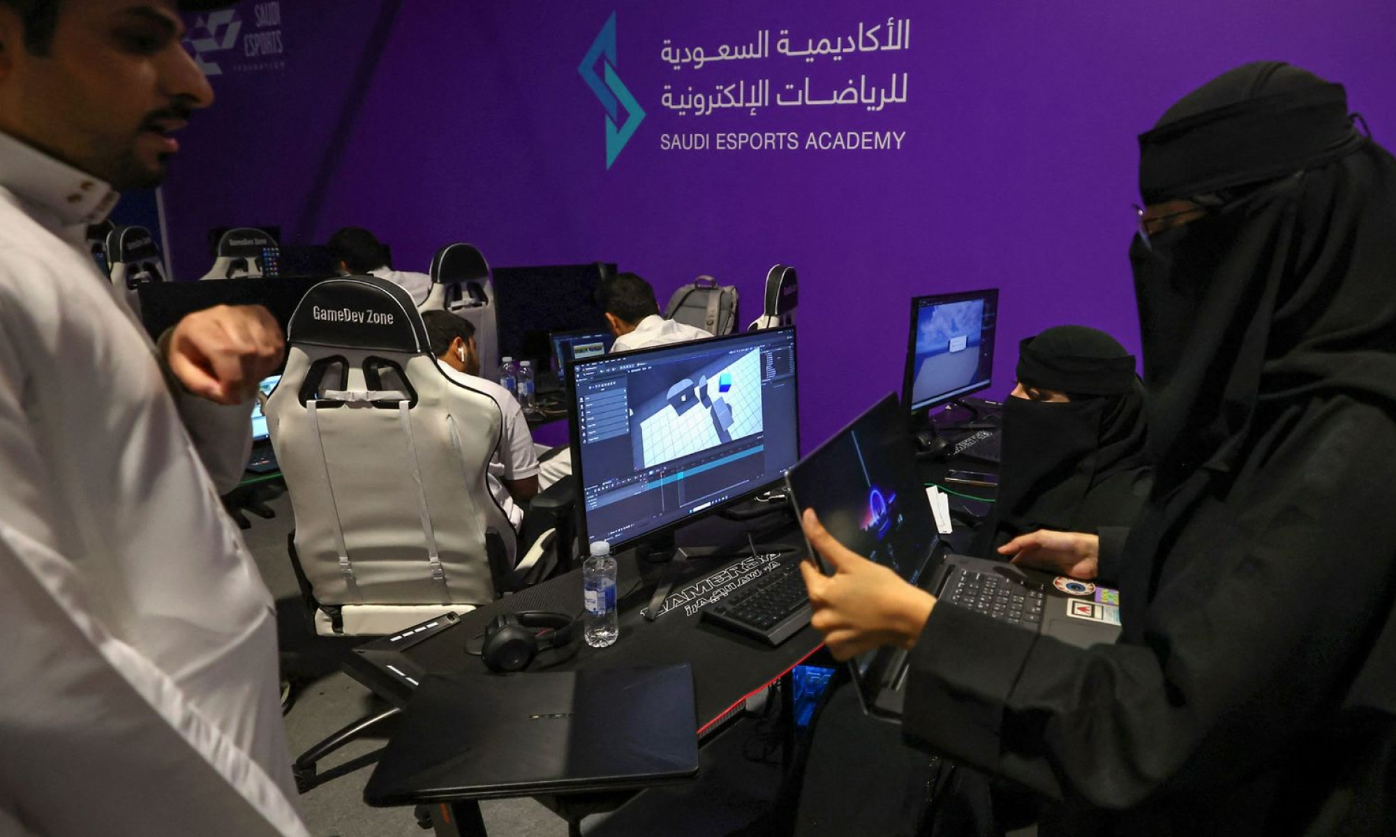
“In the past, Arabs were only buying games, not developing games. Now, there is an opportunity to develop games, design your own ideas, and make them a reality according to local customs and traditions,” explained developer Mohammed Al Fakih.
Two-thirds of the non-immigrant population of Saudi Arabia is aged under 30, making the country an important player in the world video game market. In addition, some 25,000 domestic and foreign developers are currently working to find the winning formula that will help a locally-produced title break out on the world stage.
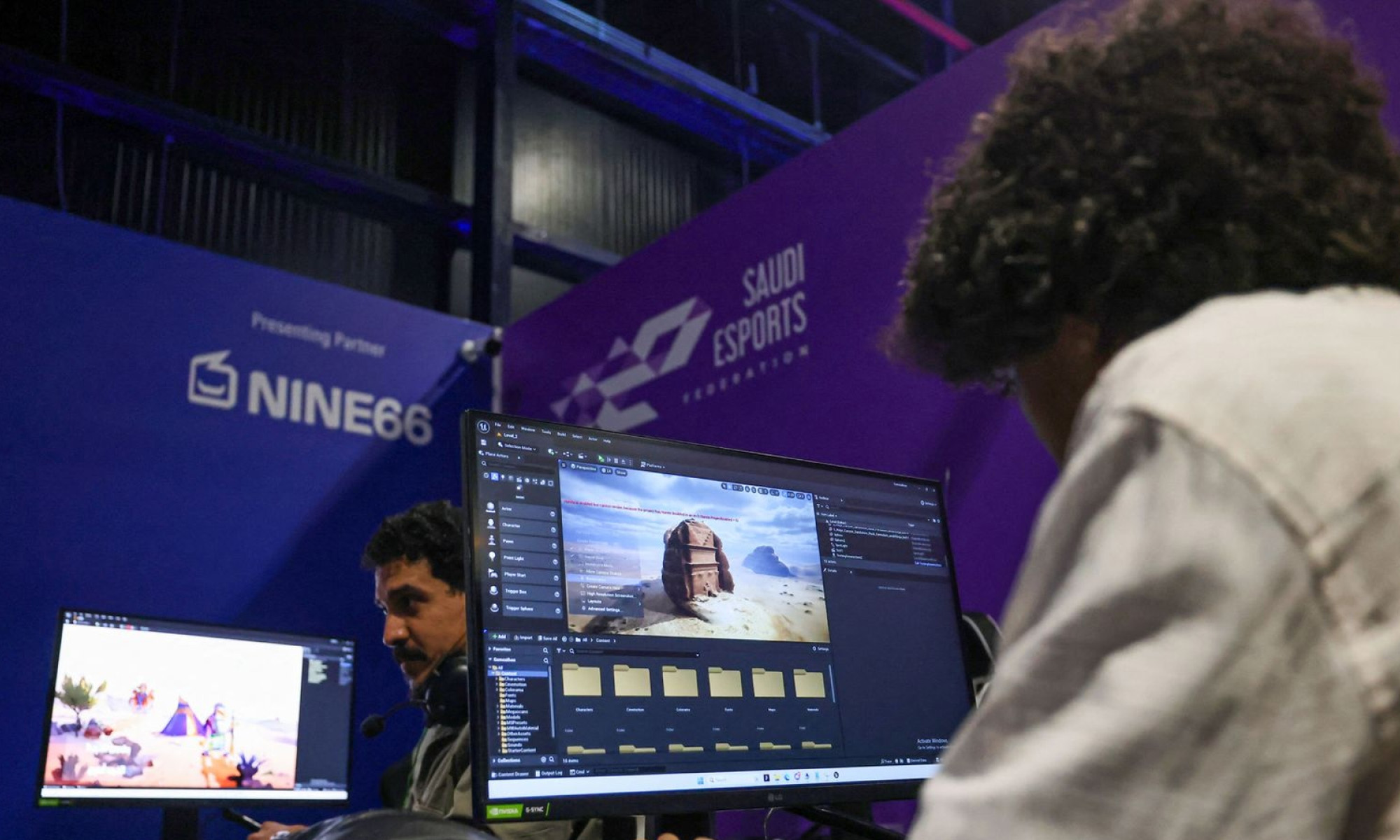
“With the expertise coming from outside and the knowledge being transferred, we will soon notice some games that can really take off internationally,” said Faisal bin Homran, chief eSports officer at the Saudi Esports Federation.
Also Read: Abu Dhabi-Developed AI Arabic Language Model Unveiled
Saudi Arabia’s national strategy has even more ambitious dreams: By 2030, officials hope that 30 globally competitive games will have been produced in domestic studios.






News
Microsoft Plans $10 Billion-Plus Gulf Expansion Despite Iran Conflict
Security is shaping Microsoft’s approach, from resilience work with governments to what it will say about how the money splits by country.
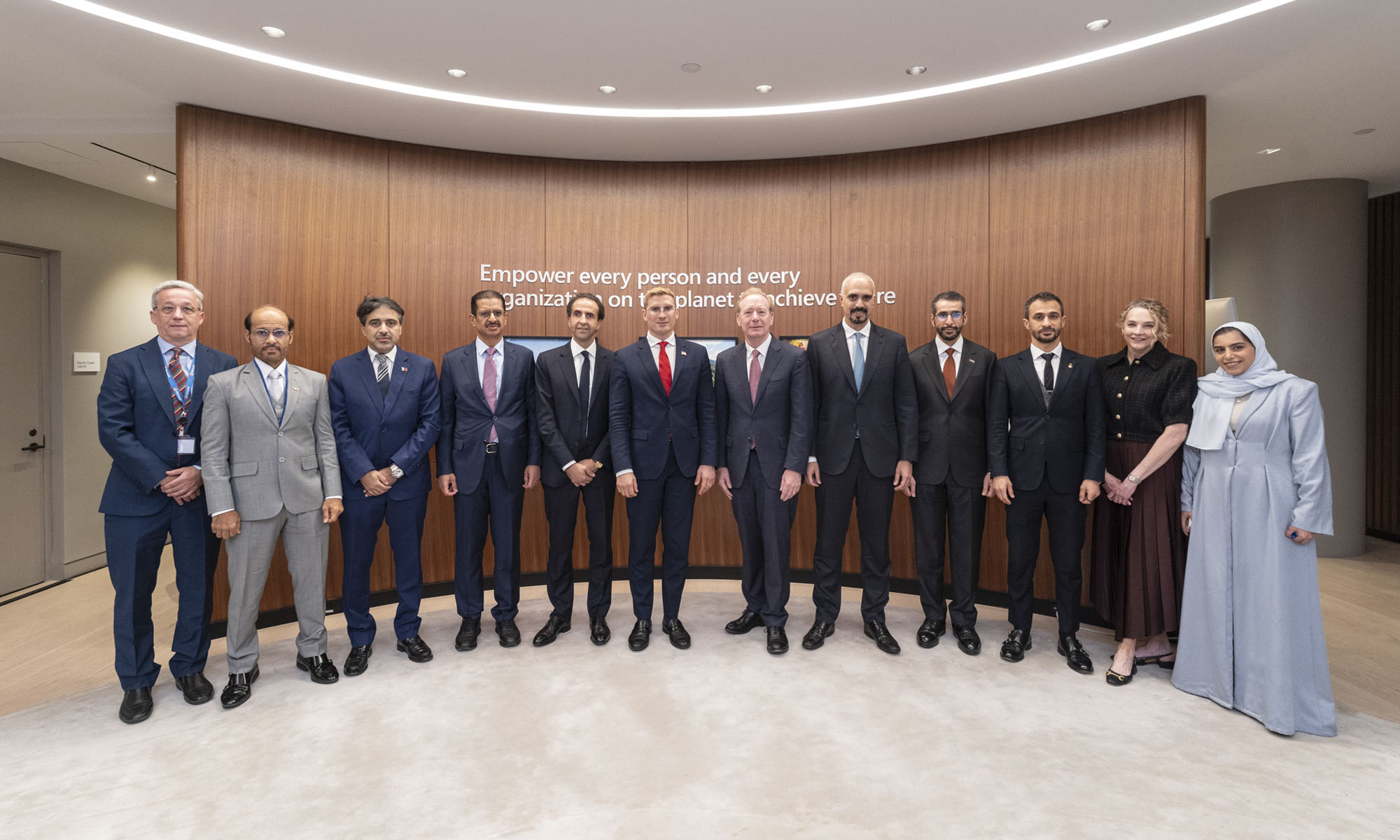
Microsoft is planning more than $10 billion of investment across the UAE, Saudi Arabia, Qatar and Kuwait through 2030, Vice Chair and President Brad Smith told Reuters, calling the spending schedule aggressive. The Iranian conflict that began on February 28 has not persuaded the company to scale back.
“We’re sustaining all the investments we planned to make before this conflict started, and we are in fact adding to them,” Smith said. The $10 billion-plus total does not, however, show how large those additions are.
The investment, which Smith described as part of Microsoft’s continued infrastructure expansion, is aimed at cloud and AI infrastructure and at the company’s growing regional operations. Microsoft also intends to put more than $400 million into subsea and terrestrial connectivity across the Middle East by 2030.
The spending fits the region’s own ambitions too. Gulf governments have been investing heavily in AI infrastructure as part of a push to diversify their economies beyond oil and gas and turn themselves into global technology hubs. Major cloud and AI providers have been drawn in part by the land and relatively low-cost energy on offer.
Microsoft is widening its partnerships with regional AI companies, though not on identical terms. In 2024, it invested $1.5 billion in Abu Dhabi-based G42 for a minority stake, and Smith currently sits on G42’s board. Saudi Arabia’s Humain and Qatar’s Qai are working with Microsoft on selected priority areas, but Smith said the company does not plan to make capital investments in either.
Also Read: Egypt’s Mobile Wallets Are Booming, But Cash Still Has Power
The conflict has added another strand to Microsoft’s work in the region. Since it began, Smith said, the company has supported regional partners with digital resilience assessments, and it is now working with Gulf countries through a digital resilience initiative focused on preparedness and the protection of critical data.
So far, the company has given no country-by-country breakdown of the investment, citing security among other factors. So while the headline figure is public, how Microsoft divides the spending among the four countries is not.

Microsoft Plans $10 Billion-Plus Gulf Expansion Despite Iran Conflict

In Kuwait, Your Surgeon Might Be Operating From Another Country

Qatar Folds 45 State Companies Into A Single Investment Platform

Trip.com Is Betting An AI Agent Will Book Your Next Vacation

Meta’s New $499 Plan Puts A Price On Reaching A Real Person

Apple’s First Folding iPhone Arrives Late To A Shrinking Market
Trip.com Is Betting An AI Agent Will Book Your Next Vacation

Egypt’s Mobile Wallets Are Booming, But Cash Still Has Power

OKX Bets Streaming Perks Can Take Crypto Mainstream Across MENA

Musk’s Boring Company Wants To Dig 150 KM Of Tunnel Under The UAE


-
 News3 weeks ago
Apple’s First Folding iPhone Arrives Late To A Shrinking Market
-
 News2 weeks ago
Trip.com Is Betting An AI Agent Will Book Your Next Vacation
-
 News2 weeks ago
Egypt’s Mobile Wallets Are Booming, But Cash Still Has Power
-
 News2 weeks ago
OKX Bets Streaming Perks Can Take Crypto Mainstream Across MENA