
News
Zoho Expands Qatar Operations & Releases New Survey Data
The productivity platform has seen strong regional growth and increased demand for its cloud-based solutions.

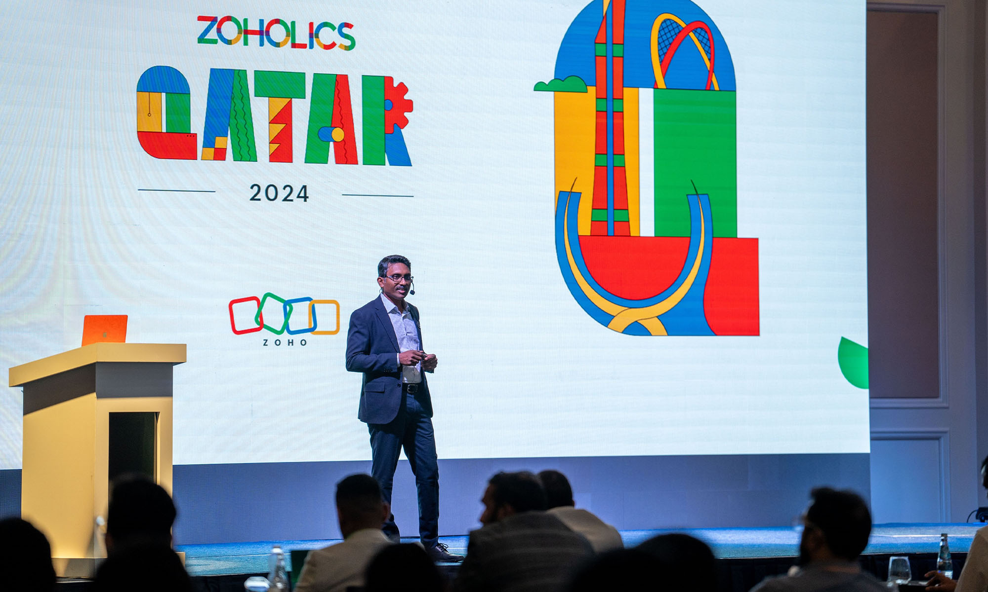
Productivity and collaboration platform Zoho has announced the opening of its first office in Doha, Qatar, following significant regional growth. The company experienced a 29% increase in revenue while expanding its partner network by 50% in 2023.
Zoho’s remarkable growth in Qatar underscores the rising demand for its cloud-based business applications. The firm’s new office and strategic expansion should enable it to offer more tailored services while strengthening customer relationships.
Hyther Nizam, President of Zoho for the Middle East and Africa (MEA) stated: “We are excited about our continued success in Qatar […] The dynamic business landscape and progressive approach to digital transformation provide an ideal environment for our expansion. We are committed to supporting the country’s journey towards digitalization by offering cutting-edge solutions that cater to the evolving needs of businesses and contribute to national economic growth”.
Productivity & Collaboration Trends In Qatar
The announcement of a new local office was accompanied by news of a Zoho productivity and collaboration survey that revealed important insights into the challenges and opportunities faced by businesses in Qatar, as well as local productivity and collaboration trends.
Also Read: Google’s New AI Technology May Revolutionize Cancer Treatment
Here are some of the key findings:
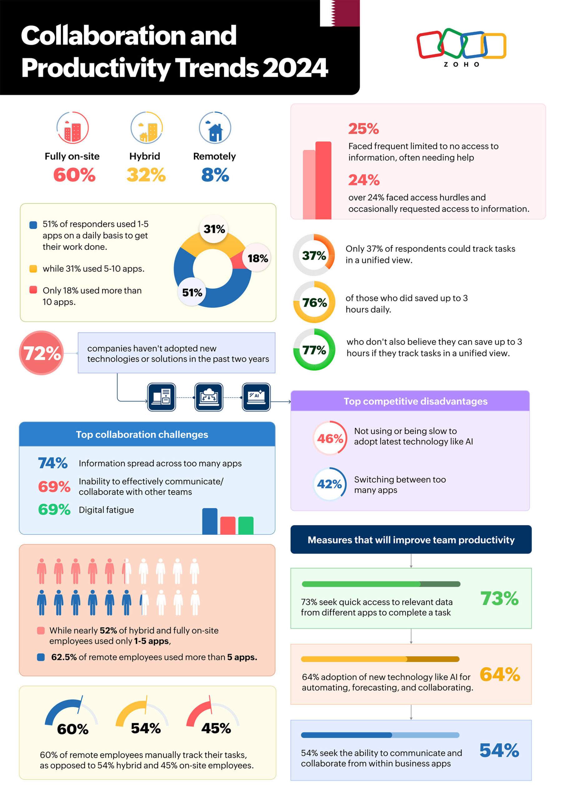
- Despite the shift towards hybrid and remote work post-pandemic, 60% of Qatari businesses have fully returned to on-site work, while 32% have adopted a hybrid model. Only 8% of respondents work fully remotely.
- The use of digital tools was widespread, with 51% of respondents using 1-5 apps daily, 31% using 5-10, and 18% using more than 10 apps.
- Unified task tracking was shown to save time, with 76% of those using it reporting savings of up to three hours. However, 77% of those manually tracking tasks or not tracking at all also noted potential time savings with a unified system.
- Access to information remains a challenge, with 25% of respondents reporting limited or no access, and 24% needing occasional help finding information.
- The survey highlighted a lag in technology adoption, with 72% of companies reporting no significant changes in the last two years, despite the competitive advantages of AI and automated workflows.
- Remote workers were more likely to adopt new technology and use a broader range of apps, but they struggled with data access. In contrast, hybrid and on-site workers expressed a greater need for improved collaboration tools and communication.



News
Instagram Redraws Its Wordmark And The Internet Reads “Instagzam”
Instagram’s first wordmark refresh in a decade arrives with new fonts, a restrained gradient — and a Reddit verdict of sidegrade.
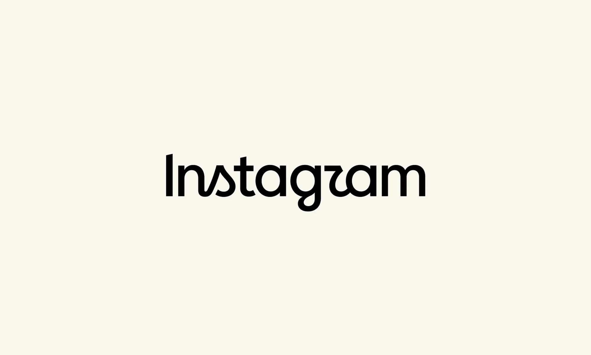
Although Instagram’s famous camera icon hasn’t changed, the company has refreshed the handwritten wordmark at the top of its app. This is the first redesign we’ve seen in ten years, and one the internet promptly set about renaming.
“The wordmark at the top of the app hasn’t changed in 10 years, so it was time for a refresh,” Instagram head Adam Mosseri wrote in a post on August 13, describing the new version as “cleaner and more modern” while keeping references to the original design.
Instagram says its team explored hundreds of options — all-caps lettering, camera-inspired concepts, even literal handwriting — before returning to script. “Script reflects individuality, so referencing that felt right,” Instagram director of product design Jasmine Probst said in Meta’s announcement. “The new wordmark is bolder and simpler, with touches of unexpectedness. It cues individual expression, a personal voice, both of which have always been core to Instagram”.
The wordmark is part of a broader brand overhaul: an updated Instagram Sans typeface, two new fonts — the hand-drawn Instagram Pen and Instagram Mono — plus refreshed motion and layouts, and more restrained use of the signature gradient. The wordmark is rolling out globally now, with the rest arriving throughout 2026 and beyond.
Also Read: Spotify Will Now Tell You If Your Favorite Artist Isn’t Real
The design mixes cursive and print lettering, some characters connected and others floating free. That hybrid approach, combined with unusually shaped “s” and “r” characters, led some users to conclude the logo actually reads “Instagzam”. On the r/logodesign subreddit, one user said the wordmark looked “fan-made,” like something built in Canva; another called it “an unsettling mix of manuscript and cursive”; a third summarized it as a “sidegrade” — or, inevitably, a “zidegrade”.
Not everyone was hostile to the new look. Some found the half-cursive design stylish and surprisingly readable, while others called it an improvement on its predecessor, and one commenter argued Instagram was simply adopting minimalist branding later than everyone else. Either way, the platform now has a refreshed identity, three updated fonts, and an unofficial new pronunciation.

Instagram Redraws Its Wordmark And The Internet Reads “Instagzam”

Spotify Will Now Tell You If Your Favorite Artist Isn’t Real

Samsung And Spotify Offer Free Premium Deal In MENA

Lebanon’s 5G Era Begins With 150 Stations And A $1M Budget

Syria Just Got Its First Super App Featuring Built-In Digital Payments

Dubai Police Finishes 65 Projects, Says AI Is The Next Priority

Beirut Wins US Flight Access, But Carriers Aren’t Sold Yet

Samsung’s Fold Goes Wide, And The Whole Galaxy Range Gets Pricier

Gulf AI Job Vacancies Nearly Triple, But Hiring Stays Lopsided

This UAE Platform Wants To Replace Fashion Photo Shoots With AI


-
 News3 weeks ago
This UAE Platform Wants To Replace Fashion Photo Shoots With AI
-

 News3 weeks ago
Nike And Hyperice’s New Slides Heat And Vibrate Your Feet
-
 Product Reviews3 weeks ago
Shokz OpenFit Pro Review: Open-Ear Audio Finally Grows Up
-
 News2 weeks ago
Syria Just Got Its First Super App Featuring Built-In Digital Payments