
News
Binance Founder Changpeng Zhao Gets 4 Months In Prison
US prosecutors had initially recommended a three year jail term.


A federal judge in the United States has handed out a four month prison sentence to Binance founder Changpeng Zhao (known as “C.Z.”). Prosecutors had recommended a three year term after Zhao pleaded guilty to violating the Bank Secrecy Act back in November 2023.
The DOJ accused Zhao of turning a blind eye to criminal activity on the crypto exchange and ignoring its legal obligations “in the pursuit of profit”. U.S. Treasury Secretary Janet Yellen also noted that Zhao’s “willful failures allowed money to flow to terrorists, cybercriminals, and child abusers through its platform”.
The U.S. government accused Binance of refusing to comply with sanctions and failing to report transactions related to drugs and child sexual abuse. Prosecutors claimed that Zhao had told Binance employees it was “better to ask for forgiveness than permission” while saying that if Binance had obeyed the law, it wouldn’t be “as big as we are today”.
To avoid a longer jail term, Binance agreed to forfeit $2.5 billion and settle a $1.8 billion fine. Zhao also paid $50 million from his own fortune as part of the settlement.
Also Read: Top E-Commerce Websites In The Middle East In 2024
The Binance founder’s sentence is much shorter than the 25 years recently given to crypto entrepreneur Sam Bankman-Fried of FTX. Zhao played a prominent role in Bankman-Fried’s downfall after Tweeting in November 2022 that his company would liquidate all FTX holdings. The posts not only destroyed FTX but rocked the wider crypto community, likely attracting attention from the U.S. government.
With Zhao heading to prison, DOJ lawyer Kevin Mosley remarked: “This wasn’t a mistake — it wasn’t a regulatory oops […] breaking U.S. law was not incidental to his plan to make as much money as possible. Violating the law was integral to that endeavor”.




News
Microsoft Plans $10 Billion-Plus Gulf Expansion Despite Iran Conflict
Security is shaping Microsoft’s approach, from resilience work with governments to what it will say about how the money splits by country.
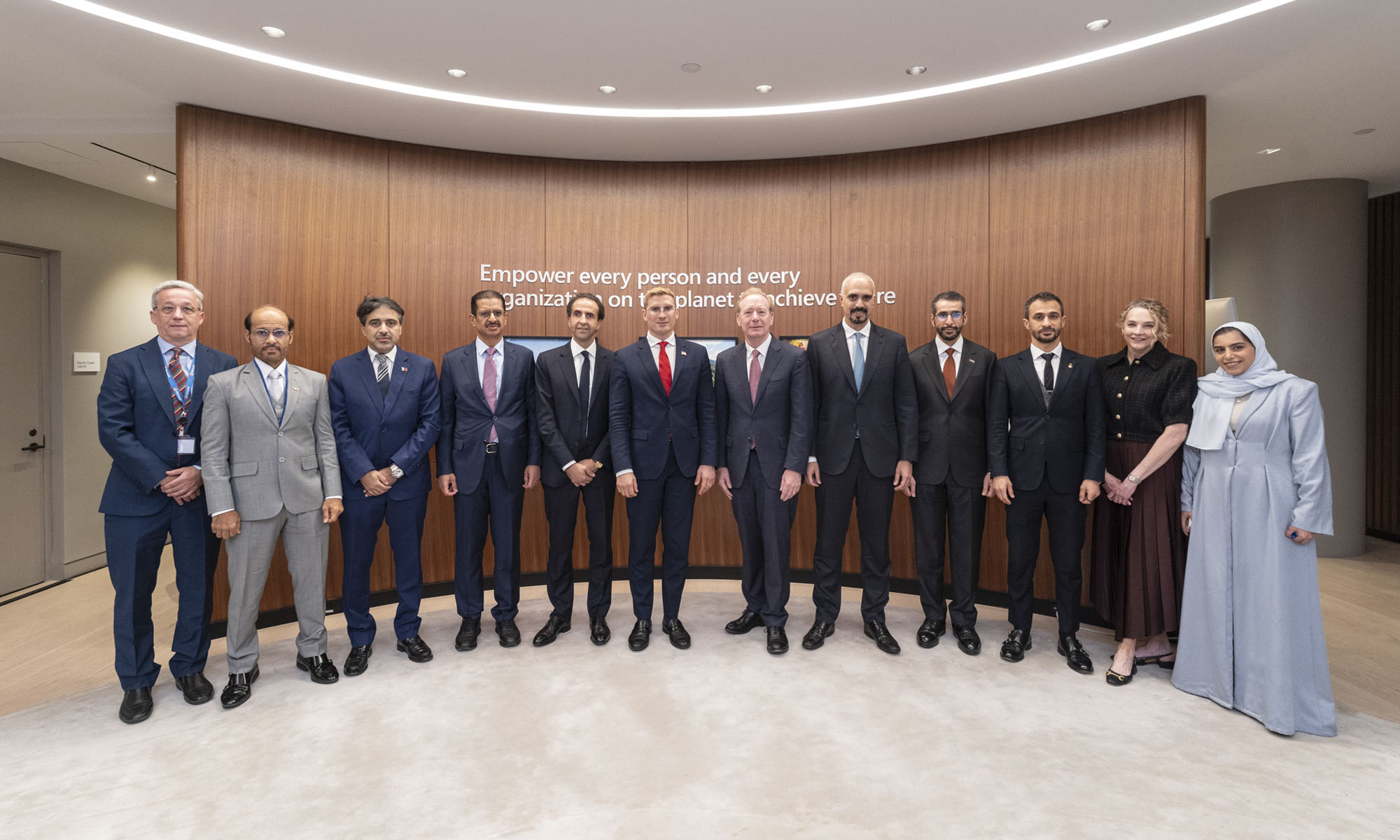
Microsoft is planning more than $10 billion of investment across the UAE, Saudi Arabia, Qatar and Kuwait through 2030, Vice Chair and President Brad Smith told Reuters, calling the spending schedule aggressive. The Iranian conflict that began on February 28 has not persuaded the company to scale back.
“We’re sustaining all the investments we planned to make before this conflict started, and we are in fact adding to them,” Smith said. The $10 billion-plus total does not, however, show how large those additions are.
The investment, which Smith described as part of Microsoft’s continued infrastructure expansion, is aimed at cloud and AI infrastructure and at the company’s growing regional operations. Microsoft also intends to put more than $400 million into subsea and terrestrial connectivity across the Middle East by 2030.
The spending fits the region’s own ambitions too. Gulf governments have been investing heavily in AI infrastructure as part of a push to diversify their economies beyond oil and gas and turn themselves into global technology hubs. Major cloud and AI providers have been drawn in part by the land and relatively low-cost energy on offer.
Microsoft is widening its partnerships with regional AI companies, though not on identical terms. In 2024, it invested $1.5 billion in Abu Dhabi-based G42 for a minority stake, and Smith currently sits on G42’s board. Saudi Arabia’s Humain and Qatar’s Qai are working with Microsoft on selected priority areas, but Smith said the company does not plan to make capital investments in either.
Also Read: Egypt’s Mobile Wallets Are Booming, But Cash Still Has Power
The conflict has added another strand to Microsoft’s work in the region. Since it began, Smith said, the company has supported regional partners with digital resilience assessments, and it is now working with Gulf countries through a digital resilience initiative focused on preparedness and the protection of critical data.
So far, the company has given no country-by-country breakdown of the investment, citing security among other factors. So while the headline figure is public, how Microsoft divides the spending among the four countries is not.

Microsoft Plans $10 Billion-Plus Gulf Expansion Despite Iran Conflict

In Kuwait, Your Surgeon Might Be Operating From Another Country

Qatar Folds 45 State Companies Into A Single Investment Platform

Trip.com Is Betting An AI Agent Will Book Your Next Vacation

Meta’s New $499 Plan Puts A Price On Reaching A Real Person

Apple’s First Folding iPhone Arrives Late To A Shrinking Market
Trip.com Is Betting An AI Agent Will Book Your Next Vacation

Egypt’s Mobile Wallets Are Booming, But Cash Still Has Power

OKX Bets Streaming Perks Can Take Crypto Mainstream Across MENA

Apple’s Latest Product Releases Make The Headlines


-
 News3 weeks ago
Apple’s First Folding iPhone Arrives Late To A Shrinking Market
-
 News2 weeks ago
Trip.com Is Betting An AI Agent Will Book Your Next Vacation
-
 News2 weeks ago
Egypt’s Mobile Wallets Are Booming, But Cash Still Has Power
-
 News2 weeks ago
OKX Bets Streaming Perks Can Take Crypto Mainstream Across MENA