
News
Carrefour City+ In Mall Of The Emirates Becomes Dubai’s First Contactless Store
Besides the shopping experience, the contactless checkout system also improves the store’s inventory management.

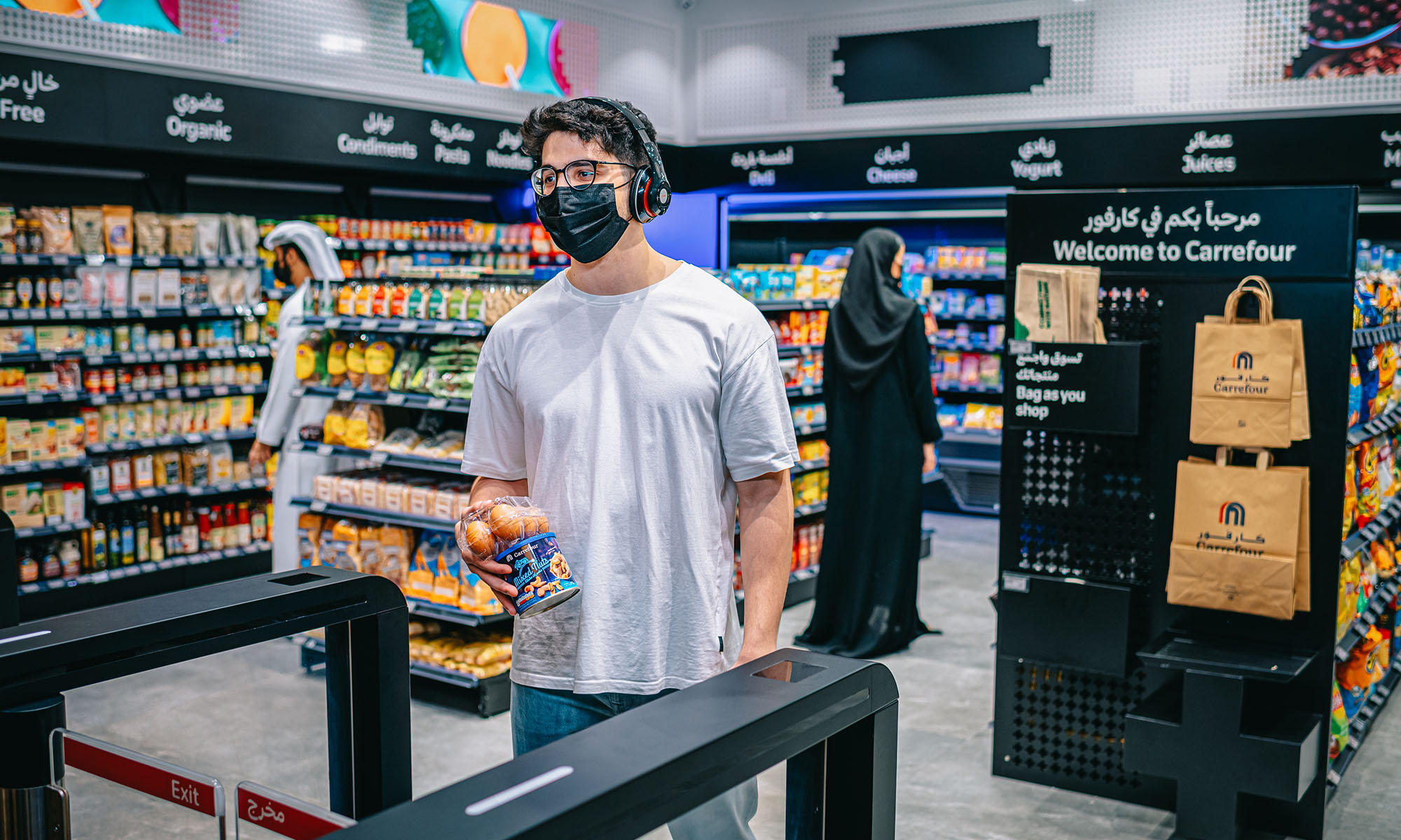
The impact of digital technology on the way we shop has been profound — just consider the fact that we can now order about anything we want online with a few simple clicks and have it shipped from the other side of the world in a few days (if you’re willing to pay for express shipping, of course). Now, shoppers at Carrefour City+ in Mall of the Emirates can simply grab anything they want and leave without going through the traditional checkout process, which, as you probably are personally familiar, can be a painfully slow experience.
“Carrefour City+ has been designed to make life easier by using technology to remove friction and enhance the retail experience,” revealed Hani Weiss, Chief Executive Officer at Majid Al Futtaim Retail. “The store represents a huge leap forwards for retail in the UAE and region as Carrefour continues to innovate to meet the needs of the present whilst anticipating future shopping trends”.
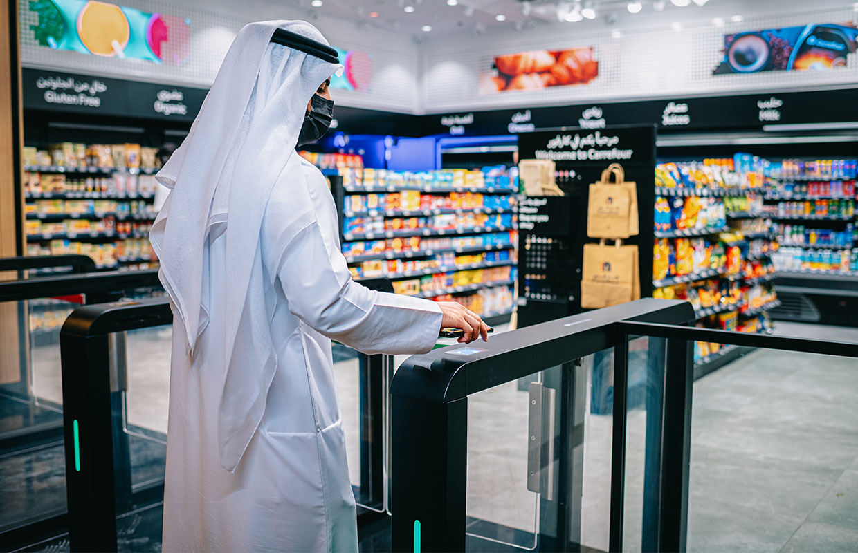
The retail and leisure operator Majid Al Futtaim (MAF) has enabled the first contactless checkout experience in Dubai using artificial intelligence and the current MAF Carrefour App. Here’s how it works in practice:
- A customer enters the store using the MAF Carrefour App.
- The customer can then simply pick any items from the shelves.
- Artificial intelligence identifies each picked item.
- All items are automatically added to a digital shopping basket.
- When the customer walks out of the store, payment is automatically made for the content of the digital shopping basket.
Also Read: Yela Secures Over $2M To Connect Arab Fans & Celebrities Via Video Messages
Carrefour City+ stocks over 1,300 items, including basic food items, ready-to-go meals, and personal hygiene products. Besides the shopping experience, the contactless checkout system also improves the store’s inventory management, ensuring pinpoint accuracy at all times. Does this sound like a shopping experience you’d be interested in?






News
Microsoft Plans $10 Billion-Plus Gulf Expansion Despite Iran Conflict
Security is shaping Microsoft’s approach, from resilience work with governments to what it will say about how the money splits by country.

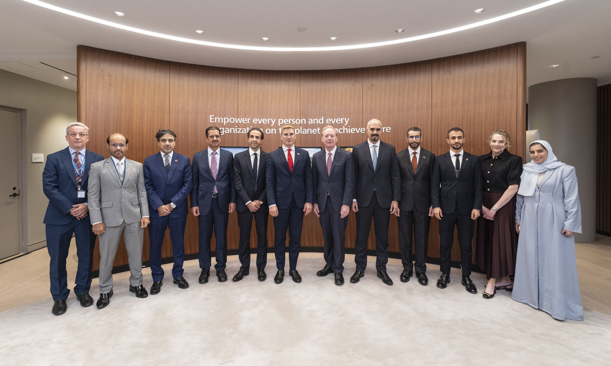
Microsoft is planning more than $10 billion of investment across the UAE, Saudi Arabia, Qatar and Kuwait through 2030, Vice Chair and President Brad Smith told Reuters, calling the spending schedule aggressive. The Iranian conflict that began on February 28 has not persuaded the company to scale back.
“We’re sustaining all the investments we planned to make before this conflict started, and we are in fact adding to them,” Smith said. The $10 billion-plus total does not, however, show how large those additions are.
The investment, which Smith described as part of Microsoft’s continued infrastructure expansion, is aimed at cloud and AI infrastructure and at the company’s growing regional operations. Microsoft also intends to put more than $400 million into subsea and terrestrial connectivity across the Middle East by 2030.
The spending fits the region’s own ambitions too. Gulf governments have been investing heavily in AI infrastructure as part of a push to diversify their economies beyond oil and gas and turn themselves into global technology hubs. Major cloud and AI providers have been drawn in part by the land and relatively low-cost energy on offer.
Microsoft is widening its partnerships with regional AI companies, though not on identical terms. In 2024, it invested $1.5 billion in Abu Dhabi-based G42 for a minority stake, and Smith currently sits on G42’s board. Saudi Arabia’s Humain and Qatar’s Qai are working with Microsoft on selected priority areas, but Smith said the company does not plan to make capital investments in either.
Also Read: Egypt’s Mobile Wallets Are Booming, But Cash Still Has Power
The conflict has added another strand to Microsoft’s work in the region. Since it began, Smith said, the company has supported regional partners with digital resilience assessments, and it is now working with Gulf countries through a digital resilience initiative focused on preparedness and the protection of critical data.
So far, the company has given no country-by-country breakdown of the investment, citing security among other factors. So while the headline figure is public, how Microsoft divides the spending among the four countries is not.

Microsoft Plans $10 Billion-Plus Gulf Expansion Despite Iran Conflict

In Kuwait, Your Surgeon Might Be Operating From Another Country

Qatar Folds 45 State Companies Into A Single Investment Platform

Trip.com Is Betting An AI Agent Will Book Your Next Vacation

Meta’s New $499 Plan Puts A Price On Reaching A Real Person

Apple’s First Folding iPhone Arrives Late To A Shrinking Market
Trip.com Is Betting An AI Agent Will Book Your Next Vacation

Egypt’s Mobile Wallets Are Booming, But Cash Still Has Power

OKX Bets Streaming Perks Can Take Crypto Mainstream Across MENA

Musk’s Boring Company Wants To Dig 150 KM Of Tunnel Under The UAE


-
 News3 weeks ago
Apple’s First Folding iPhone Arrives Late To A Shrinking Market
-
 News2 weeks ago
Trip.com Is Betting An AI Agent Will Book Your Next Vacation
-
 News2 weeks ago
Egypt’s Mobile Wallets Are Booming, But Cash Still Has Power
-
 News2 weeks ago
OKX Bets Streaming Perks Can Take Crypto Mainstream Across MENA