
News
Elon Musk Reveals Details Of Latest X Plan To Fight Bots
The changes come as many users feel the site is becoming swamped by hordes of fake accounts and trolls.

After a recent post by CEO Elon Musk it seems that changes are incoming at X, the social site formerly known as Twitter.
Musk says a new system to rid the platform of bots and trolls is “underway”, while asking users to reply to his post or ping his official account @XEng if their legitimate accounts are suspended in error.
System purge of bots & trolls underway.
Please reply to me or @XEng if legitimate accounts are suspended.
X Corp will be tracing the people responsible and bringing the full force of the law to bear upon them.
— Elon Musk (@elonmusk) April 4, 2024
“X Corp will be tracing the people responsible and bringing the full force of the law to bear upon them,” Elon Musk said, without providing further details.
The announcement comes after X’s appointment of a new head of brand safety and advertiser solutions in what it said was a bid to make the platform “a better, safer space for everyone”.
Automated accounts have long been a problem for the site and regularly reply to posts in a nonsensical or unrelated manner. Recent developments in AI make the bots harder to spot, though many users have a general feeling something is “off” with the platform, which often appears completely void of real human interaction.
Also Read: Getting Started With Google Gemini: A Beginner’s Guide
The latest round of bot-fighting measures will be a “significant, proactive initiative to eliminate accounts that violate [its] Rules against platform manipulation and spam,” X’s team announced yesterday, adding that they are “casting a wide net to ensure X remains secure and free of bots”.
Musk’s bot and troll crackdown coincides with the return of the controversial blue checkmark system on Wednesday evening. Users who had blue checks reinstated were told that they had been given a complimentary Premium subscription because they were considered “an influential member of the community.”
The outspoken SpaceX and Tesla CEO posted details last week that accounts with over 2,500 verified followers will have blue checks reinstated for free, while those with 5,000+ followers will get a complimentary $16-per-month Premium+ plan.




News
Microsoft Plans $10 Billion-Plus Gulf Expansion Despite Iran Conflict
Security is shaping Microsoft’s approach, from resilience work with governments to what it will say about how the money splits by country.
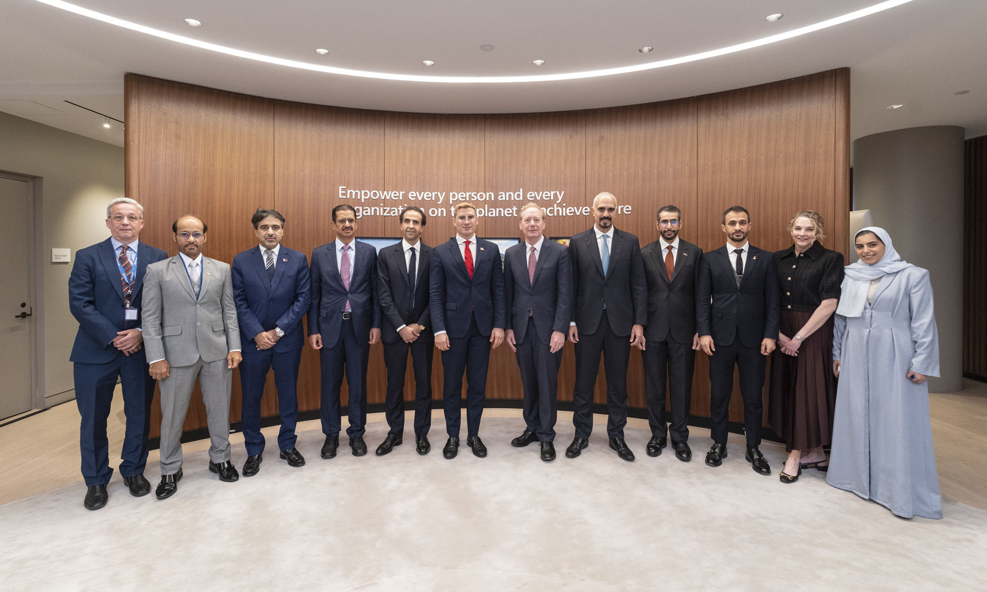
Microsoft is planning more than $10 billion of investment across the UAE, Saudi Arabia, Qatar and Kuwait through 2030, Vice Chair and President Brad Smith told Reuters, calling the spending schedule aggressive. The Iranian conflict that began on February 28 has not persuaded the company to scale back.
“We’re sustaining all the investments we planned to make before this conflict started, and we are in fact adding to them,” Smith said. The $10 billion-plus total does not, however, show how large those additions are.
The investment, which Smith described as part of Microsoft’s continued infrastructure expansion, is aimed at cloud and AI infrastructure and at the company’s growing regional operations. Microsoft also intends to put more than $400 million into subsea and terrestrial connectivity across the Middle East by 2030.
The spending fits the region’s own ambitions too. Gulf governments have been investing heavily in AI infrastructure as part of a push to diversify their economies beyond oil and gas and turn themselves into global technology hubs. Major cloud and AI providers have been drawn in part by the land and relatively low-cost energy on offer.
Microsoft is widening its partnerships with regional AI companies, though not on identical terms. In 2024, it invested $1.5 billion in Abu Dhabi-based G42 for a minority stake, and Smith currently sits on G42’s board. Saudi Arabia’s Humain and Qatar’s Qai are working with Microsoft on selected priority areas, but Smith said the company does not plan to make capital investments in either.
Also Read: Egypt’s Mobile Wallets Are Booming, But Cash Still Has Power
The conflict has added another strand to Microsoft’s work in the region. Since it began, Smith said, the company has supported regional partners with digital resilience assessments, and it is now working with Gulf countries through a digital resilience initiative focused on preparedness and the protection of critical data.
So far, the company has given no country-by-country breakdown of the investment, citing security among other factors. So while the headline figure is public, how Microsoft divides the spending among the four countries is not.

Microsoft Plans $10 Billion-Plus Gulf Expansion Despite Iran Conflict

In Kuwait, Your Surgeon Might Be Operating From Another Country

Qatar Folds 45 State Companies Into A Single Investment Platform

Trip.com Is Betting An AI Agent Will Book Your Next Vacation

Meta’s New $499 Plan Puts A Price On Reaching A Real Person

Apple’s First Folding iPhone Arrives Late To A Shrinking Market
Trip.com Is Betting An AI Agent Will Book Your Next Vacation

Egypt’s Mobile Wallets Are Booming, But Cash Still Has Power

OKX Bets Streaming Perks Can Take Crypto Mainstream Across MENA

Apple’s Latest Product Releases Make The Headlines


-
 News3 weeks ago
Apple’s First Folding iPhone Arrives Late To A Shrinking Market
-
 News2 weeks ago
Trip.com Is Betting An AI Agent Will Book Your Next Vacation
-
 News2 weeks ago
Egypt’s Mobile Wallets Are Booming, But Cash Still Has Power
-
 News2 weeks ago
OKX Bets Streaming Perks Can Take Crypto Mainstream Across MENA