
News
Ovasave Empowers Women To Tackle Difficult Fertility Choices
The UAE-based startup helps women to test their fertility at home and connects them to a network of clinics offering egg-freezing procedures.

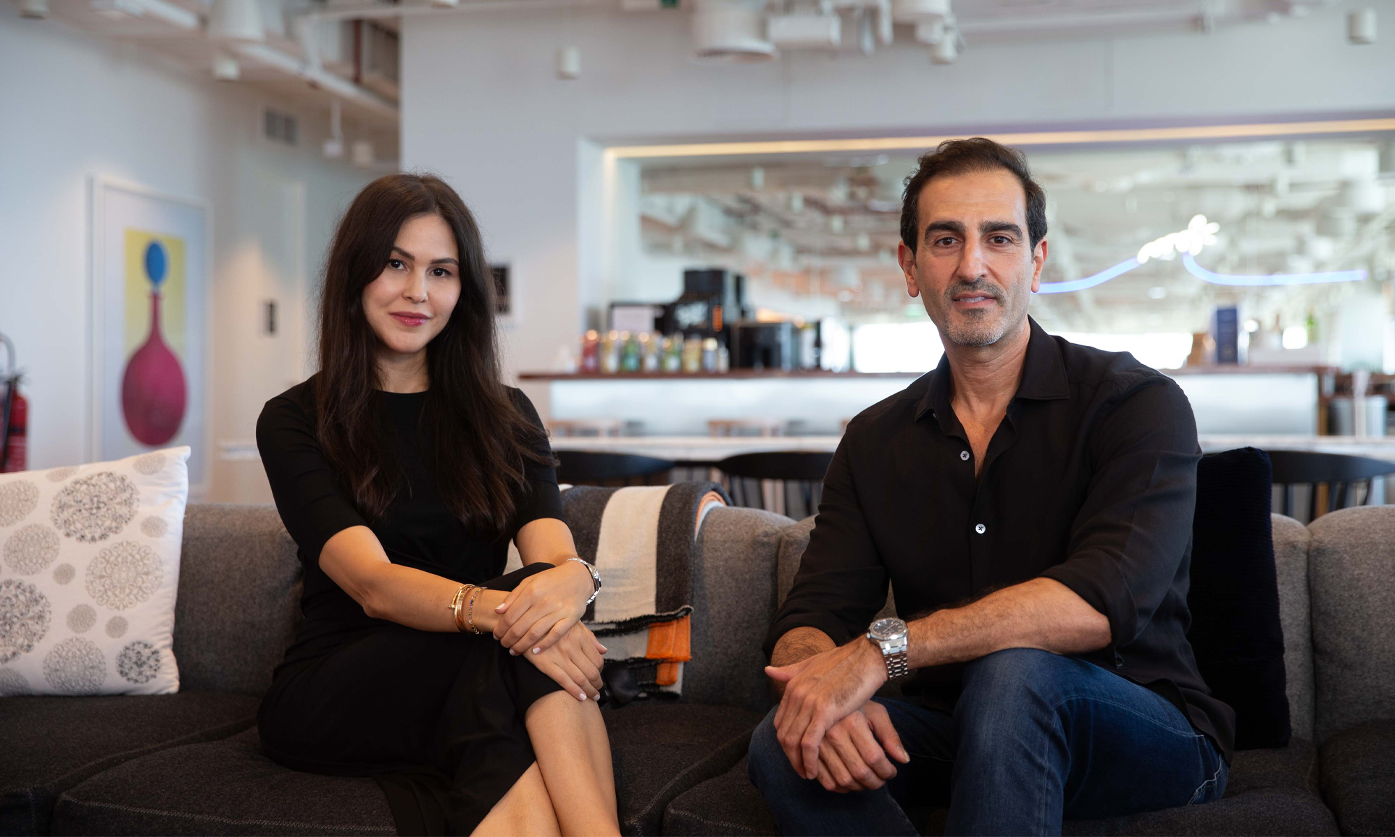
Abu Dhabi-based Ovasave is on a mission to empower women to take control of their fertility. Founded by Torkia Mahloul and Majd Abu Zant, the startup seeks to ease the complexity of freezing eggs while encouraging women to start testing their ovarian reserves at thirty years of age to improve their chances of becoming pregnant in the future.
Ovasave’s digitized process is centered around a $100 FDA-approved self-administered home hormone test, followed by a remote consultation by a doctor from a vetted fertility clinic network. Depending on the results and the consultation outcome, patients can opt for an egg-freezing package from one of the clinics in the network.
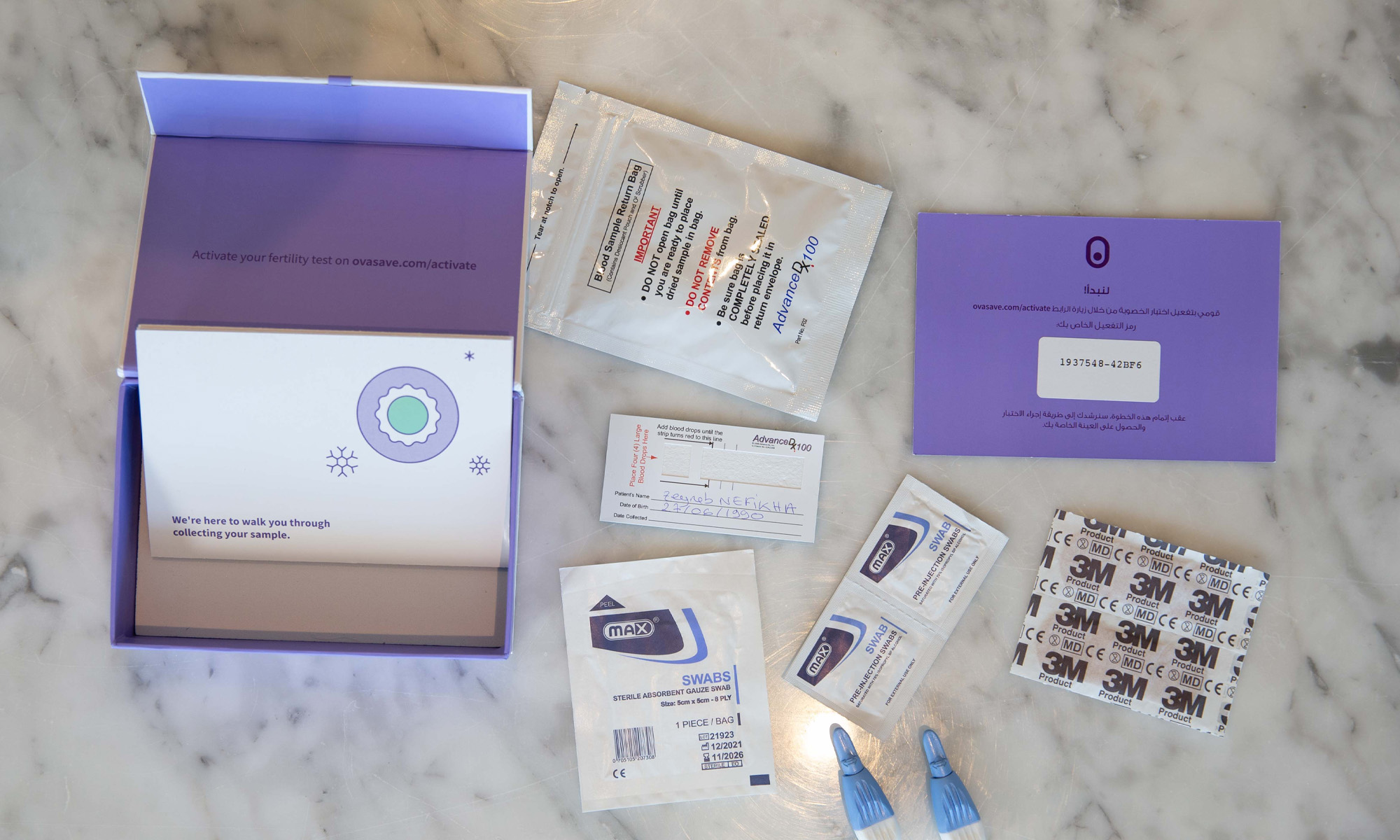
“Access to fertility services is a major issue. Women are delaying having children, so their fertility is declining, but they are not acting on it because of a lack of awareness […] and because the fertility journey is fragmented and complex,” Ms Mahloul says.
Recent changes to reproductive health laws in the United Arab Emirates now allow single and married women to preserve eggs for both social and medical reasons (including pursuing education or career advancement or undergoing cancer treatments).
According to co-founder Abu Zant, freezing eggs costs around Dh25,000 per cycle, with storage averaging another Dh1,500 per year. In the UAE, frozen eggs can be legally stored for five years, with an option to extend by an additional five years.
Also Read: LVL Wellbeing Receives $10 Million Investment To Scale Operations
Ovasave is partnering with eight UAE fertility clinics and twenty IVF specialists. Users will be able to rate doctors so that other women can compare the reviews when they book a consultation.
So far, the co-founders have invested $400,000 into the startup and are seeking to raise up to $2 million over the coming six months. The funds will be used for technical development, recruitment, and general market growth.





News
Microsoft Plans $10 Billion-Plus Gulf Expansion Despite Iran Conflict
Security is shaping Microsoft’s approach, from resilience work with governments to what it will say about how the money splits by country.
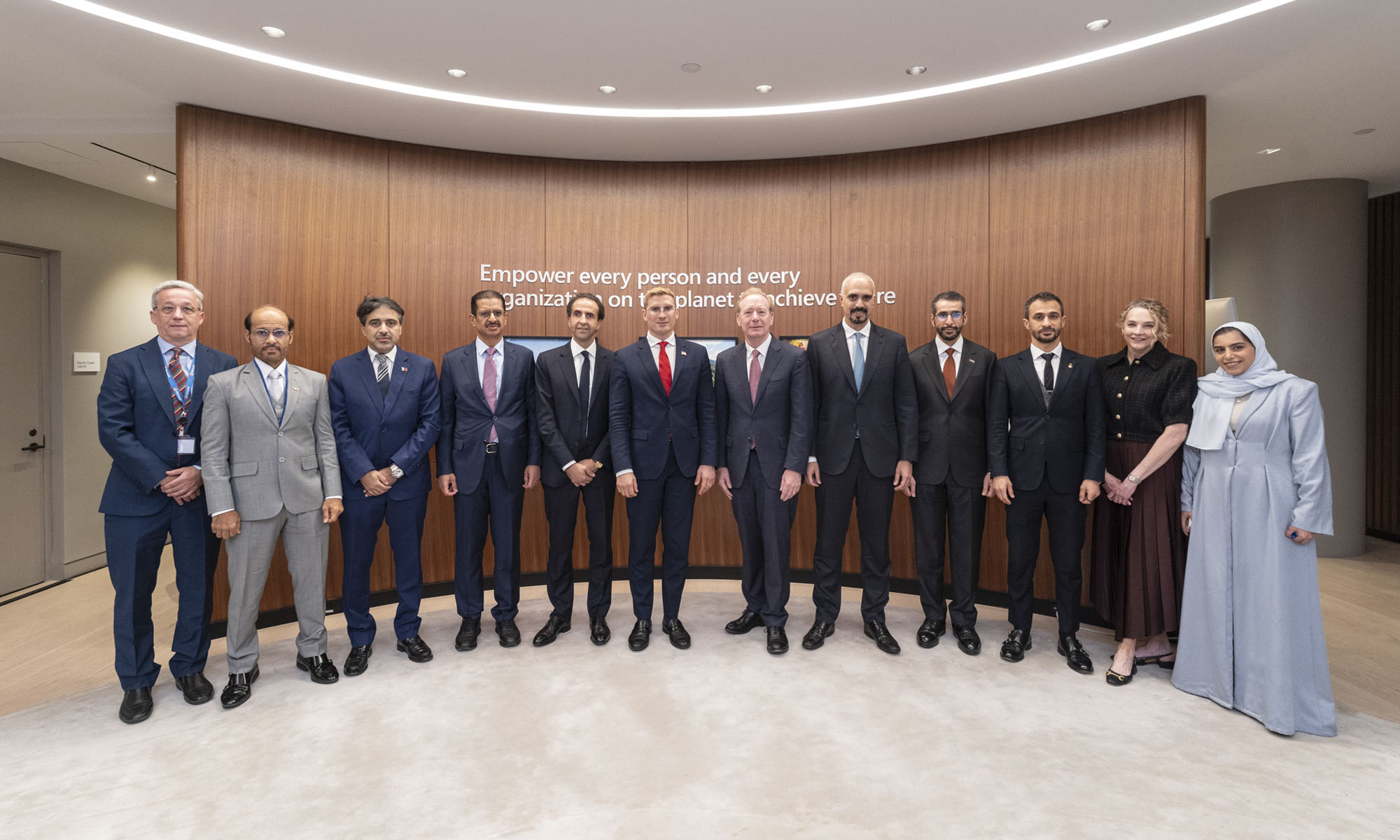
Microsoft is planning more than $10 billion of investment across the UAE, Saudi Arabia, Qatar and Kuwait through 2030, Vice Chair and President Brad Smith told Reuters, calling the spending schedule aggressive. The Iranian conflict that began on February 28 has not persuaded the company to scale back.
“We’re sustaining all the investments we planned to make before this conflict started, and we are in fact adding to them,” Smith said. The $10 billion-plus total does not, however, show how large those additions are.
The investment, which Smith described as part of Microsoft’s continued infrastructure expansion, is aimed at cloud and AI infrastructure and at the company’s growing regional operations. Microsoft also intends to put more than $400 million into subsea and terrestrial connectivity across the Middle East by 2030.
The spending fits the region’s own ambitions too. Gulf governments have been investing heavily in AI infrastructure as part of a push to diversify their economies beyond oil and gas and turn themselves into global technology hubs. Major cloud and AI providers have been drawn in part by the land and relatively low-cost energy on offer.
Microsoft is widening its partnerships with regional AI companies, though not on identical terms. In 2024, it invested $1.5 billion in Abu Dhabi-based G42 for a minority stake, and Smith currently sits on G42’s board. Saudi Arabia’s Humain and Qatar’s Qai are working with Microsoft on selected priority areas, but Smith said the company does not plan to make capital investments in either.
Also Read: Egypt’s Mobile Wallets Are Booming, But Cash Still Has Power
The conflict has added another strand to Microsoft’s work in the region. Since it began, Smith said, the company has supported regional partners with digital resilience assessments, and it is now working with Gulf countries through a digital resilience initiative focused on preparedness and the protection of critical data.
So far, the company has given no country-by-country breakdown of the investment, citing security among other factors. So while the headline figure is public, how Microsoft divides the spending among the four countries is not.

Microsoft Plans $10 Billion-Plus Gulf Expansion Despite Iran Conflict

In Kuwait, Your Surgeon Might Be Operating From Another Country

Qatar Folds 45 State Companies Into A Single Investment Platform

Trip.com Is Betting An AI Agent Will Book Your Next Vacation

Meta’s New $499 Plan Puts A Price On Reaching A Real Person

Apple’s First Folding iPhone Arrives Late To A Shrinking Market
Trip.com Is Betting An AI Agent Will Book Your Next Vacation

Egypt’s Mobile Wallets Are Booming, But Cash Still Has Power

OKX Bets Streaming Perks Can Take Crypto Mainstream Across MENA

Musk’s Boring Company Wants To Dig 150 KM Of Tunnel Under The UAE


-
 News3 weeks ago
Apple’s First Folding iPhone Arrives Late To A Shrinking Market
-
 News2 weeks ago
Trip.com Is Betting An AI Agent Will Book Your Next Vacation
-
 News2 weeks ago
Egypt’s Mobile Wallets Are Booming, But Cash Still Has Power
-
 News2 weeks ago
OKX Bets Streaming Perks Can Take Crypto Mainstream Across MENA