
News
Wave Bike Is On A Mission To Improve Beirut Commuting
The Dutch-Lebanese startup offers a pioneering e-bike service that aims to reduce traffic congestion in Lebanon’s busy capital.


Beirut — and Lebanon in general — is a place where cyclists are a comparatively rare site. Dutch entrepreneur Jan Willem de Coo, along with his all-Lebanese team at Wave Bike, aims to change that and, in the process, transform the daily commute for Lebanese workers.
“Cycling is one of the healthiest, most environmentally friendly, and financially accessible modes of city commuting. It is 18 times less polluting than driving a car and offers freedom of movement, reduces stress, and fulfills the daily physical activity required to live a healthy lifestyle,” explains Joyce Hamadeh, head of communications at Wave Bike.
Wave Bike was launched back in 2021, with a $250,000 investment helping the startup tackle Lebanon’s unique traffic dynamics, road systems, and geographic challenges. Now in full operation, Wave Bike’s fleet of 325 bicycles can be hired for as little as $49 per month.
Wave Bike assembles new additions to its fleet using a team of Lebanese mechanics. The bikes are shipped in from Taiwan and are specced with broader tires to navigate poor road surfaces, along with narrow bars for better maneuverability. Meanwhile, electric motors assist communities on inclines, and a handy center stand makes parking straightforward.
Also Read: eVTOL Gives Glimpse Into The Future Of Personal Air Travel
The bikes are offered on a subscription basis, which, according to Joyce Hamze, also includes safety gear: “Wave offers a monthly subscription, meaning every person will receive a bike of his/her own to keep until termination, and it includes maintenance, helmet, and theft insurance”.
Although Wave’s bikes use electric motors, the batteries consume little electricity. They’re also detachable, so can be recharged in a convenient location. Meanwhile, the company also offers an app that allows riders “the chance to discover the friendliest cycling routes while enjoying special features”, including routing, journey tracking, maintenance support, and access to Bike Functions.






News
Microsoft Plans $10 Billion-Plus Gulf Expansion Despite Iran Conflict
Security is shaping Microsoft’s approach, from resilience work with governments to what it will say about how the money splits by country.
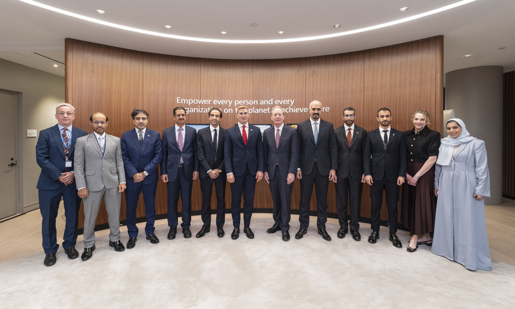
Microsoft is planning more than $10 billion of investment across the UAE, Saudi Arabia, Qatar and Kuwait through 2030, Vice Chair and President Brad Smith told Reuters, calling the spending schedule aggressive. The Iranian conflict that began on February 28 has not persuaded the company to scale back.
“We’re sustaining all the investments we planned to make before this conflict started, and we are in fact adding to them,” Smith said. The $10 billion-plus total does not, however, show how large those additions are.
The investment, which Smith described as part of Microsoft’s continued infrastructure expansion, is aimed at cloud and AI infrastructure and at the company’s growing regional operations. Microsoft also intends to put more than $400 million into subsea and terrestrial connectivity across the Middle East by 2030.
The spending fits the region’s own ambitions too. Gulf governments have been investing heavily in AI infrastructure as part of a push to diversify their economies beyond oil and gas and turn themselves into global technology hubs. Major cloud and AI providers have been drawn in part by the land and relatively low-cost energy on offer.
Microsoft is widening its partnerships with regional AI companies, though not on identical terms. In 2024, it invested $1.5 billion in Abu Dhabi-based G42 for a minority stake, and Smith currently sits on G42’s board. Saudi Arabia’s Humain and Qatar’s Qai are working with Microsoft on selected priority areas, but Smith said the company does not plan to make capital investments in either.
Also Read: Egypt’s Mobile Wallets Are Booming, But Cash Still Has Power
The conflict has added another strand to Microsoft’s work in the region. Since it began, Smith said, the company has supported regional partners with digital resilience assessments, and it is now working with Gulf countries through a digital resilience initiative focused on preparedness and the protection of critical data.
So far, the company has given no country-by-country breakdown of the investment, citing security among other factors. So while the headline figure is public, how Microsoft divides the spending among the four countries is not.

Microsoft Plans $10 Billion-Plus Gulf Expansion Despite Iran Conflict

In Kuwait, Your Surgeon Might Be Operating From Another Country

Qatar Folds 45 State Companies Into A Single Investment Platform

Trip.com Is Betting An AI Agent Will Book Your Next Vacation

Meta’s New $499 Plan Puts A Price On Reaching A Real Person

Apple’s First Folding iPhone Arrives Late To A Shrinking Market
Trip.com Is Betting An AI Agent Will Book Your Next Vacation

Egypt’s Mobile Wallets Are Booming, But Cash Still Has Power

OKX Bets Streaming Perks Can Take Crypto Mainstream Across MENA

Musk’s Boring Company Wants To Dig 150 KM Of Tunnel Under The UAE


-
 News3 weeks ago
Apple’s First Folding iPhone Arrives Late To A Shrinking Market
-
 News2 weeks ago
Trip.com Is Betting An AI Agent Will Book Your Next Vacation
-
 News2 weeks ago
Egypt’s Mobile Wallets Are Booming, But Cash Still Has Power
-
 News2 weeks ago
OKX Bets Streaming Perks Can Take Crypto Mainstream Across MENA