
News
A First Glimpse Of Dubai’s Air Taxis Flying Past Local Landmarks
The city’s first vertiport will be close to Dubai International Airport and connected to the Emirates Metro Station.

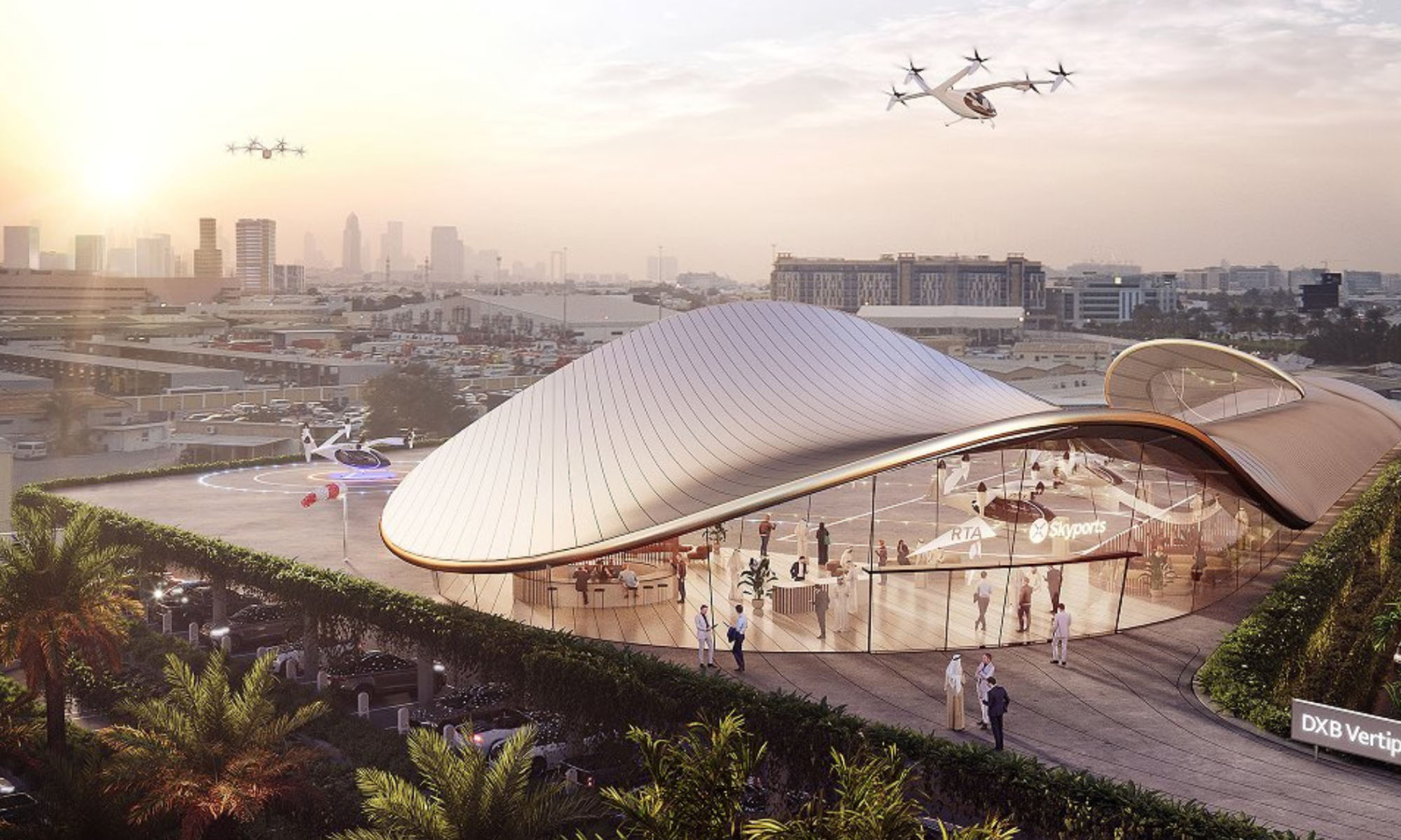
Once the preserve of science fiction movies, air taxis are being tested in cities worldwide, with Dubai’s own service set to take to the skies by 2026. With the taxis becoming a realistic prospect for the tech-focused city, the Government of Dubai Media Office has just released several artist impressions of the aircraft in action.
The photo-realistic depictions give a flavor of what tourists and locals will see as they queue at one of Dubai’s four vertiports before speeding between Downtown Dubai near the Burj Khalifa to Dubai Marina, the International Airport, and Palm Jumeirah.
A Look At Dubai’s First Vertiport
The first vertiport will be located near the Dubai International Airport, with the roof acting as a terminal for the aerial passenger vehicles. Tourists and business fliers will be able to access the vertiport using an air-conditioned bridge connecting the Emirates Metro Station.
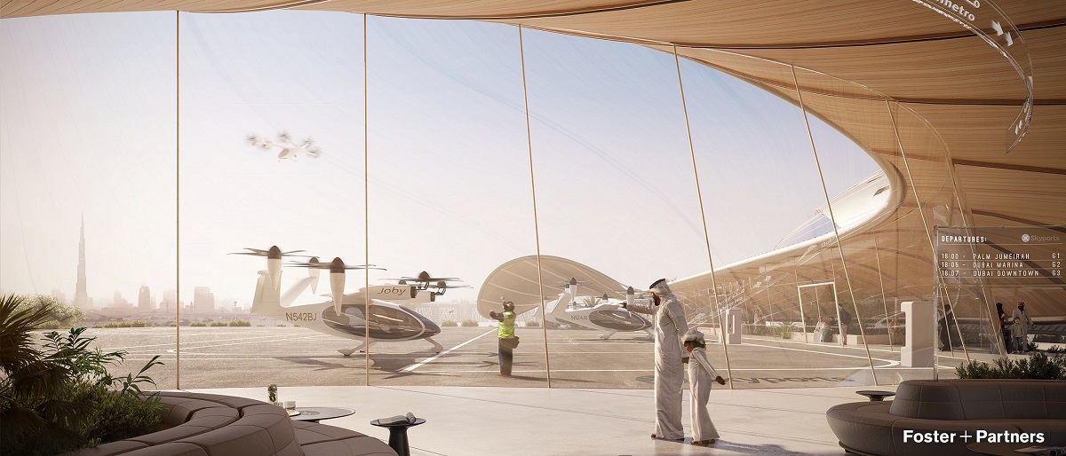
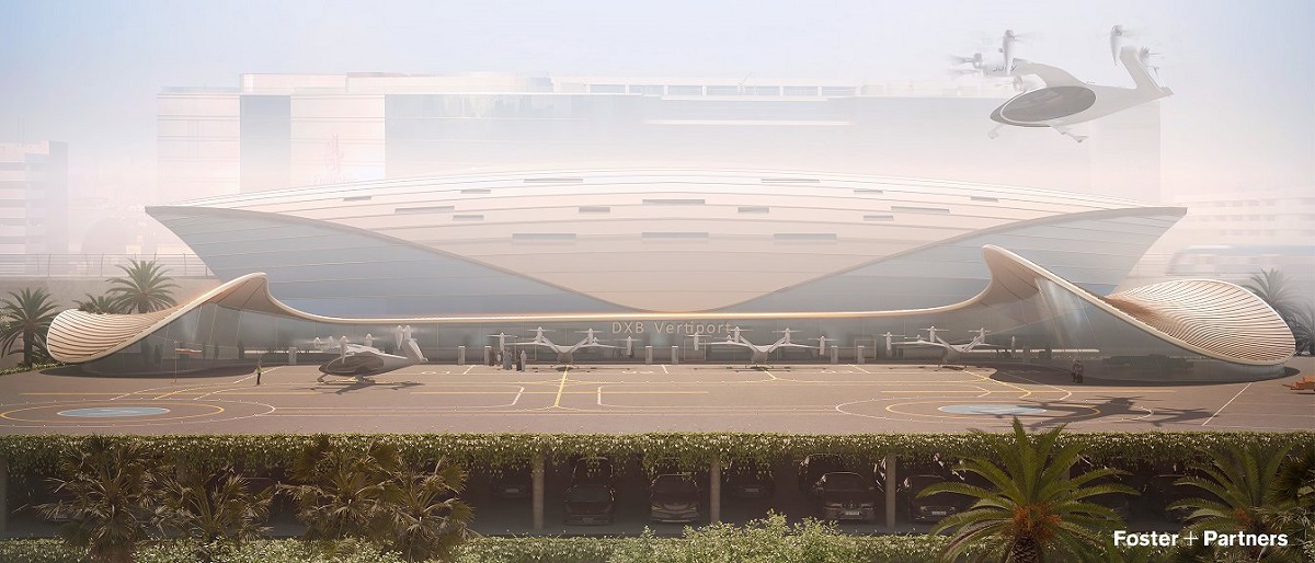
Comprising two levels of car parking, the vertiport is revealed as having a futuristic design with accommodation for four taxi stands and two landing areas. As well as a waiting area for passengers, the transport hub will have plenty of electric charging stations and integrate seamlessly with the rest of Dubai’s planned next-generation infrastructure.
The Aircraft
Unveiled at the World Government Summit, the sky taxis are all-electric, vertical take-off and landing (eVTOL) vehicles capable of 300 kmph. The craft can whisk four passengers across the city and boast an impressive range of 241 km.
The Red Tape
The RTA is working closely with Dubai Air Navigation Services and the Civil (and General) Aviation Authority to ensure high standards and safety levels for the planned air taxis service.
According to Mattar Al Tayer, Director-General and Chairman of the Board of Executive Directors of the RTA, the project consists of two main stages:
“The operation is composed of crucial elements. They include a detailed negotiation with a multitude of companies active in this field, signing of commercial agreements [and the] development of the necessary infrastructure and the highly anticipated roll-out of the service.
“The second stage involves identifying a potential partner for investing in the infrastructure needed to introduce autonomous aerial taxis to Dubai’s skies. At present, commercial negotiations are in progress with the most promising and specialized investors globally in the realm of air mobility to construct the requisite infrastructure,” says Mattar Al Tayer.





News
Microsoft Plans $10 Billion-Plus Gulf Expansion Despite Iran Conflict
Security is shaping Microsoft’s approach, from resilience work with governments to what it will say about how the money splits by country.
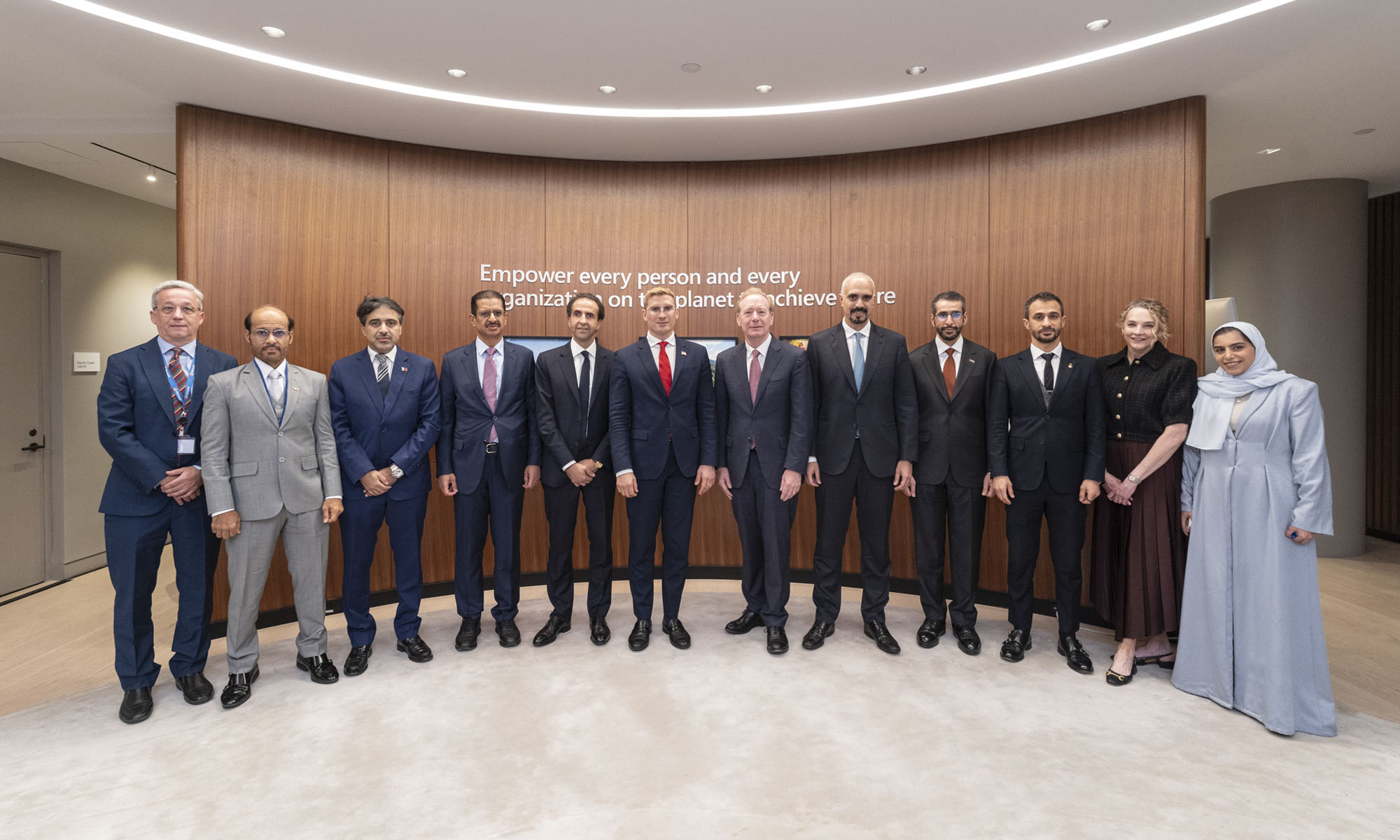
Microsoft is planning more than $10 billion of investment across the UAE, Saudi Arabia, Qatar and Kuwait through 2030, Vice Chair and President Brad Smith told Reuters, calling the spending schedule aggressive. The Iranian conflict that began on February 28 has not persuaded the company to scale back.
“We’re sustaining all the investments we planned to make before this conflict started, and we are in fact adding to them,” Smith said. The $10 billion-plus total does not, however, show how large those additions are.
The investment, which Smith described as part of Microsoft’s continued infrastructure expansion, is aimed at cloud and AI infrastructure and at the company’s growing regional operations. Microsoft also intends to put more than $400 million into subsea and terrestrial connectivity across the Middle East by 2030.
The spending fits the region’s own ambitions too. Gulf governments have been investing heavily in AI infrastructure as part of a push to diversify their economies beyond oil and gas and turn themselves into global technology hubs. Major cloud and AI providers have been drawn in part by the land and relatively low-cost energy on offer.
Microsoft is widening its partnerships with regional AI companies, though not on identical terms. In 2024, it invested $1.5 billion in Abu Dhabi-based G42 for a minority stake, and Smith currently sits on G42’s board. Saudi Arabia’s Humain and Qatar’s Qai are working with Microsoft on selected priority areas, but Smith said the company does not plan to make capital investments in either.
Also Read: Egypt’s Mobile Wallets Are Booming, But Cash Still Has Power
The conflict has added another strand to Microsoft’s work in the region. Since it began, Smith said, the company has supported regional partners with digital resilience assessments, and it is now working with Gulf countries through a digital resilience initiative focused on preparedness and the protection of critical data.
So far, the company has given no country-by-country breakdown of the investment, citing security among other factors. So while the headline figure is public, how Microsoft divides the spending among the four countries is not.

Microsoft Plans $10 Billion-Plus Gulf Expansion Despite Iran Conflict

In Kuwait, Your Surgeon Might Be Operating From Another Country

Qatar Folds 45 State Companies Into A Single Investment Platform

Trip.com Is Betting An AI Agent Will Book Your Next Vacation

Meta’s New $499 Plan Puts A Price On Reaching A Real Person

Apple’s First Folding iPhone Arrives Late To A Shrinking Market
Trip.com Is Betting An AI Agent Will Book Your Next Vacation

Egypt’s Mobile Wallets Are Booming, But Cash Still Has Power

OKX Bets Streaming Perks Can Take Crypto Mainstream Across MENA

Apple’s Latest Product Releases Make The Headlines


-
 News3 weeks ago
Apple’s First Folding iPhone Arrives Late To A Shrinking Market
-
 News2 weeks ago
Trip.com Is Betting An AI Agent Will Book Your Next Vacation
-
 News2 weeks ago
Egypt’s Mobile Wallets Are Booming, But Cash Still Has Power
-
 News2 weeks ago
OKX Bets Streaming Perks Can Take Crypto Mainstream Across MENA