
News
Istanbul Fights Disease-Carrying Mosquitoes Using A Smartphone App
There are approximately 190,000 mosquito habitats in Istanbul, and 80% of them wouldn’t exist if it wasn’t for humans creating ideal breeding conditions.

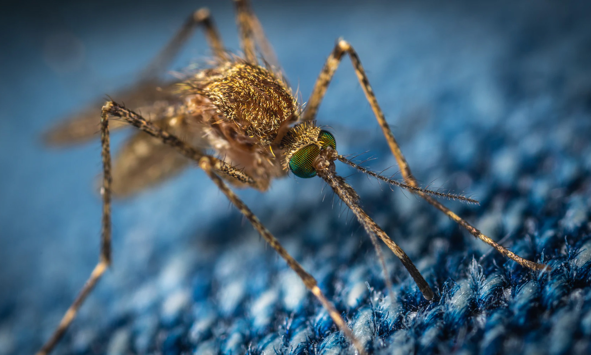
With the world’s attention focused on the still ongoing coronavirus pandemic, it’s easy to forget that there are many other serious health problems affecting the lives of people around the world. Istanbul is one of the countless cities that have been invaded by disease-carrying mosquitoes, and the city’s civic body has recently decided to solve this problem using modern technology.
More specifically, the Istanbul Municipality has released a smartphone app whose purpose is to identify different mosquito species in the city and create a real-time map showing their location. The gathered information will allow city officials to take appropriate actions in order to stop, or at least slow down, the spread of mosquitoes in the city of hundred names.
The biggest challenge is the fact that not all Istanbul residents own high-end smartphones with high-resolution cameras capable of taking detailed pictures of tiny mosquitoes, especially under poor lighting conditions. That said, even less-than-ideal pictures can help officials map out the general presence of mosquitoes in Istanbul, which can go a long way in tackling the infestation.
Önder Yüksel Eryiğit, a senior municipal official, said that there are approximately 190,000 mosquito habitats in Istanbul, and 80 percent of them wouldn’t exist if it wasn’t for humans creating ideal breeding conditions for mosquitoes.
Also Read: FDA Approves Israeli Cancer-Freezing Technology
Academics have warned the Istanbul Municipality about the possibility of mosquitoes infected with Zika and West Nile viruses already making the city their new home. To prevent a deadly outbreak of these and other infectious diseases, it’s important to act quickly and avoid letting the problem get out of hand.
This certainly isn’t the first application of mobile apps in the Middle East for the purposes of solving pressing healthcare issues, and it’s safe to say that it won’t be the last. For example, during the early stages of the coronavirus pandemic, a group of 16 technology enthusiasts from Turkey developed a contact-tracing app to instantly alert users who had contact with infected people.







News
Microsoft Plans $10 Billion-Plus Gulf Expansion Despite Iran Conflict
Security is shaping Microsoft’s approach, from resilience work with governments to what it will say about how the money splits by country.

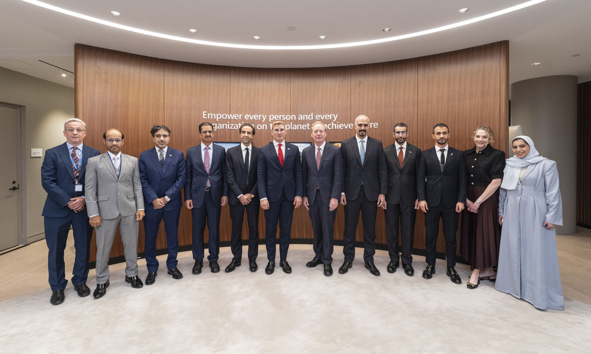
Microsoft is planning more than $10 billion of investment across the UAE, Saudi Arabia, Qatar and Kuwait through 2030, Vice Chair and President Brad Smith told Reuters, calling the spending schedule aggressive. The Iranian conflict that began on February 28 has not persuaded the company to scale back.
“We’re sustaining all the investments we planned to make before this conflict started, and we are in fact adding to them,” Smith said. The $10 billion-plus total does not, however, show how large those additions are.
The investment, which Smith described as part of Microsoft’s continued infrastructure expansion, is aimed at cloud and AI infrastructure and at the company’s growing regional operations. Microsoft also intends to put more than $400 million into subsea and terrestrial connectivity across the Middle East by 2030.
The spending fits the region’s own ambitions too. Gulf governments have been investing heavily in AI infrastructure as part of a push to diversify their economies beyond oil and gas and turn themselves into global technology hubs. Major cloud and AI providers have been drawn in part by the land and relatively low-cost energy on offer.
Microsoft is widening its partnerships with regional AI companies, though not on identical terms. In 2024, it invested $1.5 billion in Abu Dhabi-based G42 for a minority stake, and Smith currently sits on G42’s board. Saudi Arabia’s Humain and Qatar’s Qai are working with Microsoft on selected priority areas, but Smith said the company does not plan to make capital investments in either.
Also Read: Egypt’s Mobile Wallets Are Booming, But Cash Still Has Power
The conflict has added another strand to Microsoft’s work in the region. Since it began, Smith said, the company has supported regional partners with digital resilience assessments, and it is now working with Gulf countries through a digital resilience initiative focused on preparedness and the protection of critical data.
So far, the company has given no country-by-country breakdown of the investment, citing security among other factors. So while the headline figure is public, how Microsoft divides the spending among the four countries is not.

Microsoft Plans $10 Billion-Plus Gulf Expansion Despite Iran Conflict

In Kuwait, Your Surgeon Might Be Operating From Another Country

Qatar Folds 45 State Companies Into A Single Investment Platform

Trip.com Is Betting An AI Agent Will Book Your Next Vacation

Meta’s New $499 Plan Puts A Price On Reaching A Real Person

Apple’s First Folding iPhone Arrives Late To A Shrinking Market
Trip.com Is Betting An AI Agent Will Book Your Next Vacation

Egypt’s Mobile Wallets Are Booming, But Cash Still Has Power

OKX Bets Streaming Perks Can Take Crypto Mainstream Across MENA

Musk’s Boring Company Wants To Dig 150 KM Of Tunnel Under The UAE


-
 News3 weeks ago
Apple’s First Folding iPhone Arrives Late To A Shrinking Market
-
 News2 weeks ago
Trip.com Is Betting An AI Agent Will Book Your Next Vacation
-
 News2 weeks ago
Egypt’s Mobile Wallets Are Booming, But Cash Still Has Power
-
 News2 weeks ago
OKX Bets Streaming Perks Can Take Crypto Mainstream Across MENA