
News
Microsoft Wants To Purchase Discord And We Know Why


According to multiple independent reports, Microsoft is interested in acquiring Discord, an instant messaging and digital distribution platform that’s especially popular among Gen Z gamers.
While the two companies are still far away from striking a deal, Microsoft seems to be the only potential buyer at the moment, and the software giant is willing to pay up to $10 billion to add Discord to its portfolio.
But why is one of the largest companies in the world interested in spending so much money to buy what was once the alt-right’s favorite chat app? The answer may surprise you: Microsoft isn’t really interested in the platform itself; it’s interested in the community of around 150 million monthly active users.
“Creation, creation, creation — the next 10 years is going to be as much about creation as it is about consumption and about the community around it, so it’s not creating alone,” said Microsoft CEO Satya Nadella. “If the last 10 years has been about consumption — we’re shopping more, we’re browsing more, we’re binge-watching more — there is creation behind every one of those.”
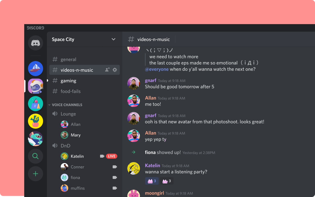
Discord
Discord is a huge community of content creators, and many of its users play video games on Microsoft’s video game consoles. In the past, Microsoft had attempted to create a place for gamers to “come together to talk about games, watch games, watch others play games,” as Xbox chief Phil Spencer put it, by purchasing live streaming platform Beam and renaming it Mixer, but that effort turned out to be a failure.
The difference between mixer and Discord is that the latter platform is already loved by its target audience, so Microsoft wouldn’t face an uphill struggle and could simply focus on tightening the integration between Xbox, PC, and Discord.
Also Read: Tinder Will Soon Let You Background Check Your Matches
“There’s a big opportunity to bundle Discord’s premium offering, Nitro, into the Game Pass service to drive more subscriptions from the last reported 18 million,” pointed out Bloomberg Intelligence Analyst Matthew Kanterman.
It’s worth noting that Microsoft has been looking for its next big acquisition for quite some time now. The company attempted to purchase both TikTok and Pinterest but failed each time. It will be interesting to see if things will work out on the third try.



News
Microsoft Plans $10 Billion-Plus Gulf Expansion Despite Iran Conflict
Security is shaping Microsoft’s approach, from resilience work with governments to what it will say about how the money splits by country.

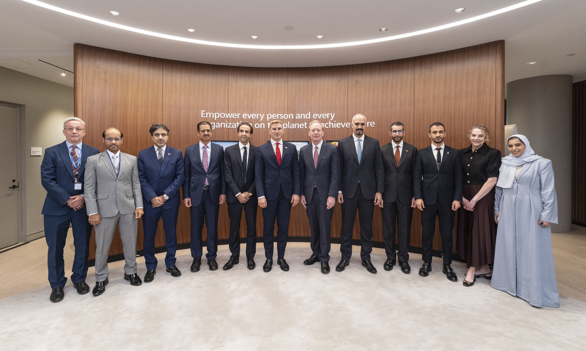
Microsoft is planning more than $10 billion of investment across the UAE, Saudi Arabia, Qatar and Kuwait through 2030, Vice Chair and President Brad Smith told Reuters, calling the spending schedule aggressive. The Iranian conflict that began on February 28 has not persuaded the company to scale back.
“We’re sustaining all the investments we planned to make before this conflict started, and we are in fact adding to them,” Smith said. The $10 billion-plus total does not, however, show how large those additions are.
The investment, which Smith described as part of Microsoft’s continued infrastructure expansion, is aimed at cloud and AI infrastructure and at the company’s growing regional operations. Microsoft also intends to put more than $400 million into subsea and terrestrial connectivity across the Middle East by 2030.
The spending fits the region’s own ambitions too. Gulf governments have been investing heavily in AI infrastructure as part of a push to diversify their economies beyond oil and gas and turn themselves into global technology hubs. Major cloud and AI providers have been drawn in part by the land and relatively low-cost energy on offer.
Microsoft is widening its partnerships with regional AI companies, though not on identical terms. In 2024, it invested $1.5 billion in Abu Dhabi-based G42 for a minority stake, and Smith currently sits on G42’s board. Saudi Arabia’s Humain and Qatar’s Qai are working with Microsoft on selected priority areas, but Smith said the company does not plan to make capital investments in either.
Also Read: Egypt’s Mobile Wallets Are Booming, But Cash Still Has Power
The conflict has added another strand to Microsoft’s work in the region. Since it began, Smith said, the company has supported regional partners with digital resilience assessments, and it is now working with Gulf countries through a digital resilience initiative focused on preparedness and the protection of critical data.
So far, the company has given no country-by-country breakdown of the investment, citing security among other factors. So while the headline figure is public, how Microsoft divides the spending among the four countries is not.

Microsoft Plans $10 Billion-Plus Gulf Expansion Despite Iran Conflict

In Kuwait, Your Surgeon Might Be Operating From Another Country

Qatar Folds 45 State Companies Into A Single Investment Platform

Trip.com Is Betting An AI Agent Will Book Your Next Vacation

Meta’s New $499 Plan Puts A Price On Reaching A Real Person

Apple’s First Folding iPhone Arrives Late To A Shrinking Market
Trip.com Is Betting An AI Agent Will Book Your Next Vacation

Egypt’s Mobile Wallets Are Booming, But Cash Still Has Power

OKX Bets Streaming Perks Can Take Crypto Mainstream Across MENA

Musk’s Boring Company Wants To Dig 150 KM Of Tunnel Under The UAE


-
 News3 weeks ago
Apple’s First Folding iPhone Arrives Late To A Shrinking Market
-
 News2 weeks ago
Trip.com Is Betting An AI Agent Will Book Your Next Vacation
-
 News2 weeks ago
Egypt’s Mobile Wallets Are Booming, But Cash Still Has Power
-
 News2 weeks ago
OKX Bets Streaming Perks Can Take Crypto Mainstream Across MENA