
News
New Malware Could Mean Trouble For iOS & macOS Security
Security researchers discovered an attack vector that, if exploited, would allow hackers to access messages, photos, and more.

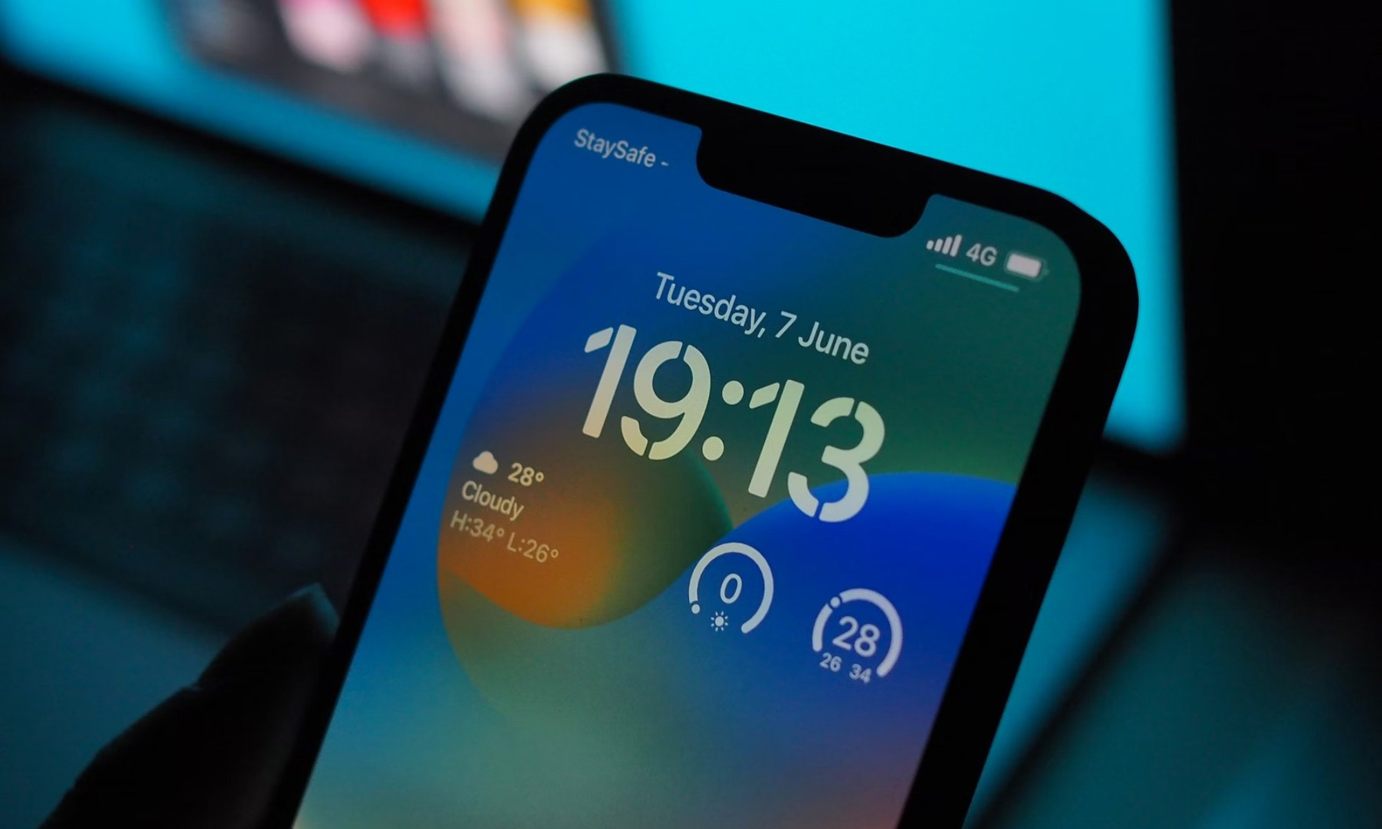
Although Apple’s products are renowned for their robust security, no company is completely immune to hackers and malware. New research has recently revealed an attack vector that can affect Apple’s iPhone and Mac operating systems, allowing criminals to sweep messages, photos, and call history for exploitable data and — even more worryingly — access location data, photos, and the main camera.
The research comes from security firm Trellix, which says that the security flaws rank as “medium to high severity” and bypass the protections Apple puts in place to protect its users.
“The key thing here is the vulnerabilities break Apple’s security model at a fundamental level,” notes Doug McKee, director of vulnerability research at Trellix. McKee thinks his company’s findings could potentially lead to similar bugs being uncovered. However, it’s important to point out that Apple has so far plugged all of the security holes found by Trellix, and there’s no evidence they were ever exploited.
Trellix’s findings build on previous work by Google and Citizen Lab, who jointly discovered malware known as “ForcedEntry”, a zero-click, zero-day iOS exploit linked to Israeli spyware maker NSO Group and found initially on the iPhone of a Saudi activist.
Also Read: Facebook & Instagram Are Testing Twitter-Style Blue Checks
Analysis of ForcedEntry showed that it worked by fooling an iPhone into opening a malicious PDF disguised as a GIF, ultimately bypassing Apple’s sandbox — a protocol that keeps apps from accessing the data stored by other programs and areas of the device.
While Trellix’s findings are worrisome, it’s important to remember that attackers would need to gain a foothold into a device before being able to install any malware, and Apple has been very efficient at issuing security updates. The initial findings relate to macOS 13.2 and iOS 16.3, which were released in January, so it’s vital that readers ensure their devices are fully up to date!



News
Microsoft Plans $10 Billion-Plus Gulf Expansion Despite Iran Conflict
Security is shaping Microsoft’s approach, from resilience work with governments to what it will say about how the money splits by country.
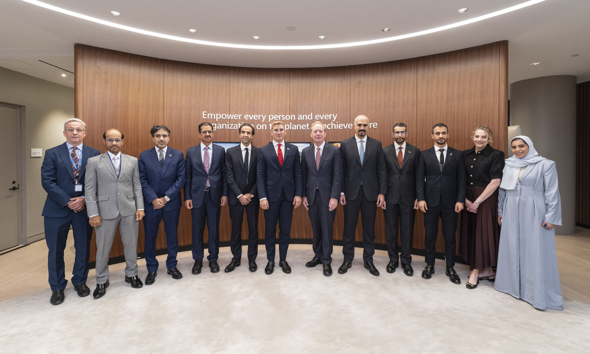
Microsoft is planning more than $10 billion of investment across the UAE, Saudi Arabia, Qatar and Kuwait through 2030, Vice Chair and President Brad Smith told Reuters, calling the spending schedule aggressive. The Iranian conflict that began on February 28 has not persuaded the company to scale back.
“We’re sustaining all the investments we planned to make before this conflict started, and we are in fact adding to them,” Smith said. The $10 billion-plus total does not, however, show how large those additions are.
The investment, which Smith described as part of Microsoft’s continued infrastructure expansion, is aimed at cloud and AI infrastructure and at the company’s growing regional operations. Microsoft also intends to put more than $400 million into subsea and terrestrial connectivity across the Middle East by 2030.
The spending fits the region’s own ambitions too. Gulf governments have been investing heavily in AI infrastructure as part of a push to diversify their economies beyond oil and gas and turn themselves into global technology hubs. Major cloud and AI providers have been drawn in part by the land and relatively low-cost energy on offer.
Microsoft is widening its partnerships with regional AI companies, though not on identical terms. In 2024, it invested $1.5 billion in Abu Dhabi-based G42 for a minority stake, and Smith currently sits on G42’s board. Saudi Arabia’s Humain and Qatar’s Qai are working with Microsoft on selected priority areas, but Smith said the company does not plan to make capital investments in either.
Also Read: Egypt’s Mobile Wallets Are Booming, But Cash Still Has Power
The conflict has added another strand to Microsoft’s work in the region. Since it began, Smith said, the company has supported regional partners with digital resilience assessments, and it is now working with Gulf countries through a digital resilience initiative focused on preparedness and the protection of critical data.
So far, the company has given no country-by-country breakdown of the investment, citing security among other factors. So while the headline figure is public, how Microsoft divides the spending among the four countries is not.

Microsoft Plans $10 Billion-Plus Gulf Expansion Despite Iran Conflict

In Kuwait, Your Surgeon Might Be Operating From Another Country

Qatar Folds 45 State Companies Into A Single Investment Platform

Trip.com Is Betting An AI Agent Will Book Your Next Vacation

Meta’s New $499 Plan Puts A Price On Reaching A Real Person

Apple’s First Folding iPhone Arrives Late To A Shrinking Market
Trip.com Is Betting An AI Agent Will Book Your Next Vacation

Egypt’s Mobile Wallets Are Booming, But Cash Still Has Power

OKX Bets Streaming Perks Can Take Crypto Mainstream Across MENA

Apple’s Latest Product Releases Make The Headlines


-
 News3 weeks ago
Apple’s First Folding iPhone Arrives Late To A Shrinking Market
-
 News2 weeks ago
Trip.com Is Betting An AI Agent Will Book Your Next Vacation
-
 News2 weeks ago
Egypt’s Mobile Wallets Are Booming, But Cash Still Has Power
-
 News2 weeks ago
OKX Bets Streaming Perks Can Take Crypto Mainstream Across MENA