
News
Widespread Phishing Scam Discovered In Saudi Arabia
Group-IB, a global cybersecurity firm, has published research into a scheme where scammers impersonate one of the leading manpower agencies in Saudi Arabia.

Analysts from a leading cybersecurity firm, Group-IB, have uncovered a massive phishing scam operation meant to impersonate one of the Kingdom of Saudi Arabia’s top recruitment agencies.
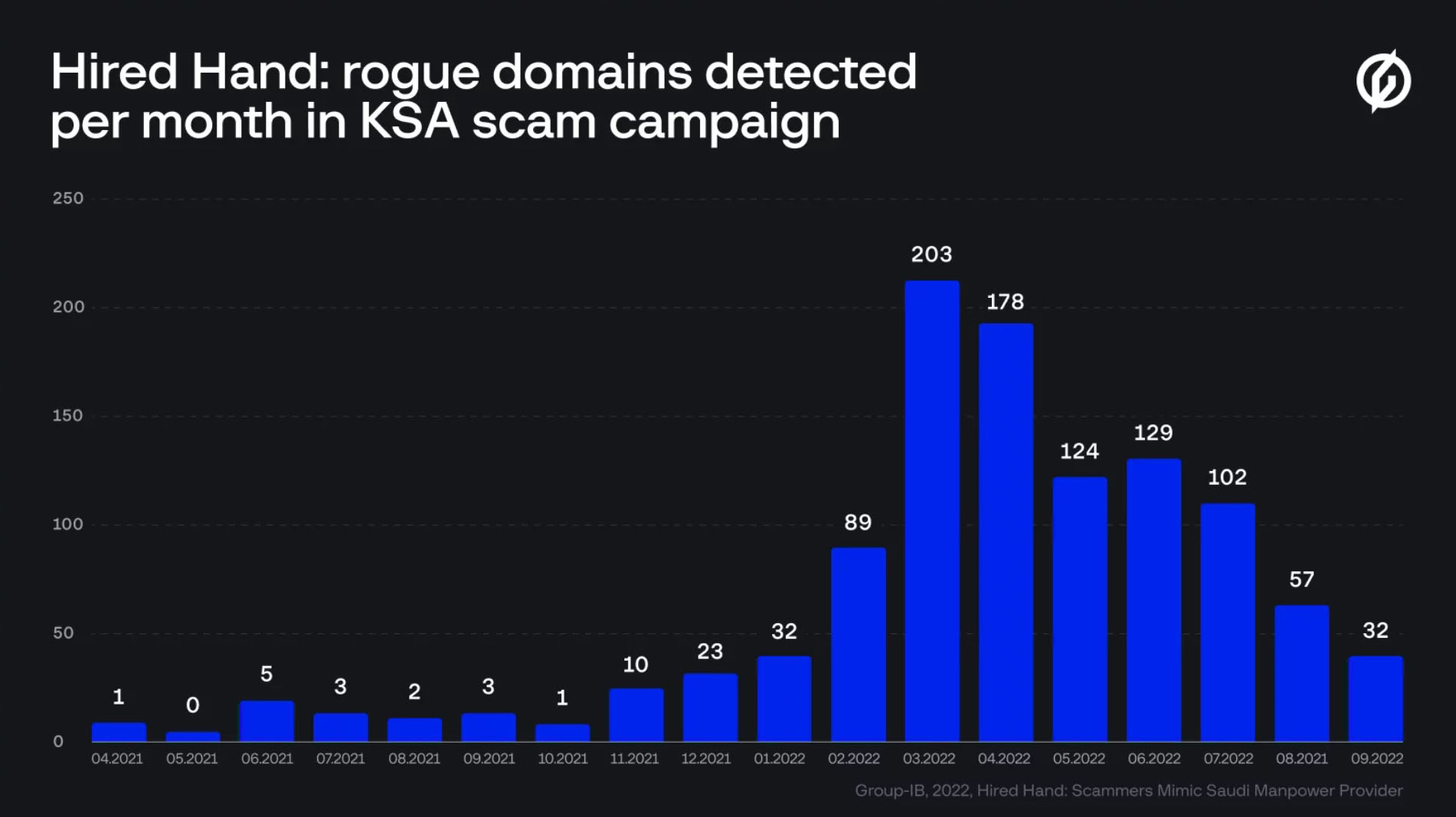
The cybersecurity team found at least 1,000 malicious domains during their research, with most containing a close match to a well-known Saudi agency that offers assistance in hiring employees for the construction and services sector, as well as domestic workers. Scams of this nature are growing at a rate of 10% per year, with more than $55 billion stolen during 2021 alone.
How The Scam Worked
The fake domains and their associated URLs were meant to fool people into thinking they’re the real deal. In addition, each domain featured convincing web pages designed to mimic the official agency website. Scammers were using these web pages to convince people to enter their data, hoping to harvest banking details, as well as both login information and two-factor authentication (2FA) codes.
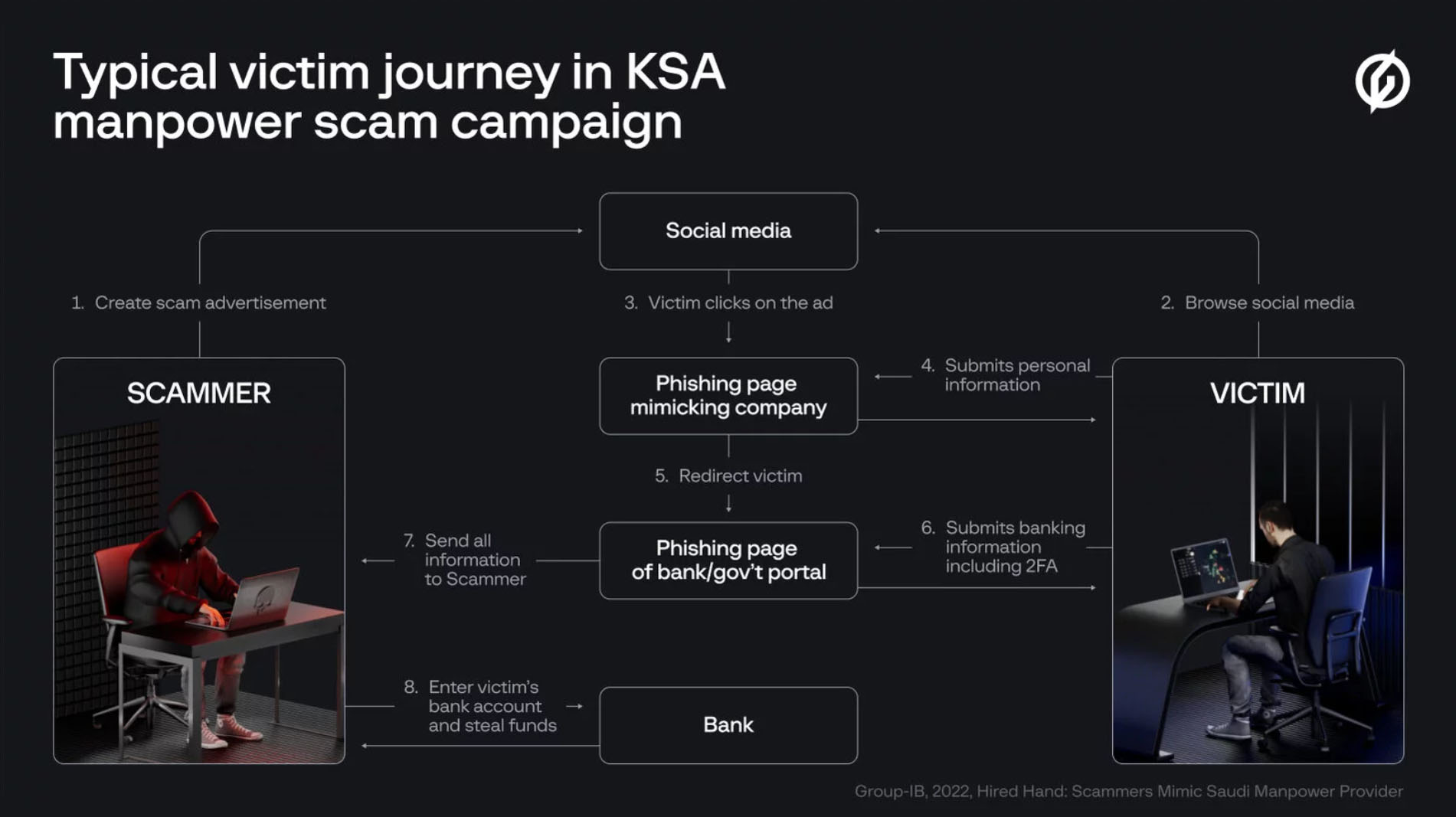
To drive traffic to these fraudulent websites, the criminals used multiple layers of social engineering, first using ads on Facebook, Twitter, and Google that encouraged SMS or WhatsApp conversations, and then sending unwitting users to the fake sites to enter their details.
Once a user had landed on a fake domain, they were persuaded to part with a small processing fee of 50 or 100 SAR (approximately $13 or $27), which enabled the scammers to harvest banking data to empty accounts and make off with user’s hard-earned cash.
Also Read: Is Your Phone Hacked? How To Find Out & Protect Yourself
“Scammers are becoming increasingly resourceful and collaborative, and spoof domain brokers are actively assisting cybercriminals. We encourage companies and organizations to monitor for signs of brand abuse, and we also urge internet users to remain vigilant so that they do not become victims of scams such as this,” says Mark Alpatskiy, CERT-GIB Senior Analyst.
Falling victim to a phishing scam can be costly, and Internet users are urged to show caution and always check URLs to verify they are legitimate before entering any personal data, as well as ensuring they are in communication with online chat services or call centers of the official company in question.




News
Microsoft Plans $10 Billion-Plus Gulf Expansion Despite Iran Conflict
Security is shaping Microsoft’s approach, from resilience work with governments to what it will say about how the money splits by country.
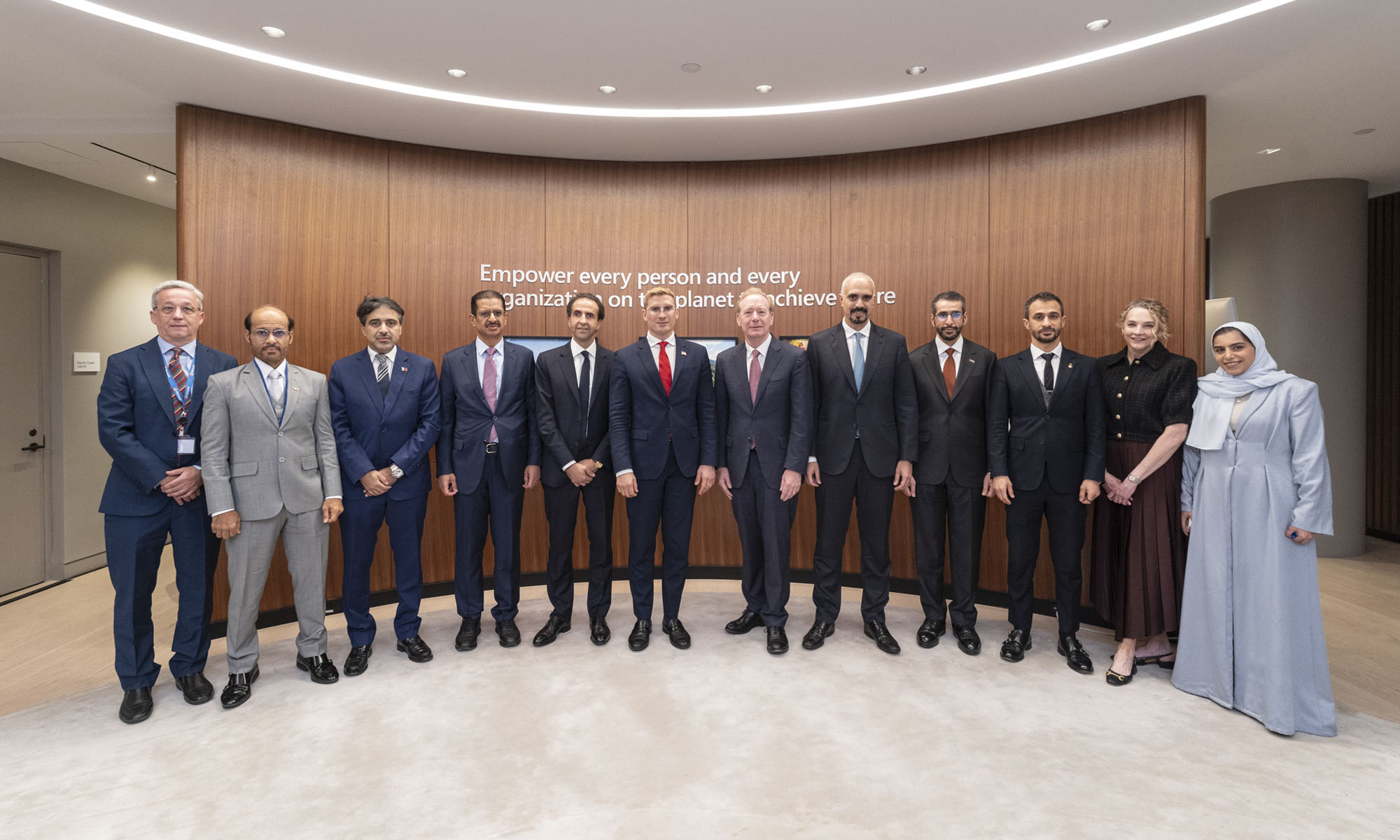
Microsoft is planning more than $10 billion of investment across the UAE, Saudi Arabia, Qatar and Kuwait through 2030, Vice Chair and President Brad Smith told Reuters, calling the spending schedule aggressive. The Iranian conflict that began on February 28 has not persuaded the company to scale back.
“We’re sustaining all the investments we planned to make before this conflict started, and we are in fact adding to them,” Smith said. The $10 billion-plus total does not, however, show how large those additions are.
The investment, which Smith described as part of Microsoft’s continued infrastructure expansion, is aimed at cloud and AI infrastructure and at the company’s growing regional operations. Microsoft also intends to put more than $400 million into subsea and terrestrial connectivity across the Middle East by 2030.
The spending fits the region’s own ambitions too. Gulf governments have been investing heavily in AI infrastructure as part of a push to diversify their economies beyond oil and gas and turn themselves into global technology hubs. Major cloud and AI providers have been drawn in part by the land and relatively low-cost energy on offer.
Microsoft is widening its partnerships with regional AI companies, though not on identical terms. In 2024, it invested $1.5 billion in Abu Dhabi-based G42 for a minority stake, and Smith currently sits on G42’s board. Saudi Arabia’s Humain and Qatar’s Qai are working with Microsoft on selected priority areas, but Smith said the company does not plan to make capital investments in either.
Also Read: Egypt’s Mobile Wallets Are Booming, But Cash Still Has Power
The conflict has added another strand to Microsoft’s work in the region. Since it began, Smith said, the company has supported regional partners with digital resilience assessments, and it is now working with Gulf countries through a digital resilience initiative focused on preparedness and the protection of critical data.
So far, the company has given no country-by-country breakdown of the investment, citing security among other factors. So while the headline figure is public, how Microsoft divides the spending among the four countries is not.

Microsoft Plans $10 Billion-Plus Gulf Expansion Despite Iran Conflict

In Kuwait, Your Surgeon Might Be Operating From Another Country

Qatar Folds 45 State Companies Into A Single Investment Platform

Trip.com Is Betting An AI Agent Will Book Your Next Vacation

Meta’s New $499 Plan Puts A Price On Reaching A Real Person

Apple’s First Folding iPhone Arrives Late To A Shrinking Market
Trip.com Is Betting An AI Agent Will Book Your Next Vacation

Egypt’s Mobile Wallets Are Booming, But Cash Still Has Power

OKX Bets Streaming Perks Can Take Crypto Mainstream Across MENA

Apple’s Latest Product Releases Make The Headlines


-
 News3 weeks ago
Apple’s First Folding iPhone Arrives Late To A Shrinking Market
-
 News2 weeks ago
Trip.com Is Betting An AI Agent Will Book Your Next Vacation
-
 News2 weeks ago
Egypt’s Mobile Wallets Are Booming, But Cash Still Has Power
-
 News2 weeks ago
OKX Bets Streaming Perks Can Take Crypto Mainstream Across MENA